Fotofobia does not describe the exhibition — it names what happens to the body at the end of the pigment’s passage.
Fotofobia is not a metaphor. It is a medical condition: extreme sensitivity to light — brightness becomes painful, darkness desirable. Marte Johnslien’s exhibition begins there, not with white as neutrality or clarity, but with white as something the body may not be able to tolerate.
This marks a break from the exhibitions that preceded it. White to Earth, The Whitest White, Hidden Stone, The Materiality of White — each title named titanium dioxide as substance, mineral, research object. The final exhibition of the four-year project names something else entirely. It names the effect on the observer.
The shift is categorical. The arrangement is structural. Six works trace the pigment’s passage from mineral body to cultural image. The seventh stage is the viewer. Without that final stage, the passage does not close.
Marte Johnslien’s four-year research project, TiO2: The Materiality of White, conducted with the art and architectural historian Ingrid Halland, has argued that titanium dioxide enabled what Halland has called an inconspicuous modernity — a white so pervasive it receded from attention. The research response to that invisibility has been documentary: archives, fieldwork, chemical experimentation, publication. Fotofobia closes the project. It also does something the research frame does not name. The research produces knowledge about the pigment. The exhibition produces the condition the pigment creates in the observer.
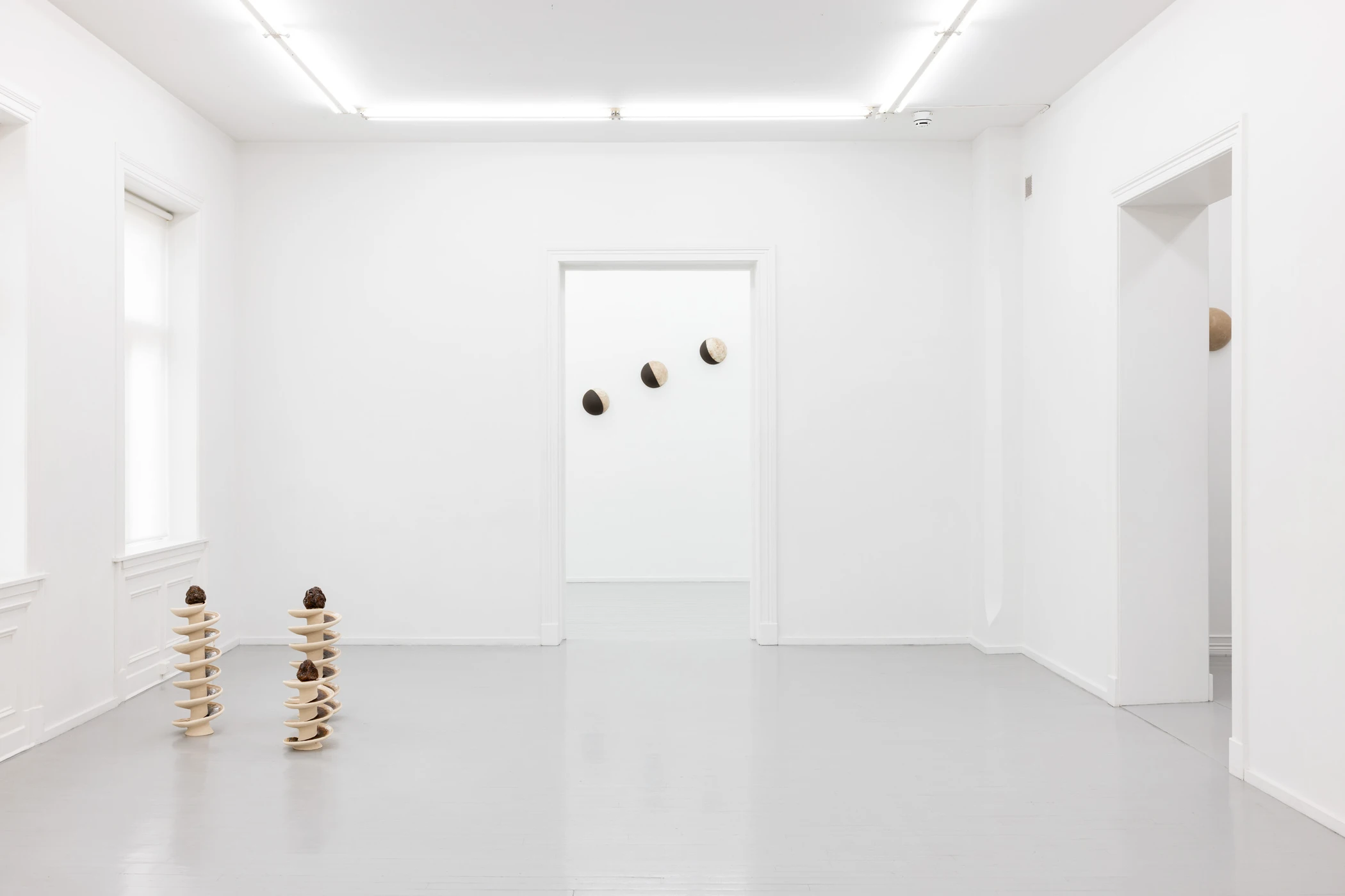
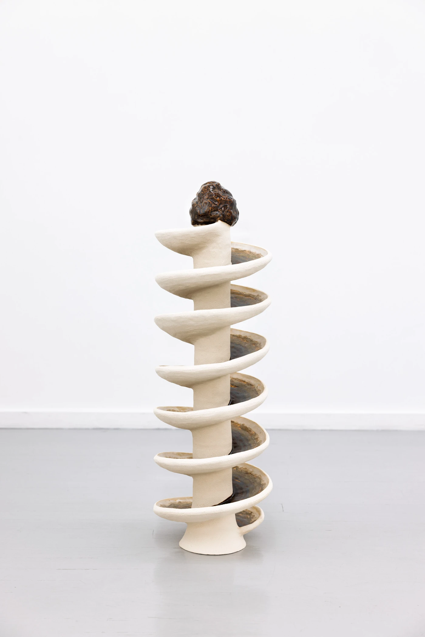
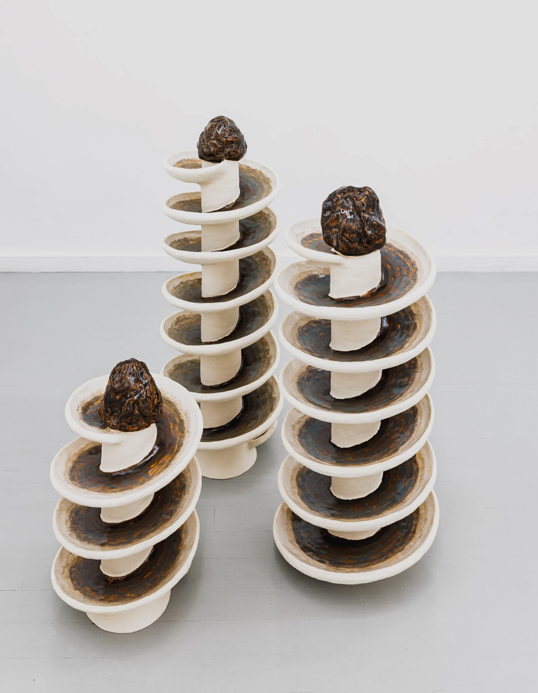
Reading Rocks 1, 2, 3, 2025–26, fixes the exhibition to origin. Three spiral ceramic towers, 39 to 69 cm tall, carry glazes that incorporate historical magnetite mineral samples from the Titania mine in Sokndal. Fragments of the source material are physically embedded in the glaze running in delicate bands down each tower. The work does not represent the mine. It contains it. Across the rest of the exhibition, material origin does not remain. Here, it is preserved inside the object. This is the exhibition’s one fixed reference point.
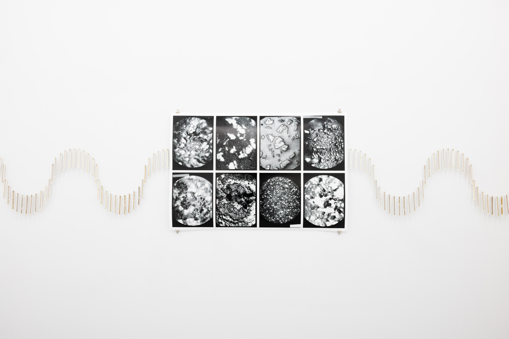
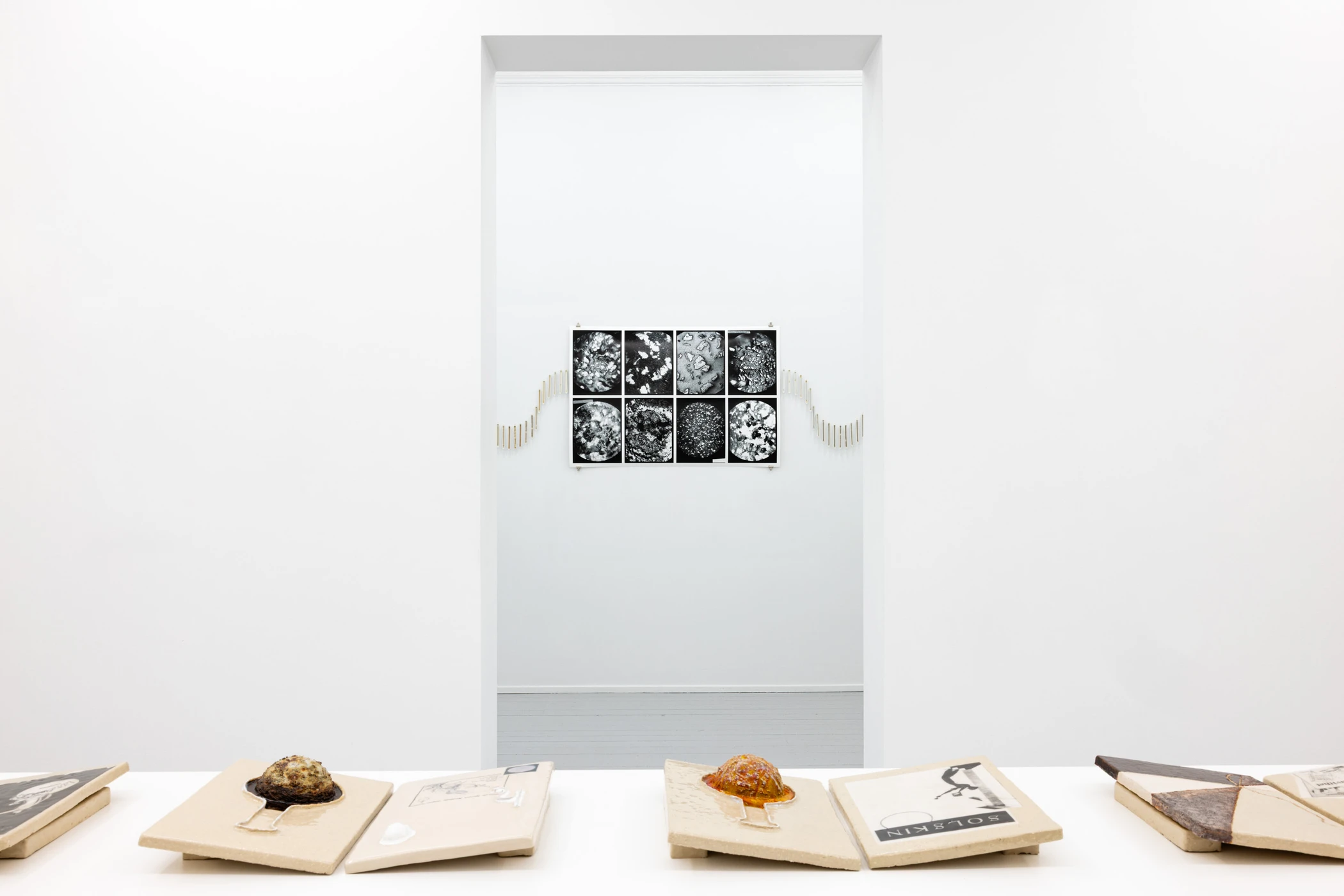
In Fotofobia, 2026, origin begins to lose scale. The title work is a suite of eight microphotographs of melted titanium iron ore, scanned from glass-plate negatives found in Titania’s old laboratory, printed at 75 by 112 cm. The source material is microscopic. The print is nearly a meter wide. The eye finds no stable scale. The image can be read as mineral detail or as astronomical field; neither reading settles. What is captured is the moment the ore melts — matter caught between states, not yet pigment, no longer stone. If Reading Rocks preserves origin, the title work preserves transition.
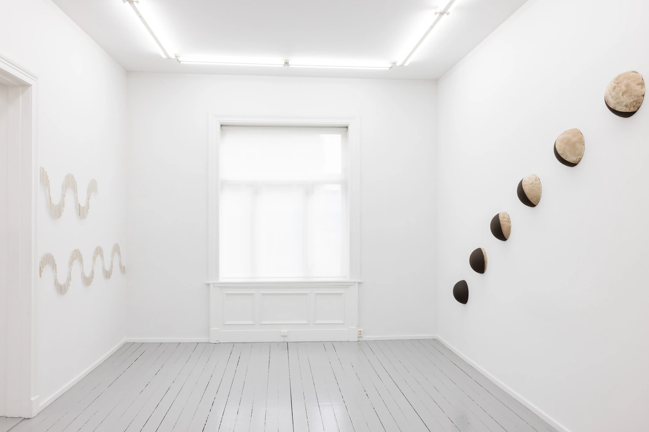
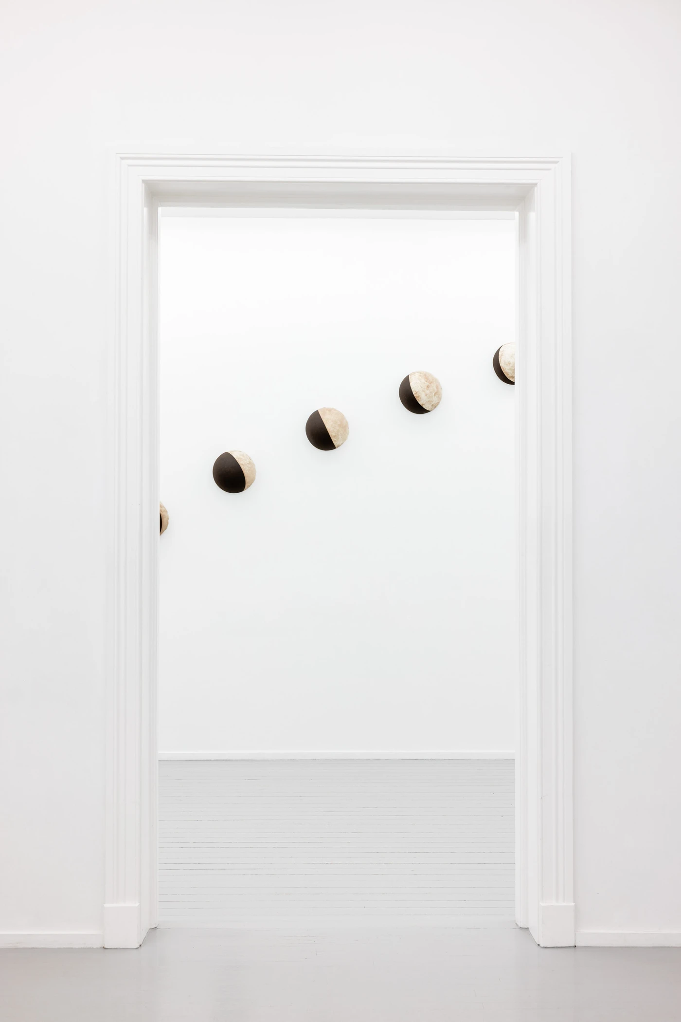
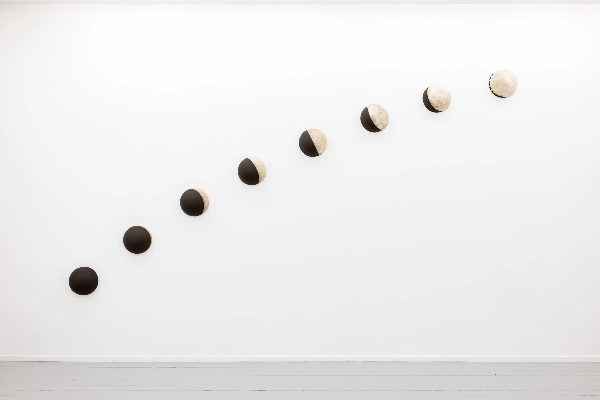
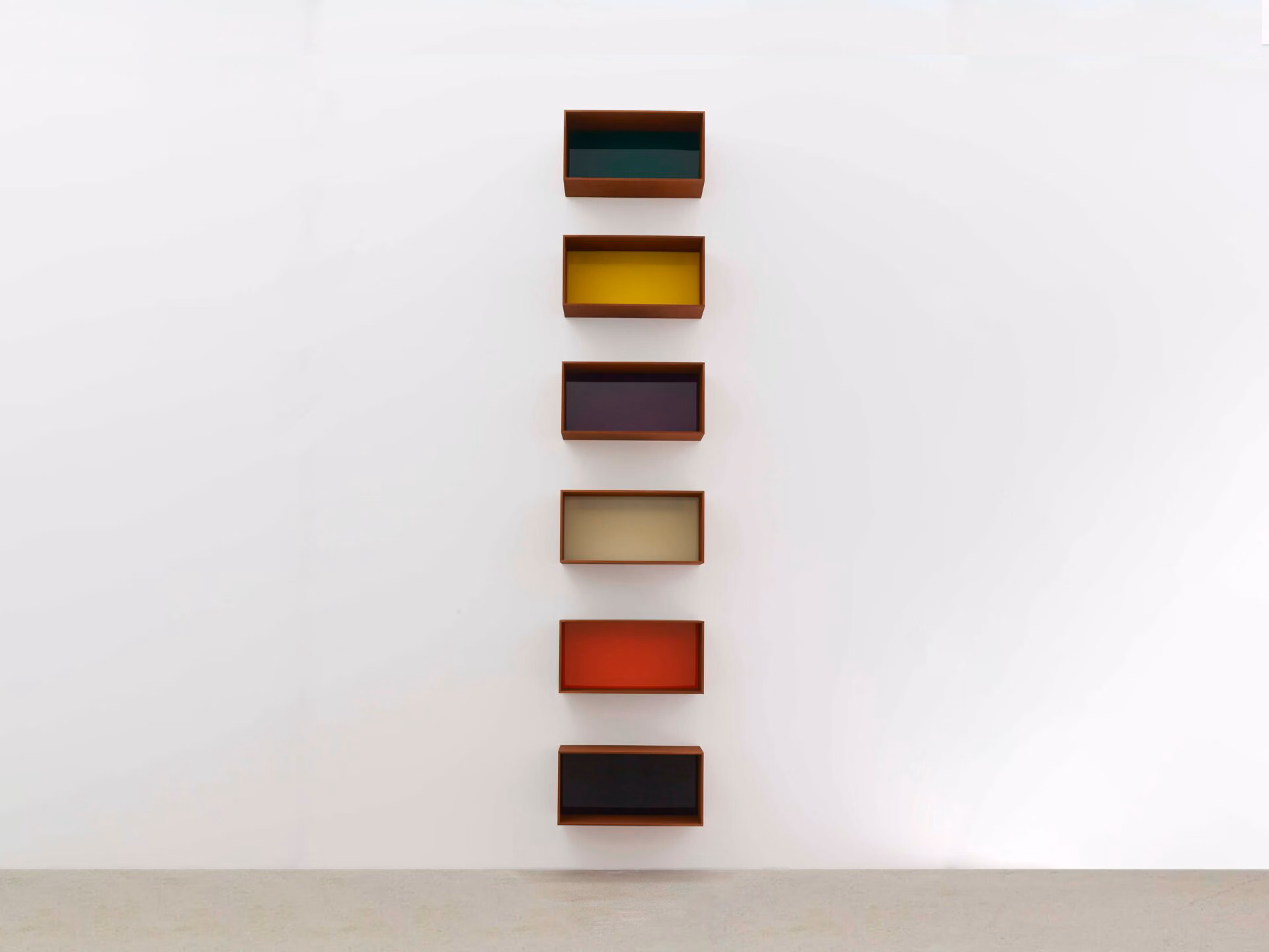
In She, Coated, 2025–26, whiteness emerges as sequence. Eight black stoneware reliefs, each 12.5 by 27 cm, are arranged across the gallery’s longest wall as moon phases. Each relief carries a different coverage of titanium dioxide glaze on its dark substrate. The sequence moves from near-black to near-white. Whiteness takes over the dark body in eight steps. What begins as stone ends as reflected light. The transformation is not described. It is performed, optically, across a wall.
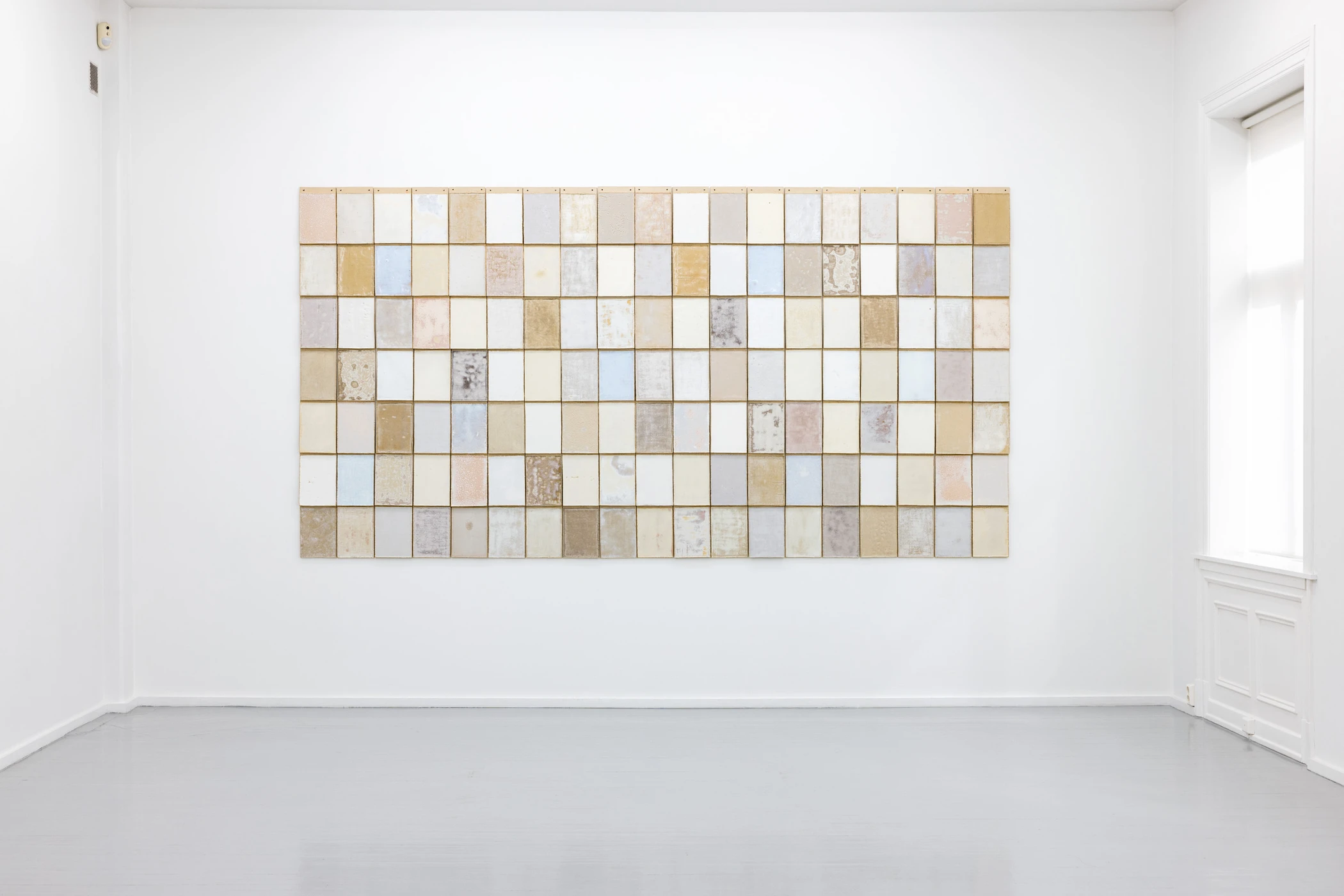
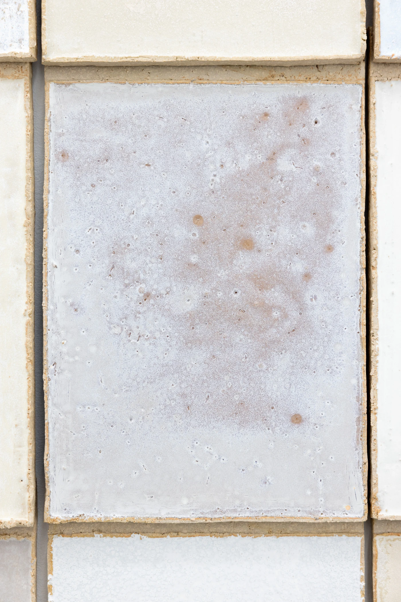
Snø i april, 2026, the collaborative work with Julia K. Persson, turns the wall into taxonomy. The work is made of 133 ceramic tiles measuring 180 by 346.5 cm overall. The glazes combine six calibrated minerals — kaolin, silica, wollastonite, dolomite, nepheline syenite, titanium dioxide. Each tile is a sample. The wall is a reference panel. To read the work, the viewer must compare tile to tile, small difference to small difference. The eye performs the labour of chemical analysis. The grid here is not contemplative. It is diagnostic.
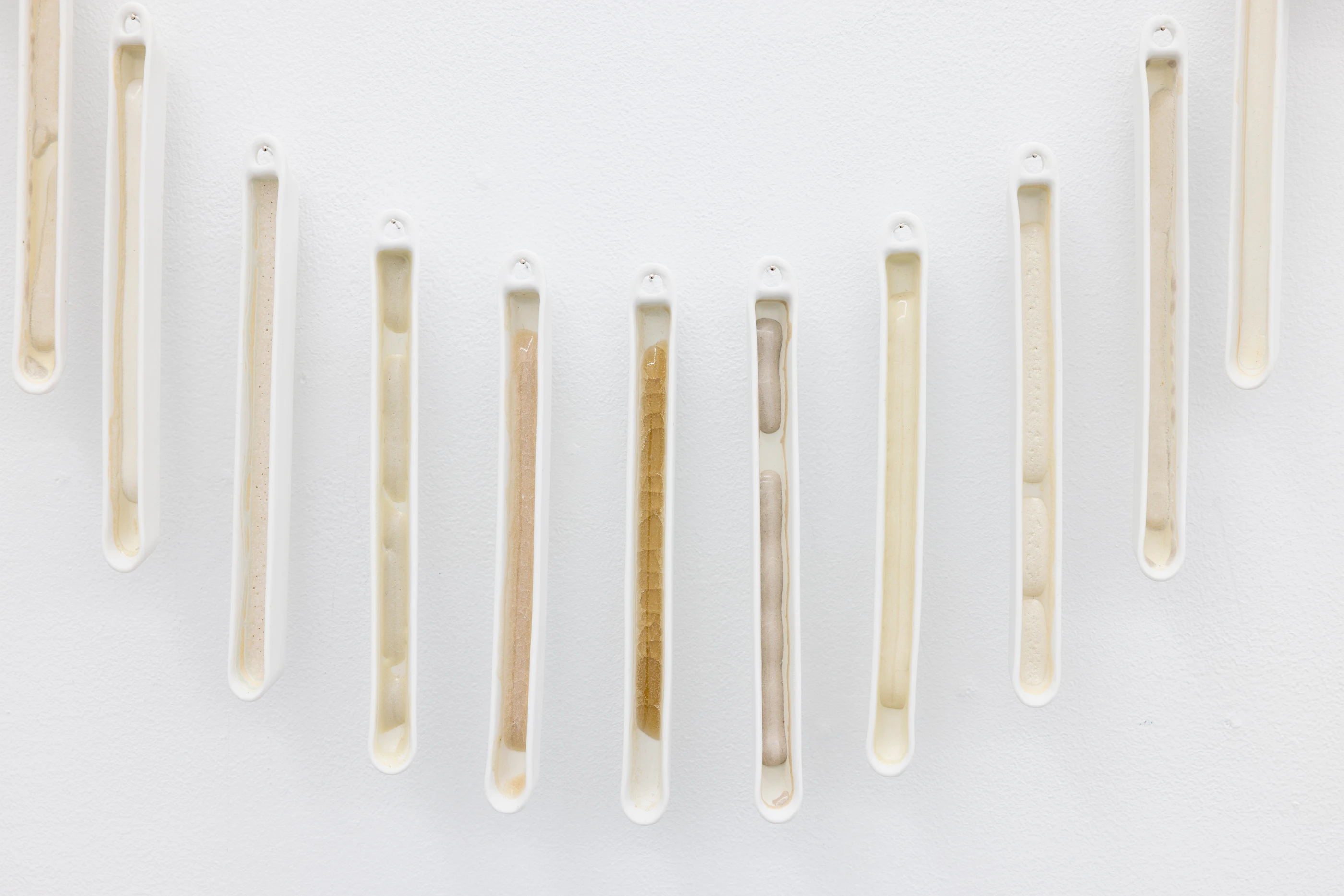
Earthwave, 2024–26, is the exhibition’s scale hinge. Hundreds of prefabricated laboratory vessels of unglazed porcelain, each filled with a different titanium dioxide glaze variation, undulate through multiple rooms. The unit is the combustion boat — the instrument used in industrial chemistry to hold samples for high-temperature analysis. Each vessel carries a subtly different chemistry. The wave has no centre and no resolution. The rhythm will not release the eye.
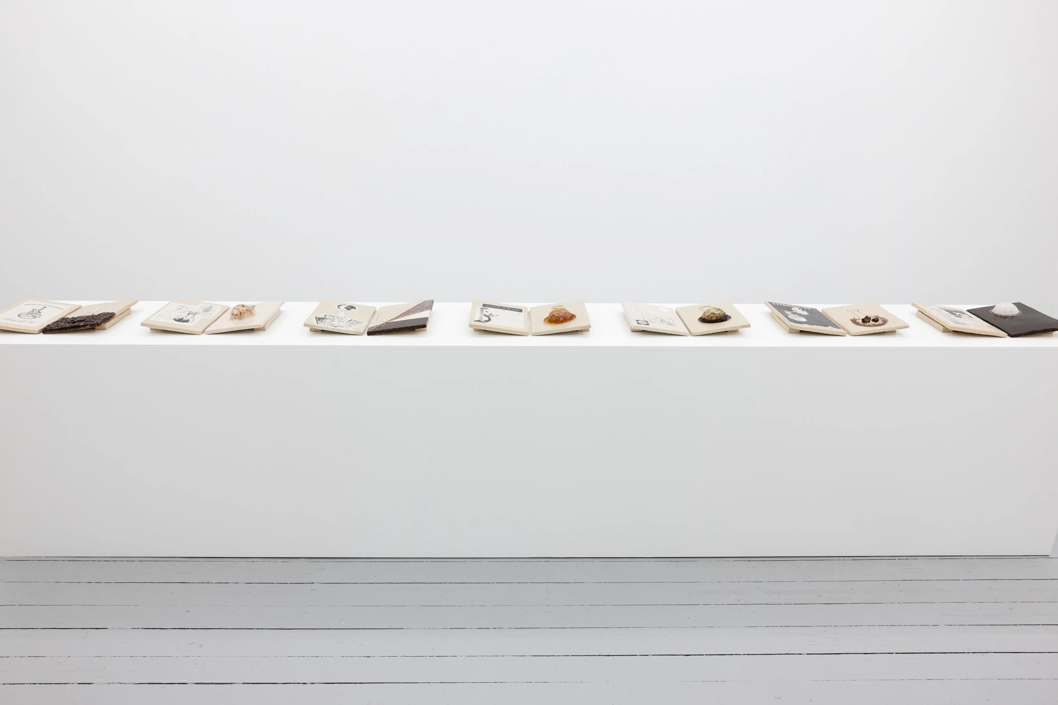
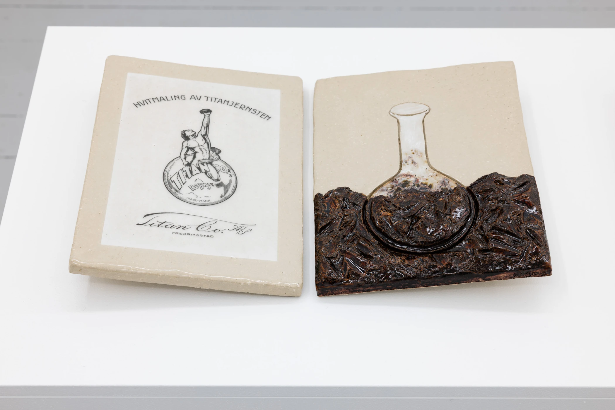
In Descend and Dwell, 2023–25, pigment enters cultural circulation. Fourteen ceramic tablets bear decals of archival advertisements produced by Atelier E-O for Kronos Titan between 1918 and the late 1950s. After the wave, the grid, and the phases, the tablets slow the eye to reading. Pigment passes into graphic design, graphic design into corporate identity, corporate identity into ambient visual culture. The pressure changes form. It is no longer optical accumulation. It is recognition: the mineral has become the image-world the viewer already inhabits. The research project ends here.
The exhibition does not.
The six works do not present variations on a theme. They operate as six technologies of perceptual pressure. The wave prevents grasp. The grid demands analysis. The phases demand traversal. The title work refuses scale. The tablets drain into circulation. Only the towers fix. The seventh stage is not another work. It is the viewer moving through them. The viewer is not looking at the exhibition’s work. The viewer is doing it.
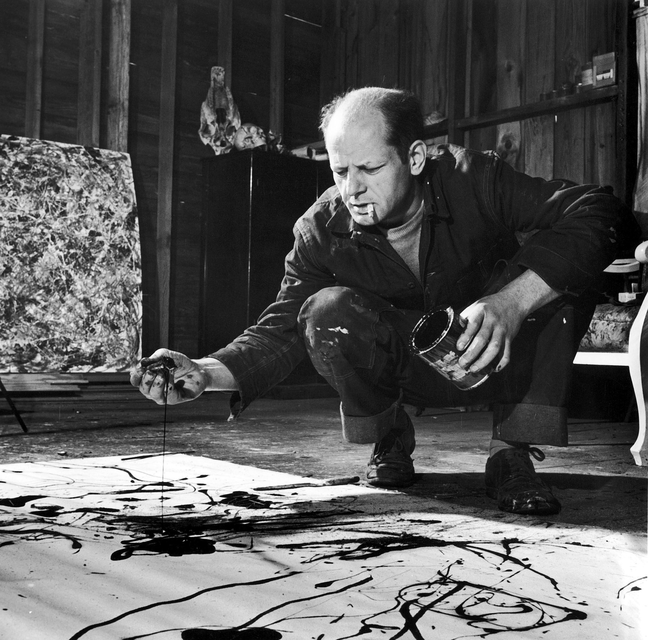
The accumulation of hundreds of white ceramic units has precedents. Agnes Martin repeats the mark; each pencil line is a vehicle toward tranquility. Robert Ryman repeats the surface; each variation reveals nuance. Ryman’s own formulation: “white has a tendency to make things visible. With white, you can see more.” The Light and Space artists — Turrell, Irwin, Wheeler — use light as medium, producing heightened perceptual awareness through controlled environments. Edmund de Waal arranges hundreds of porcelain vessels in vitrines as memorial and elegy. In every case, white reveals; accumulation sustains looking.
Martin’s mark, Ryman’s surface, Turrell’s photon, de Waal’s vessel carry aesthetic genealogies. Johnslien’s unit carries an epistemic one. The combustion boat is a lab specimen. The 133 tiles are a sample field. The towers carry ore. The title work is a laboratory photograph. The building block throughout is drawn from the vocabulary of industrial-scientific evidence — the instruments through which matter is analyzed in the factory. The exhibition does not extend the modernist tradition of white as revelation. It reverses it. Where that tradition makes white visible, Fotofobia makes it felt. The exhibition assembles evidence. The evidence accumulates into pressure.
The research frame makes the history of titanium dioxide visible. The installation makes the body endure it.
At its close, Fotofobia is no longer the exhibition’s subject. It is the condition produced at the end of the pigment’s passage. The pigment’s final transformation is not chemical. It is perceptual. The body is the last surface. It carries the condition out.