



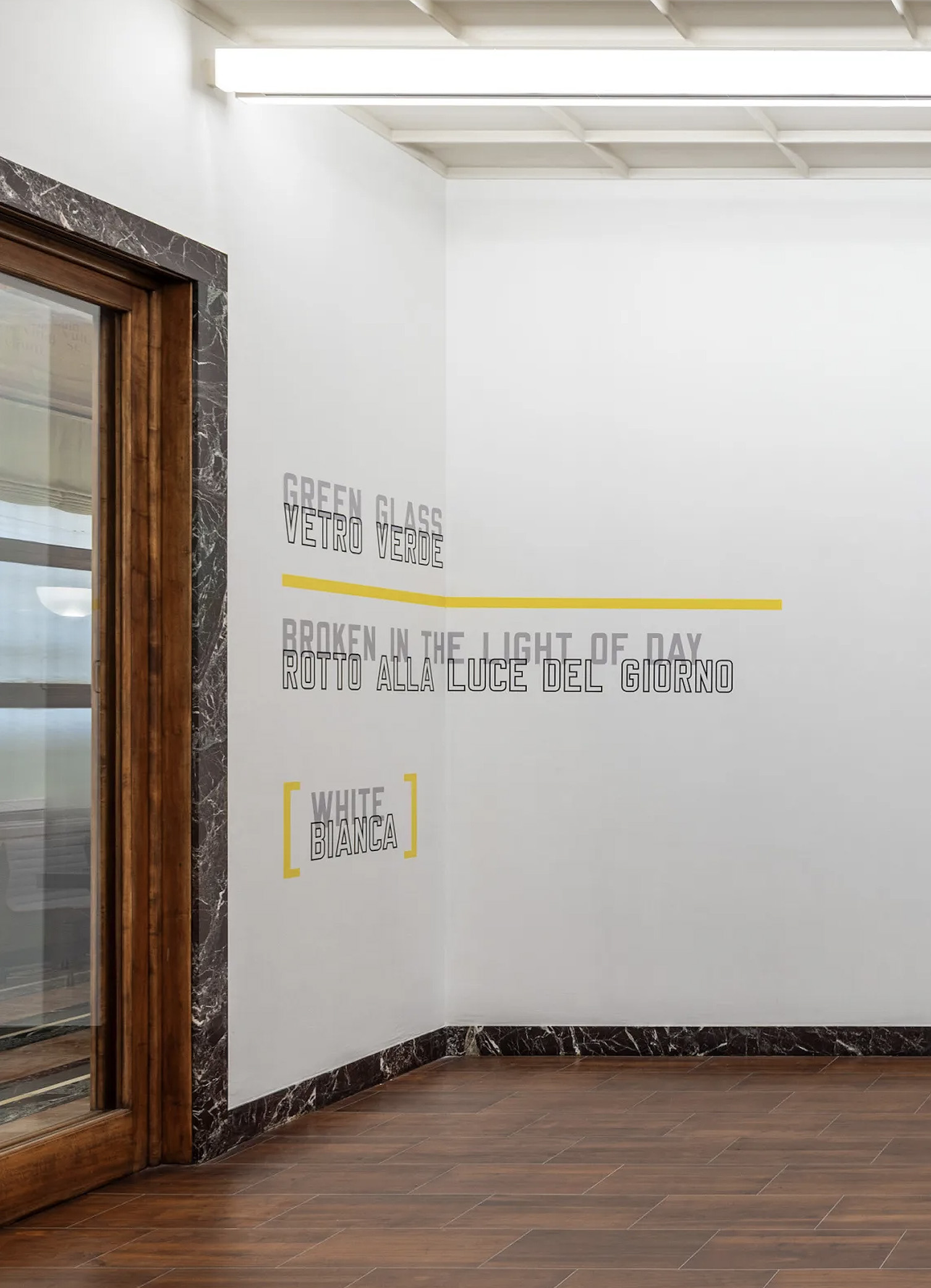
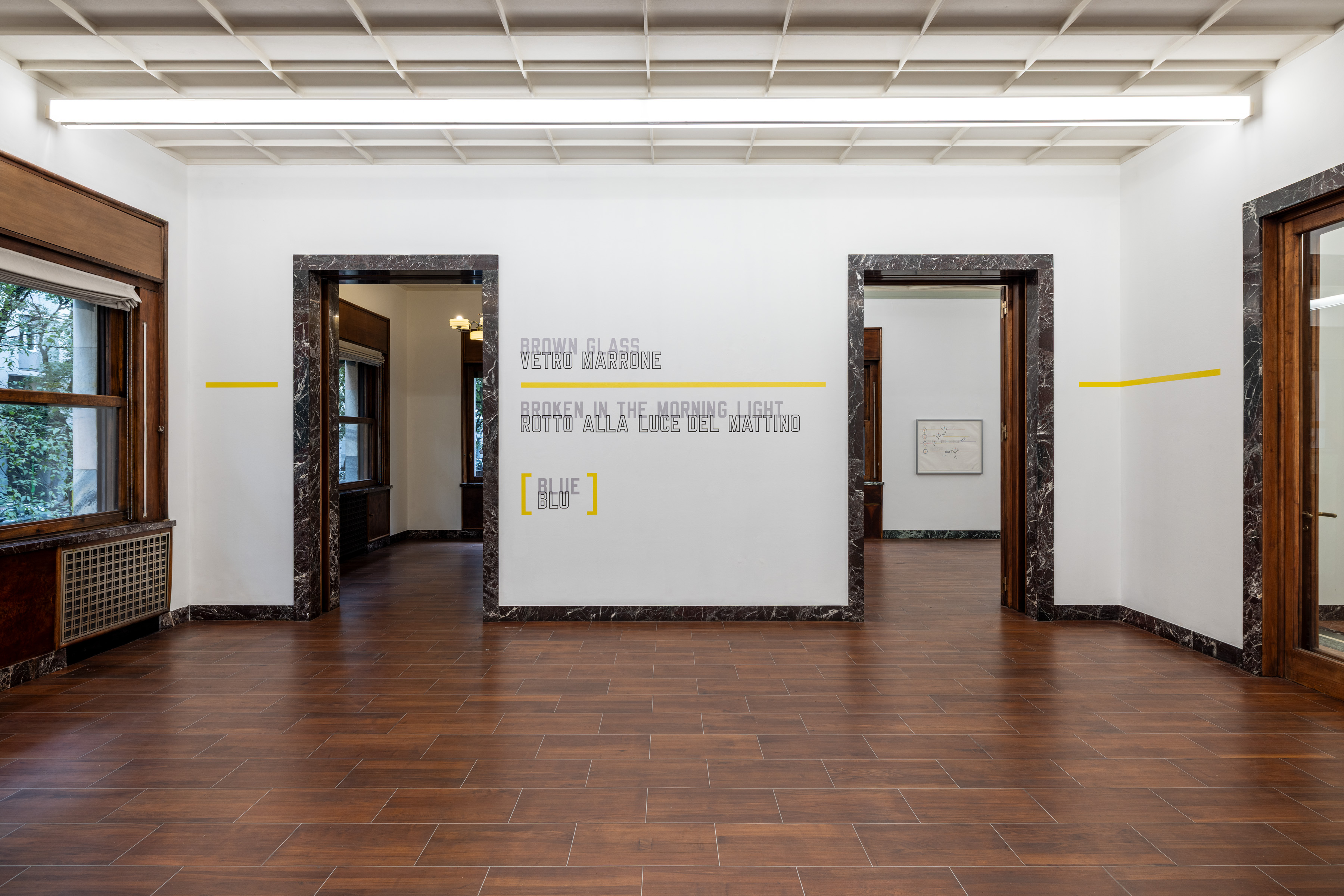
Three kinds of glass are named in the first room, and none of them is in it. GREEN GLASS and MILK GLASS share the right-hand wall; BROWN GLASS has the wall opposite, on the pier between two doorways. Under each English name the Italian is drawn in dark outline — VETRO VERDE, VETRO OPALE, VETRO MARRONE — its capitals overlapping the foot of the pale grey English by a fraction of a letter. Below each pair comes a second: BROKEN IN THE LIGHT OF DAY, BROKEN IN THE LIGHT OF SUNSET, BROKEN IN THE MORNING LIGHT, each with its Italian beneath. Lower still, inside square brackets, a colour: WHITE, RED, BLUE, with BIANCA, ROSSA, BLU under them. None of those colours is there. The language is grey, pale and filled for the English, dark and outlined for the Italian, and the words that name colour are as grey as the words that name glass.
The brackets are yellow. And between each glass name and its line about breaking runs a horizontal yellow bar, perhaps a third of a letter in height, which starts at the left edge of the group and continues past its longest line by two or three letter widths. Three groups, three bars, one height. The house is Piero Portaluppi’s, from the 1930s. The door surrounds are a dark red stone veined with white; the ceiling is coffered in squares; the floor is planked; a tube light hangs the length of each long wall. The yellow sits well below the lintels and well above the skirting, in the band where a picture would hang.
On the BROWN wall the bar does what the other two only begin to do. BROWN GLASS and VETRO MARRONE end. The yellow goes on, across bare wall, toward the doorway on the right, and stops about a letter’s width short of the stone. Past that doorway, on the stub of wall between it and the corner, there is another length of yellow, with no words near it. Same height, same thickness. It stops short of the surround and short of the corner. Beyond the doorway on the far side of the BROWN group there is a second such length, and across the room, beside the doorway next to the MILK group, a third. From the middle of the room it reads as one line carried along both long walls in pieces. Up close, each piece has ends of its own; every doorway interrupts it.
The gallery reads the line as a horizon and follows it into four works on paper from 2001 that are shown framed elsewhere in the exhibition. Long horizontals cross the sheets, and the word HORIZON is written out more than once. The reading has a great deal on its side. A yellow line running level through a room whose windows give onto trees is easy to see as a horizon, and the drawings do put horizons beneath their words.
Through the doorway beside the MILK group the last words of the exhibition’s title show on a wall in the next room: DI TUTTO. In that room the English, & DETERMINED MASS AT THE BASE OF IT ALL, runs in solid black capitals just under the ceiling, across a closed door and above an empty built-in bookcase, and turns the corner onto the adjacent wall. The Italian, & UNA CERTA MASSA ALLA BASE DI TUTTO, runs just above the skirting, beginning only where the bookcase ends, and turns the same corner. Between the two lines the entire height of the wall is blank. Each line opens with an ampersand drawn in outline, taller than the letters and projecting above and below them: the same black, but a different kind of drawing, as if the sign had come from somewhere other than the words. There is nothing yellow here. It is a room with two lines at its extremes and an empty bookcase between.
Through the glazed doors of the first room, past a passage with a striped stone floor, a further doorway frames part of a block of orange text, cropped on both sides. The room it belongs to has no surrounds, no skirting, no coffers: a flat ceiling, islands of small blue and white mosaic set in grey screed, a door frame painted ochre. The Italian is a single blue line in the upper third of the long wall — CARTA VETRATA [RUVIDA] + PIETRA [FREDDA] & MOSSE L’UNA — and it turns the corner inside a word, L’UN on one wall and A CONTRO L’ALTRA on the next. The English is orange and low on the back wall, five lines set flush right: SANDPAPER [COARSE]; a plus sign alone on its line; STONE [COLD]; an ampersand alone; then MOVED ONE AGAINST THE OTHER, running almost corner to corner, its baseline less than a letter above a floor with no skirting. In both languages the brackets, the plus and the ampersand are grey: chamfered brackets, an outlined plus, an outlined ampersand like the title room’s. The words are coloured. The signs are not. Twice now, and still only something one notices.
In a room with a green stone fireplace and a ceiling coffered in diamonds, TILES PILED UPON MORTAR PILED UPON TILES sits above a lattice-inlaid door, between a mirror and the corner: eight lines of dark grey, Italian first — PIASTRELLE / ACCATASTATE / SU MALTA / ACCATASTATA / SU PIASTRELLE — then the English, set flush right and nearly touching the top of the door surround, with no colour and no sign of any kind. The brass basket-weave tiles inside the hearth below make the gallery’s material reading especially persuasive. In the exhibition’s own account the house and its materials are the argument, its marble above all. The list runs on easily enough: glass in the doors and windows, tiles in the fireplaces, stone in every surround, sand fused into glass in every pane. Hestetika has read the show the same way, as evidence that material never disappears behind Weiner’s language. It does not. But the tiles are not what is odd in that room.
Back in the first room the yellow is where it was. But the titles have been read now, and a title as the gallery gives it carries its signs inside the string. SANDPAPER (COARSE) + STONE (COLD) & MOVED ONE AGAINST THE OTHER has its parentheses, its plus and its ampersand before any wall does. & DETERMINED MASS AT THE BASE OF IT ALL opens with its ampersand. The glass titles close with a colour in square brackets. The signs are set apart from the words in the titles, and on the walls they are set apart again. The eight plain lines above the lattice door come from a title with no sign to give them.
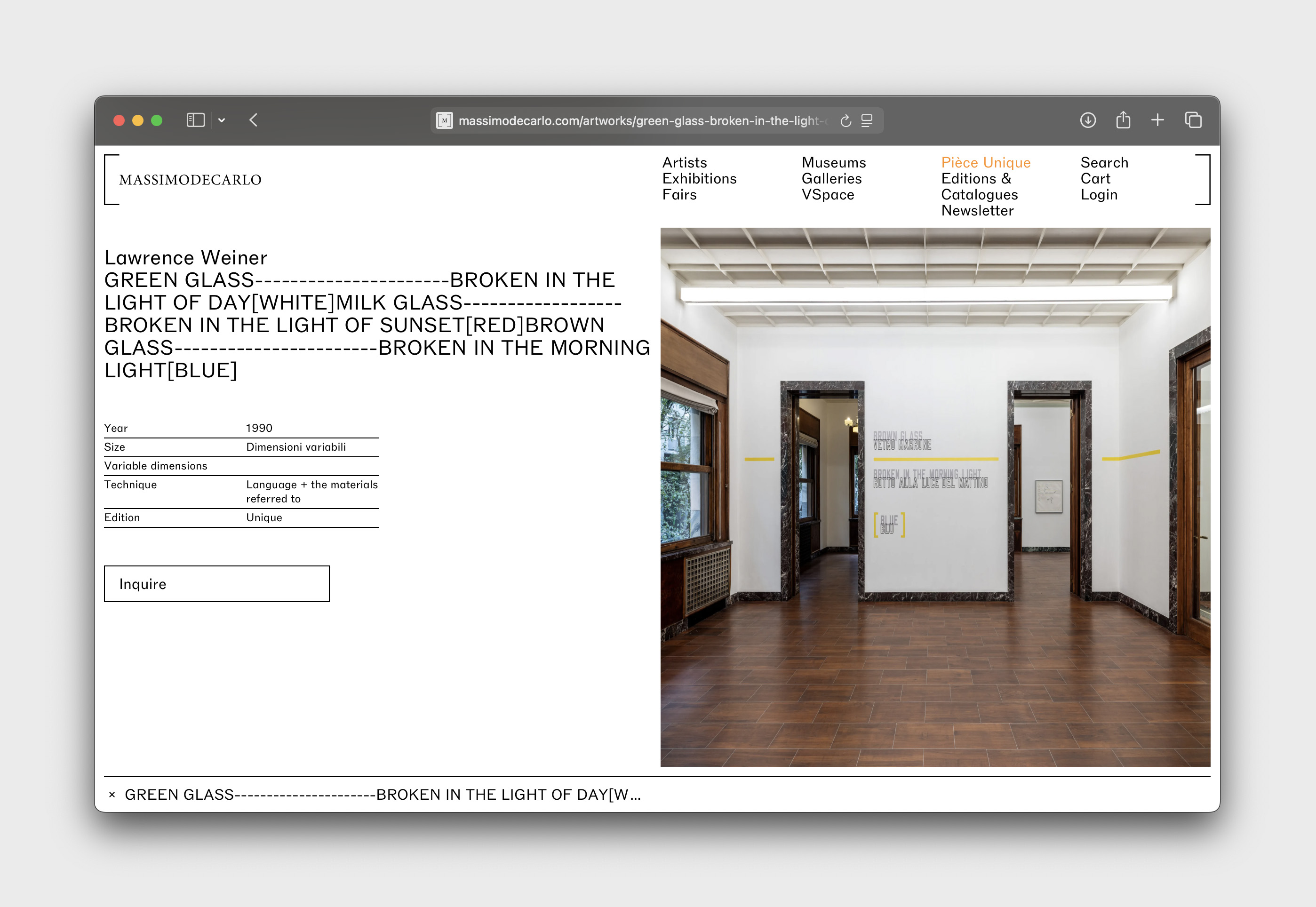
The gallery’s page for the works renders each of the three glass titles with a run of dashes between the glass and the breaking, where the bar stands on the wall. The line is in the title before it is yellow.
That tells us why the line is there. It does not tell us how far it goes. A dash on a page is a dash long. On the GREEN wall the yellow runs two or three letter widths past the words. On the BROWN wall it runs to within a letter’s width of the doorway. On the stubs it runs with no words at all. The propositions stop. The line does not. Nothing in the yellow changes at the point where MARRONE ends — no thinning, no break, no shift in colour; the paint after the last letter is the paint under the first. The sentence gives the line a place. On the wall it acquires colour and length. It acquires a height, a thickness, a number of pieces, and endpoints that fall in relation to the doorways, and none of that was in the dash.
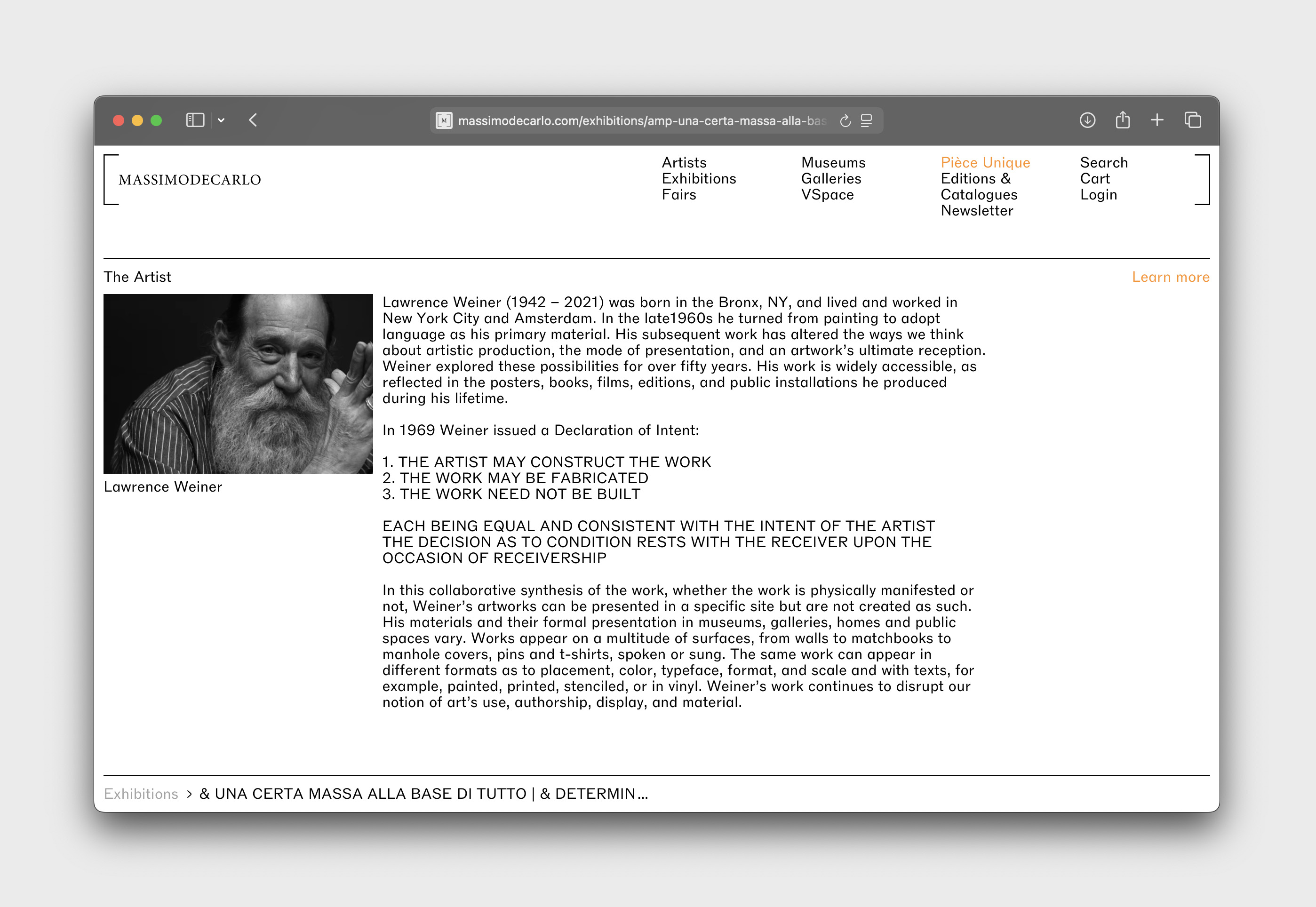
The variability itself is not in question. The gallery’s own artist page lists placement, colour, typeface, format and scale as variable between realizations. Giuseppe Panza chose typeface and medium for the Weiners he owned, and Weiner accepted the results. What the BROWN wall adds is narrower than the rule that the work is not the object. It is a place on a wall where one can put a finger on the seam. Under the words, the relation between sentence and line is easy to read.
The room with the chandelier undoes this at once. IMPACTED TO THE POINT OF FUSING SAND INTO GLASS occupies the room around the fireplace. The Italian, COLPITO AL PUNTO DI FONDERE LA SABBIA IN VETRO, runs high in orange-red. COLPITO begins on the window wall, and the rest of the Italian line runs across the fireplace wall to end above the open door on the right. Here the Italian is larger than the English. The English is dark grey and broken into four lines: IMPACTED / TO THE POINT OF / FUSING SAND centred on one another above the mantel, INTO GLASS displaced down and to the right. A red-orange curve begins beneath SABBIA, sweeps down past the right edge of the English block, and hooks back to end a little above the mantel shelf. Two grey hexagons flank the English block. And on the window in the adjacent wall, laid over the trees outside, the curve and the hexagons appear again, mirrored, with no words on the glass at all. According to the New York gallery’s checklist and release, this work was laid across a gallery floor in 2010. Here it is a wall and a window.
Everything just learned says what the hexagons are: set apart, grey, drawn as the plus and the ampersands are drawn. The title as the gallery gives it carries no bracket, no dash, no ampersand. IMPACTED’s marks stand where punctuation stands, and there is no punctuation. For a while there is nothing to do with them. The explanation that made the yellow obvious cannot be run in reverse: there is no sign in the sentence for these marks to have come from. And they are not bare the way the yellow stubs are bare. The yellow on a stub continues a line that has a place in a title. The hexagons on the window continue nothing. The wall has words for the curve to pass between. The glass has none.
It has been understood since Weiner’s Declaration of Intent was published in 1969 that realization did not belong exclusively to the artist:
The distinction at stake in Milan is not whether realization permits variation. Weiner had established that from the beginning. The harder question is which decisions belong to the work before it reaches the wall, and which are made in bringing it there.
Asked, MASSIMODECARLO draws a line where the eye had already found one. The yellow rule and the brackets of GREEN GLASS are registered as part of the work. The curve and the hexagons of IMPACTED are not part of the work as such; the Estate calls them “gestures,” and they are included here on the basis of a presentation of Weiner’s own. That is a distinction maintained in stewardship, and it answers a question the room itself cannot. A register can distinguish the status of marks that vision groups together. The gestures can recur in a later presentation while remaining outside the registered work. The resemblance the eye made between the hexagons and the ampersands does not go away because of it.
Nearly five years after Weiner’s death, the five works stand on these walls in Italian. The translations were prepared for this exhibition with the Estate; these works had not appeared in Italian before. Death did not make realization a shared matter; it was shared already. What death removed is one recourse. Questions that might once have been returned to the artist cannot be now. The wall does not register that loss.
The Italian, meanwhile, does not follow one graphic template through the house. In the first room it is drawn in outline beneath each English line, overlapping it, and one yellow bar serves both languages. In the title room it takes the low line and the English the high one, each with an ampersand of its own. In the mosaic room the Italian carries its brackets, its plus and its ampersand inline in a single run, while the English gives the plus and the ampersand lines to themselves. Above the lattice door the Italian comes first in the same column, and nothing accompanies either language. In the chandelier room the curve begins under the Italian and ends beside the English, and the hexagons keep to the English. So the sign a title carries is not simply copied from one language to the other. Each work settles the relation of sentence, sign and language in its own way, and the settlements do not add up to a rule.
What the house makes visible is a finer distinction within realization. Not everything that appears on the wall arrives there with the same status, and the difference is not necessarily visible from inside the room. GREEN GLASS makes the division unusually easy to see. The sentence supplies a line and its place in the proposition. In Milan that line acquires colour, thickness, height, extent and a wall on which to stop. IMPACTED shows the inverse difficulty: a realization can also contain marks for which the sentence supplies no sign at all. The variability is on the gallery’s own artist page, and the principle behind it has been in print since 1969. Neither is a map of a wall. The BROWN wall is where the seam can be seen. The last letter of MARRONE is the place.
The four sheets from 2001 are shown framed elsewhere in the exhibition. Long horizontals cross them; THE HORIZON and HORIZONS are written on them; PER SE appears on all four, treated four different ways; small lens shapes split into two colours sit on thin horizontals with arcs crossing through them; V-shaped notches drop from the lines; bracket-like arcs open and close phrases. The gallery follows the yellow into these horizontals, and the comparison is real: the horizontal is the device the gallery carries from the walls into the drawings. A horizon says what the line can look like. It does not say where the line stops. On the sheets every horizontal ends where the hand ended it — a stroke’s length, sometimes a taper, sometimes an arrowhead — and the ending is part of the mark. On the wall the yellow stops at the doorway. That is a comparison, not a proof; the drawings are not instructions for the walls. But the two endings are different in kind. In the drawings, the hand stops the line. On the BROWN wall, the line stops at the doorway.
More than the sentence, but less than a fixed image. Certain relations belong to the work, while colour, scale, placement and extent are resolved through realization. The distinction becomes visible when a mark continues beyond the words that account for it—or when a graphic gesture appears with no corresponding sign in the sentence.
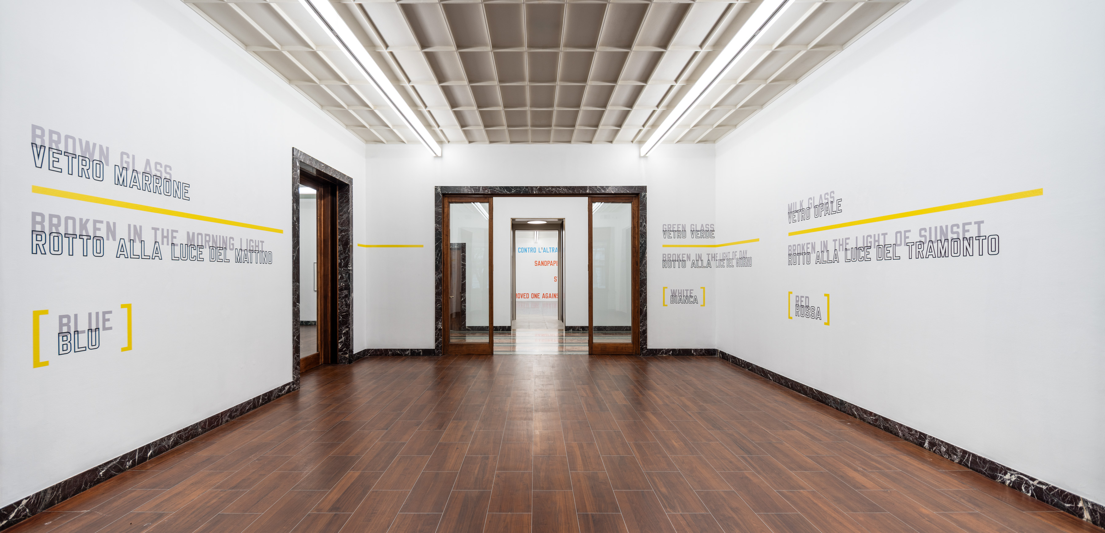
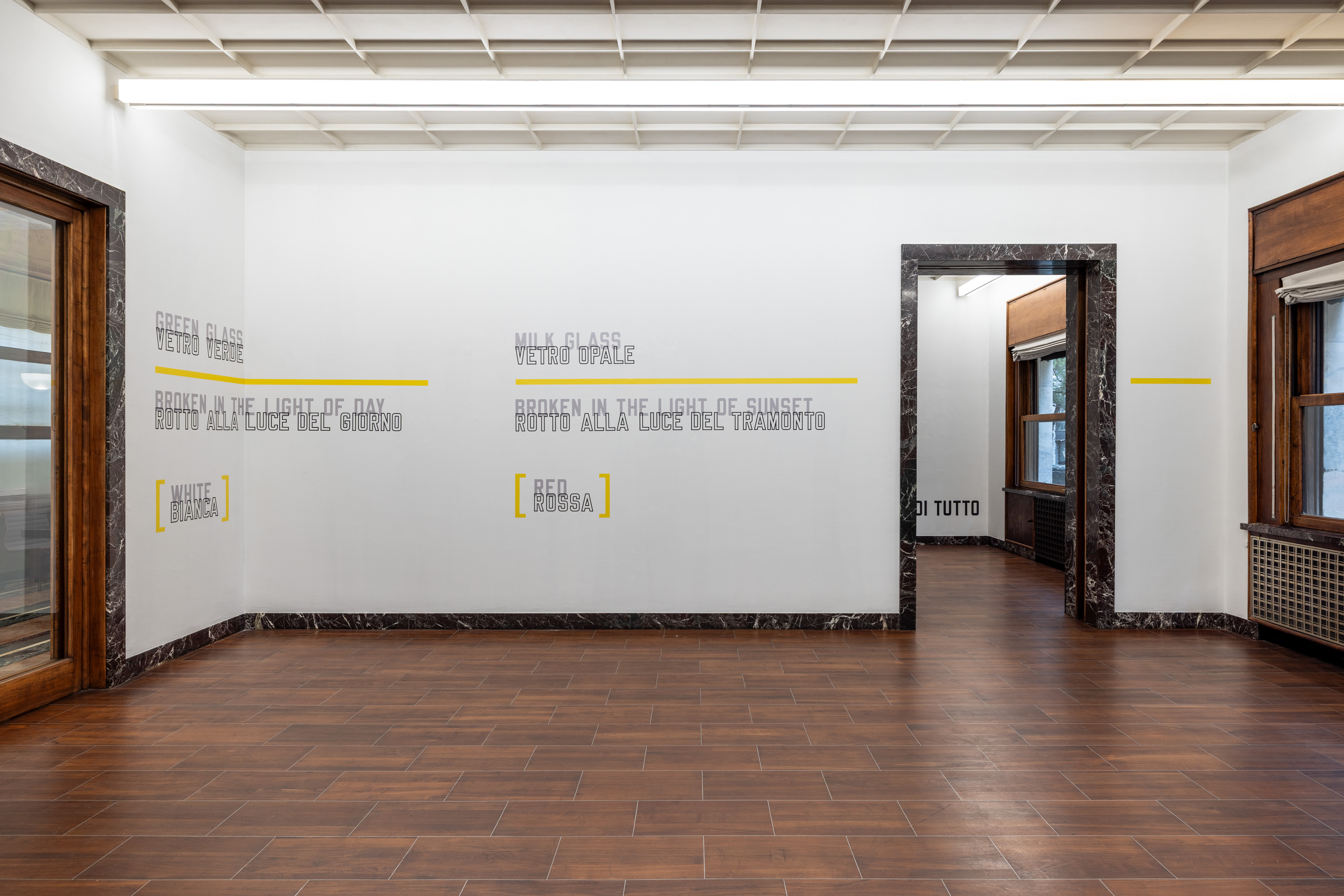

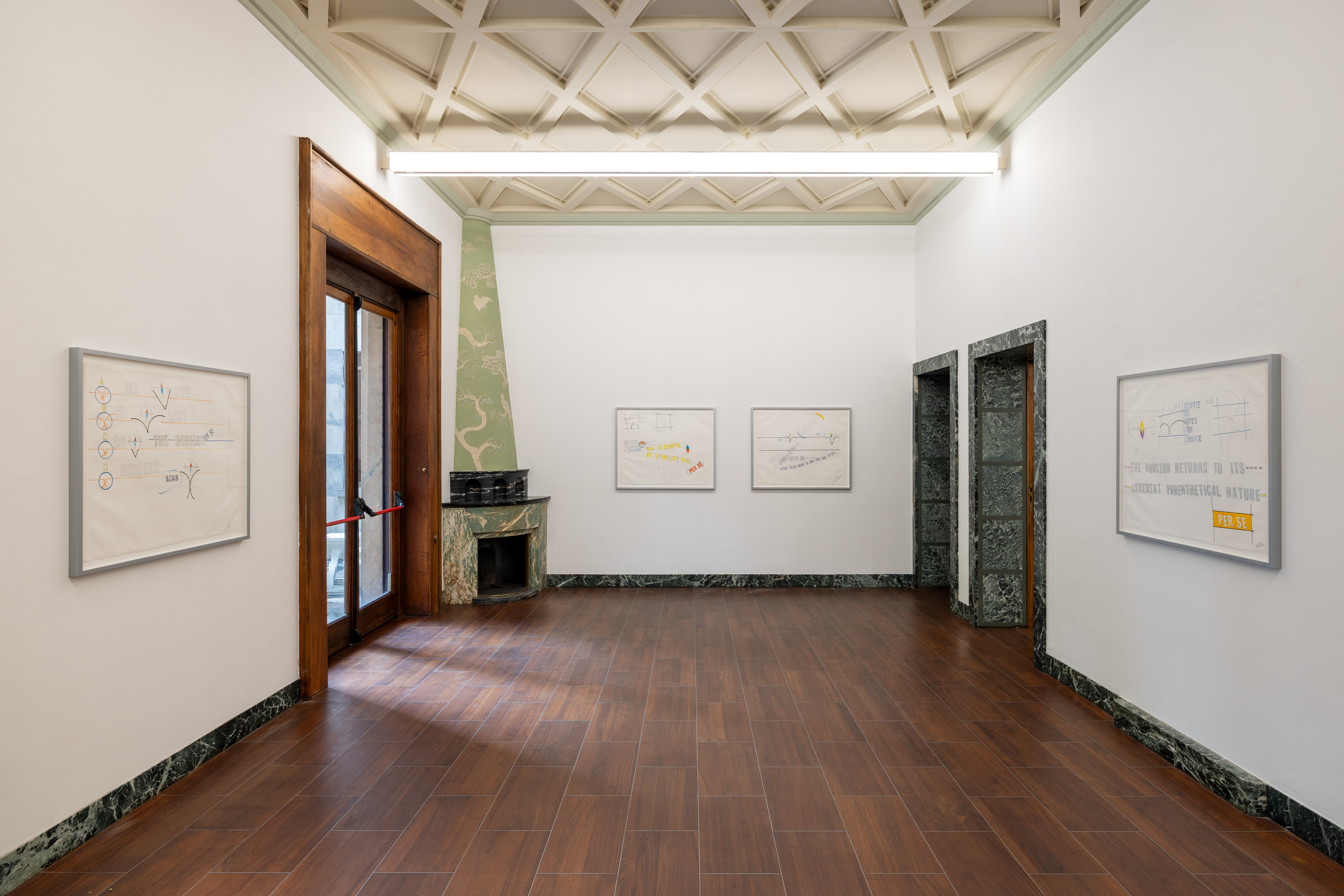

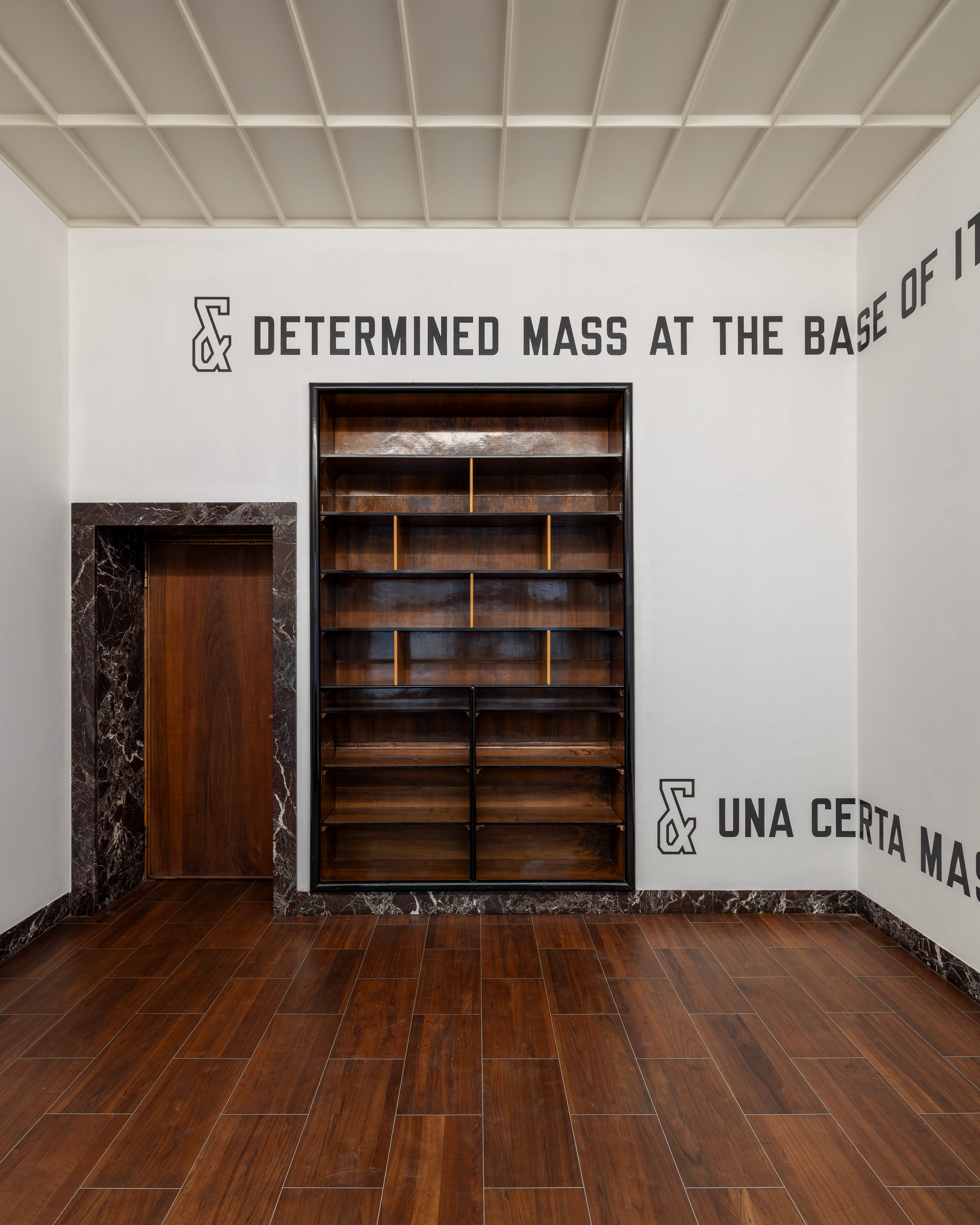
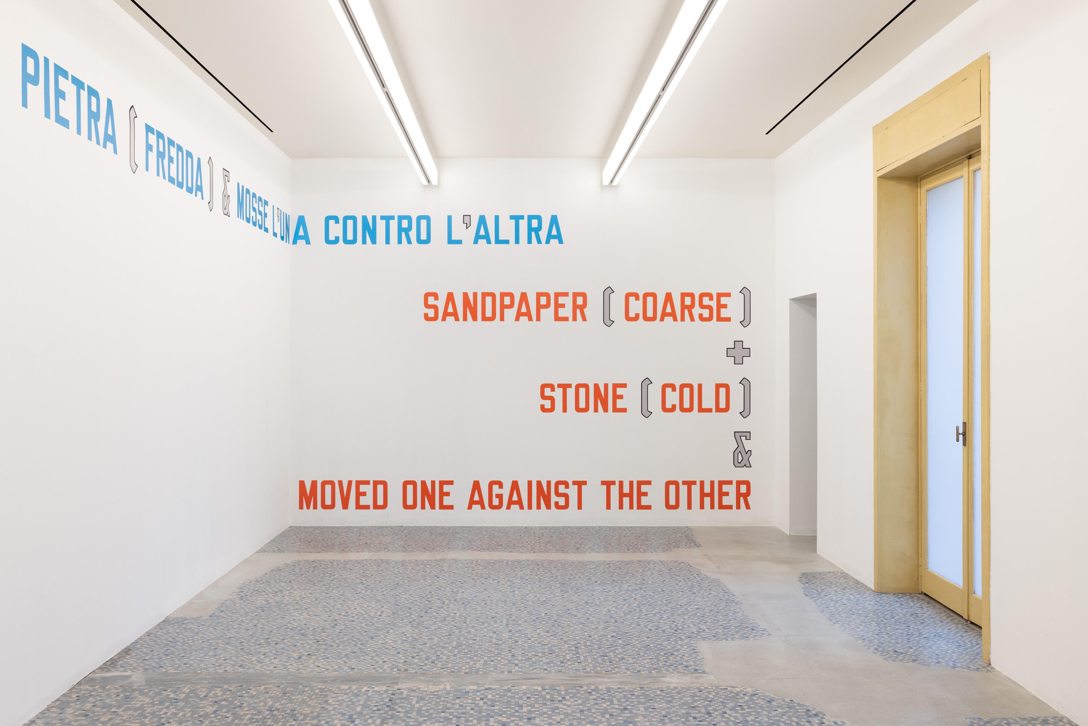
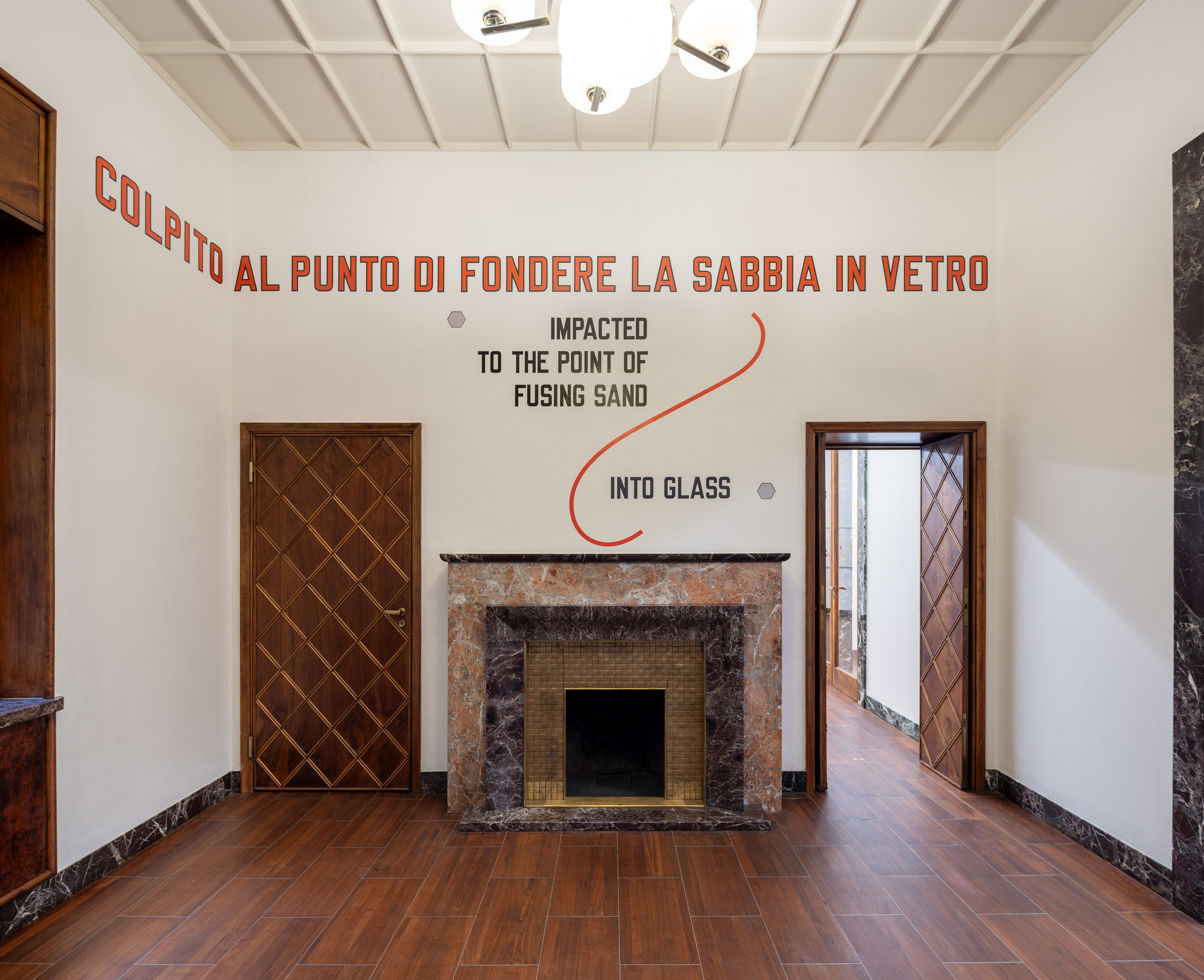
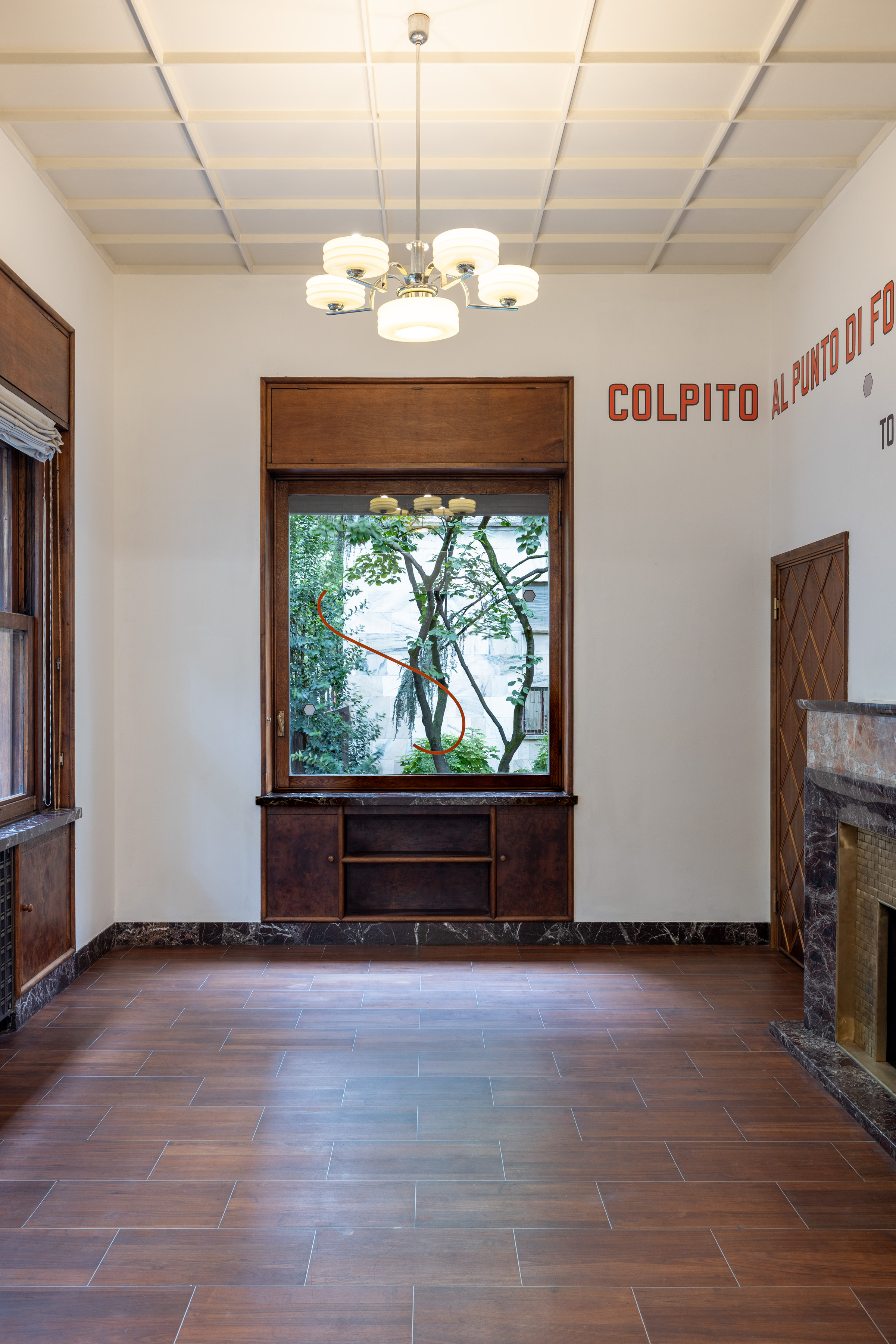
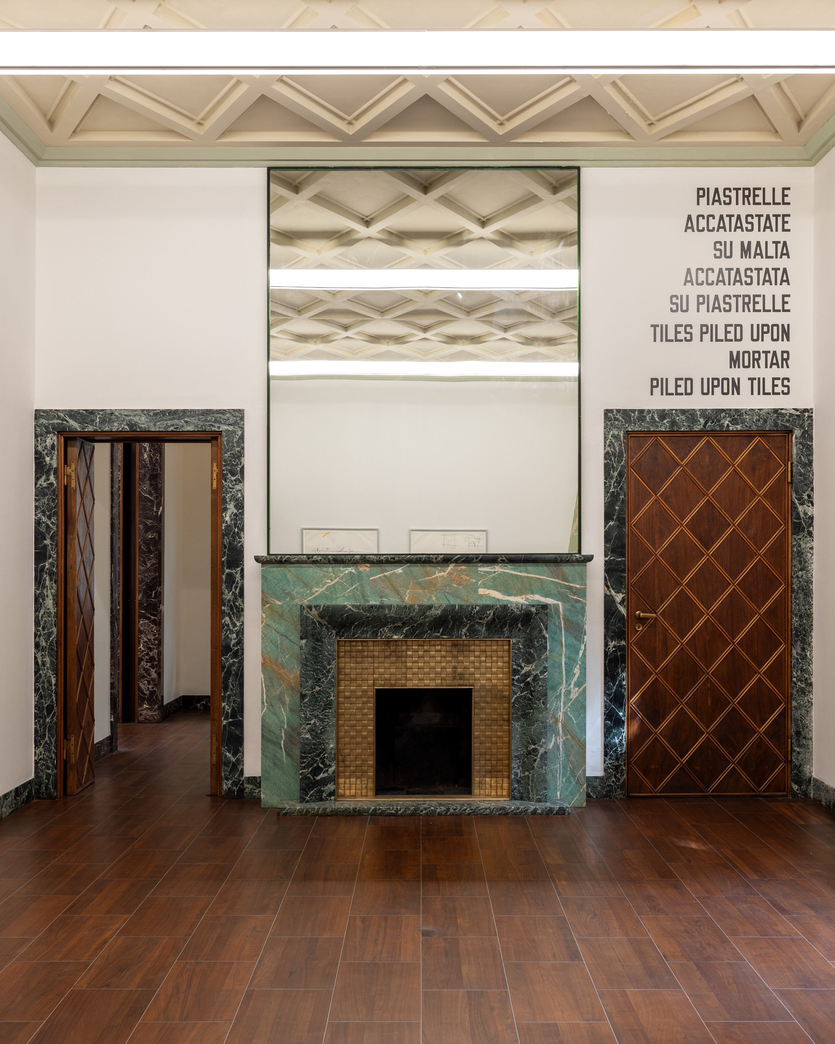
Cover image: Lawrence Weiner, & UNA CERTA MASSA ALLA BASE DI TUTTO | & DETERMINED MASS AT THE BASE OF IT ALL, MASSIMODECARLO, Casa Corbellini-Wassermann, Milan, September 10–October 10, 2026. Installation view. Courtesy of the Artist and MASSIMODECARLO. Photo: Roberto Marossi.