

Sewn into a Stone Island parka from Autumn–Winter 1999–2000 is a white label with more to say than care instructions usually have. It opens with a name, PURE METAL SHELL, and then it begins to make promises. The garment, it says, has been produced using "a bronze at the natural state." The bronze, it says, guarantees excellent protection against electromagnetic radiation, and in shielding the wearer from radiation safeguards what the label calls the individual's "psychophysical state." The electrical conductivity of the material, it continues, allows the body to release its accumulated energy, favoring better conditions of relaxation. Then comes an instruction set in capitals: in order to allow the jacket to discharge, use leather sole shoes. In the label's account the shoes complete the garment's operation — the claimed function runs from the bronze through the body to the soles of the wearer's feet, and without the right footwear the system is unfinished. None of this is offered as poetry. It is offered as product information, in Italian and then in English, sewn into the garment where a fabric-content notice would go.
The label is not done. The bronze's refraction of light, it says, increases the garment's metallic glitter, producing the color effects typical of objects made of metal. And the changes that wear will bring are claimed in advance. The lived-in aspect and the folds that form — le pieghe, in the Italian — are declared a characteristic of metallic materials used in their natural state, one that makes every garment different from every other. The English block promises the same divergence but names a different phenomenon: not folds but "the cracks eventually formed by wearing it."
The garment cannot confirm most of what its label claims. What it can confirm is the material. The shell is woven bronze mesh on a cotton support — the composition tab gives the exterior as 100% metal and its support as 100% cotton, the cotton backing the metal rather than lining the body. Up close, at the grommets, the weave is unmistakable: warp and weft in a fine grid, cloth logic executed in metal, translucent where light comes through the open structure. The surface is crushed and stays crushed, holding its folds the way foil does and cloth does not, breaking the light unevenly across the whole back of the garment — the divergence the label promised, already underway. In the house's own description of the fabric, this was intended: the mesh was meant to oxidize, crease, lose its shine, and become different through wear. In one place the mesh carries a small snag, the material's vulnerability documented rather than claimed. And ordinary garment hardware enters this ground as though nothing unusual were happening: grommets set through the mesh, black snaps, machine stitching running seams through metal. The factory handled the bronze as fabric, and on the evidence of the object, it was fabric.
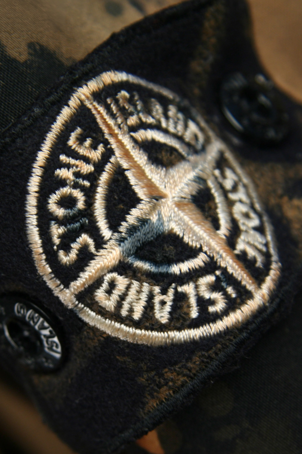
The shell does not stand alone in the surviving documentation. Behind it is a separate dark inner jacket with its own white Stone Island tab, its own zip and snap closures and drawcord, a wool-like mélange face of unidentified fibre. The period presentation — a rotation sequence from the house's own interactive CD-ROM catalogue for the season — shows the two worn together, the shell open over the inner layer, and the object in hand pairs them the same way: a designed pairing, whatever the commercial arrangement was. The label describes a function that extends past the garment itself, into the wearer's body and the wearer's shoes. The surviving object distributes something different — wearability — across the bronze shell, its cotton support, and the separate inner layer. On the shell's sleeve sits a compass badge embroidered in white on a black felt ground, fixed by two black snaps — the white-embroidered version Stone Island introduced, by its own account, for garments developed through advanced research into fabrics and processes. The composition tab names the manufacturer, Sportswear Company S.p.A., and the country, Italy. Nowhere on the garment, its labels, or its badge does a designer's name appear.
The designer whose tenure contains it is Paul Harvey, at Stone Island from 1996 to 2008. Asked years later how involved he had been, he answered "100%" — from the birth of the fabric, through the design of the garments, to the signing-off of the finished piece — and then qualified his own number: total authorship could make a very pure product and a less commercial one. The testimony is retrospective, and it is his account of his own reach; the parka does not prove it, but gives the claimed reach an object through which to be understood. Taken with the later account of Carlo Rivetti, the company's owner, it describes a position through which fabric development, garment design, seasonal continuity, and final judgment were understood to pass, season after season, for twelve years. Harvey did not perform every operation. Around the position stood an institution older and larger than any designer — the dye works, the textile research, the production engineering — which predated his arrival and outlasted his departure; what the position did was give that distributed capacity a single path to approval. To finish, in that arrangement, was not to end the garment's life — Pure Metal Shell had already assigned part of its future to the wearer, the shoes, and wear itself — but to reach the internal point at which a proposition could leave the house as complete. The garment held those two states apart: an open afterlife, a closed approval. None of the convergence was visible from outside; the public saw only the house. The position itself was an answer to an earlier departure — after Massimo Osti, the company's founding designer, design at Stone Island had converged again, in Harvey. After Harvey, it did not converge again.
Harvey's account of leaving is brief: he wanted something more direct, without the ties of a big label. The company's account surfaced four years later, from the person who had decided. Rivetti took the title of Creative Director himself because, as he put it, "it was no longer right to have one only designer," and gathered a group of designers to carry the brand's ideas. Each man describes the change from where he stood — Harvey from inside the position's reach, Rivetti from above it — and on one point the two accounts agree. No one was installed in Harvey's position at Harvey's scale, and creative authority over the house did not disperse: Rivetti held it. What went was narrower — the convergence of fabric, garment, season, and approval through one designer. Bounded propositions were nothing new; Pure Metal Shell had been one, finished through the position and sold with its life open. What changed was where finishing could happen. In Harvey's account, the point of completion had been attached to the one position responsible for the house as a whole; after him, it could occur at more than one scale.
In the year the position emptied, two projects designed outside the company reached the public. Stone Island after 2008 was more than they show — the main collection ran under an internal team, and other lines and programmes continued — but the two arrivals make the boundary of completion unusually visible. Neither occupied the house-wide position Harvey had left. Shadow Project was already in development before Harvey's departure and arrived during the transition, designed by ACRONYM, the office Michaela Sachenbacher and Errolson Hugh had founded.
Stone Island Shadow Project arrived describing itself in advance. Its founding material proposed four initial garment positions — a total-weather-protection shield jacket, a vest, a light shell blazer with Windstopper, and a long-sleeve interlock — while the programme's broader organizational framework was PARSEQ, a five-part modular grid: PROOF, AUGMENT, RESIST, SKIN, and EQUIP. Stone Island later described PARSEQ as "the organizational framework upon which the idea is built," intended to connect garments both within a collection and across seasons. The account of the project's origin named its authorship as a structure too: a discourse between Rivetti and the design team of Sachenbacher and Hugh that evolved, in the founding phrase, into a system based program. The line ran inside Stone Island's own numbering grammar, using the same seasonal stem as the main collection but a different line suffix. The external programme was given its own register inside the house calendar. A first-season Shadow garment was therefore a strange thing to buy: it occupied one cell of a structure built to be refilled, and part of its meaning depended on seasons that did not yet exist. Its launch did not exhaust it.
The early seasons repeatedly occupied that framework. PARSEQ remained explicit through at least Autumn–Winter 2012–13; by Autumn–Winter 2013–14, the category field had disappeared from the catalogue's account of the collection. Shadow continued. The programme outlived the taxonomy through which it had first described itself. Shadow's authorship remained attached to ACRONYM — Stone Island's own catalogues credited both partners — while the public increasingly read one name. By the line's tenth anniversary, the copy marking the occasion credited its design since inception to ACRONYM's Errolson Hugh, who "stands unrivaled" — and only then named the founding team.
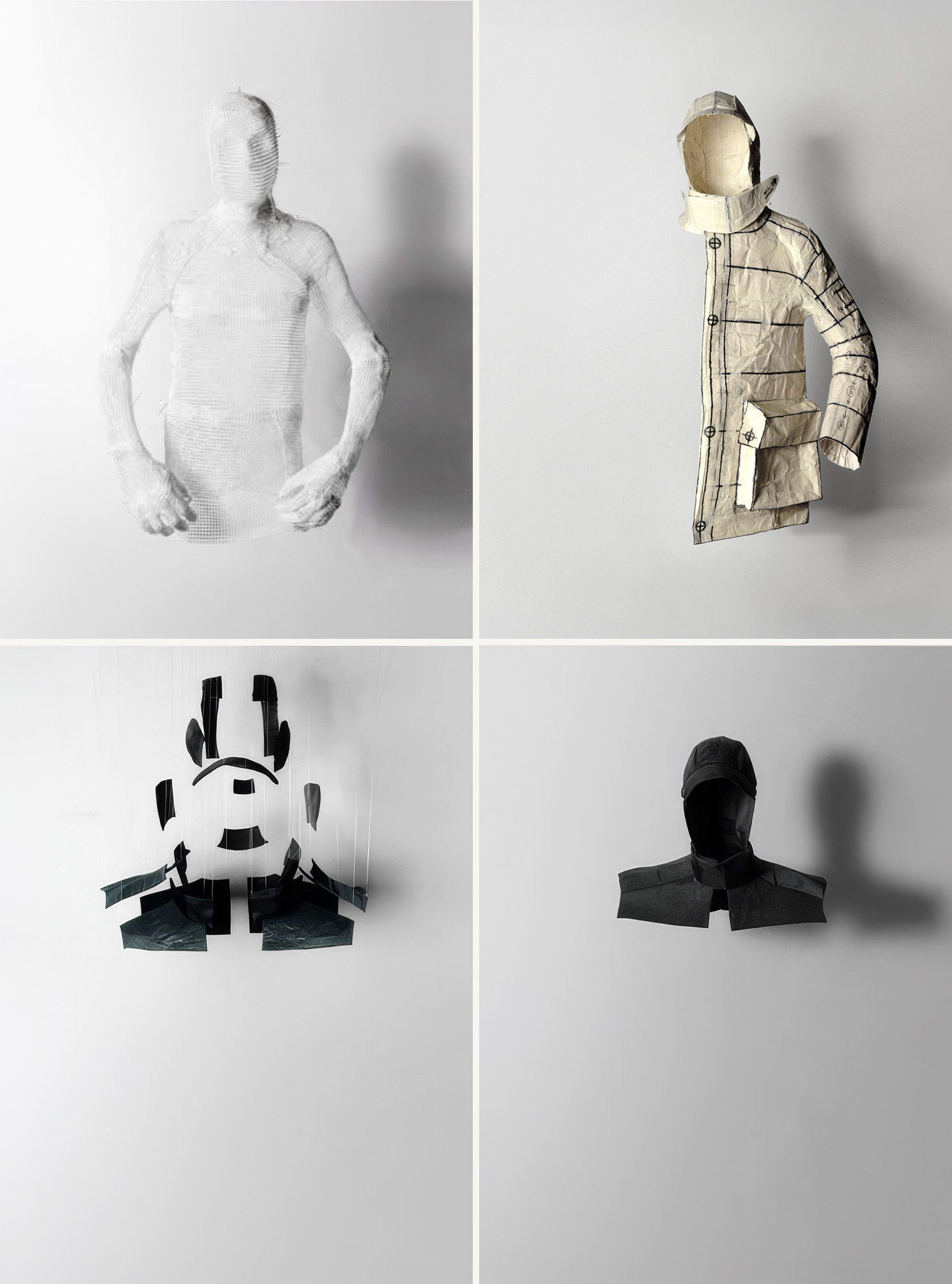
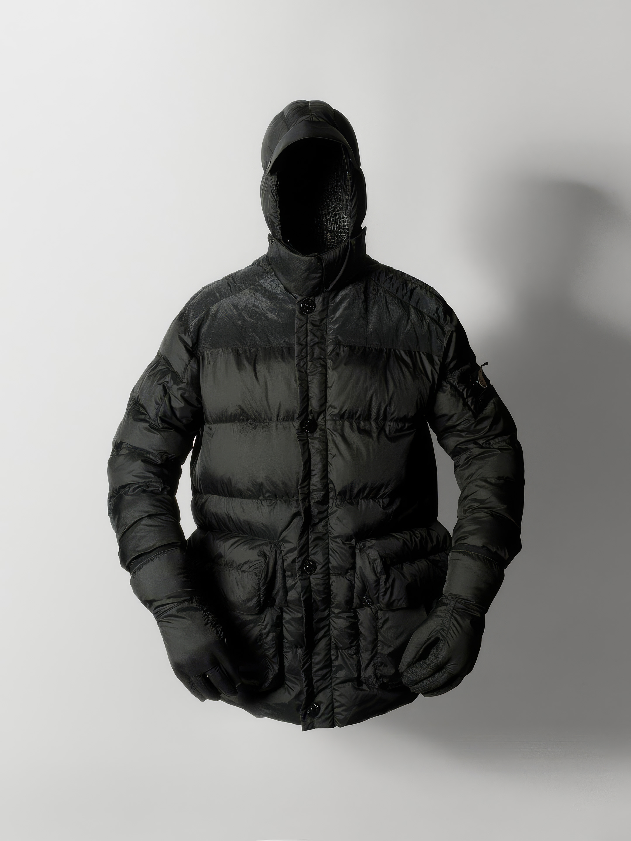
The other 2008 arrival could be held in the hands — all of it. Modular Anatomy, presented in Milan under the name of Aitor Throup, then two years out of the Royal College of Art and named in the project's early press material, holds its load-bearing construction in a single set: a jacket and the matching down-filled gloves supplied with it. The jacket, turned inside out on the table, discloses its construction immediately. There is no conventional filled shell beneath a segmented surface; each padded module is a separately filled section, and the boundary of every module runs identically along the interior and the exterior. Turn the garment from one face to the other and the same divisions reappear in the same places, because the divisions are what it is made of. The joins are not quilting. Conventional quilting confines fill to repeated channels and is indifferent to the shape it crosses; these joins trace the edges of the modules, and they keep the transitions between filled sections unusually flat — a hand drawn across a boundary finds almost none of the ridge that stacked cloth and thread ordinarily build. The gloves carry the same language over the hand: padded segments continuing across the fingers, articulated divisions, a ribbed junction at the wrist, black panels at the palm. The project reaches past the jacket and onto the hand, and stops there. The proposition is the construction, and the construction ends at the fingertips.
Laid flat, the jacket withholds part of what the table has just shown. Its modules keep their volume, overlap at their edges, turn partly away, and conceal the relations that give them their shapes. The boundaries that explain the garment run through it in three dimensions; the plane records where they cross the surface, not what they do. Across the available documentation, the set appears suspended, drawn in exploded views, diagrammed at its articulations, turned inside out, photographed in prototype and worn on a body. No single image carries the construction.
The launch language of 2008 agrees with the table. Each segment was described as a down-filled cushion, stitched by a special method that eliminates excess stitching bulk; the concept was framed as a challenge to the traditional patterns of garment construction, its modules generated to reflect the complexity of the human body, each module dependent upon the other. Years later, Throup's studio would describe the project in nearly the same terms — each segment an individually down-filled cushion, joined edge to edge to eliminate excess stitching bulk, each dependent on its surrounding segments — and would add one detail the contemporary record does not carry: the segments were individually filled, finished, and numbered before the jacket was stitched together. The later account preserves the 2008 language; it is not evidence of it. What neither the seams nor the language, then or later, disclose is how the shapes and joining method moved from proposition to production. The available public record examined here does not establish what Throup supplied — sculptures, drawings, patterns, a prototype, a proposition — what Stone Island developed, or who industrialized the joining method. His practice of working from small sculptures makes an anatomical procedure plausible. The object does not make it known.
A second season arrived for Spring–Summer 2009 and announced its own difference: Articulated Anatomy shifted the enquiry from the intricately laborious construction of the previous season to the articulation of the body — garments engineered to mirror its range of movement, addressed to the fabric that builds up at bent joints and the waistband that slips when the wearer sits. The collaboration was described at the time as ongoing. The collaboration continued. The construction system did not. No third Anatomy season has surfaced, and whatever the company retained of the modular method stayed invisible from outside.
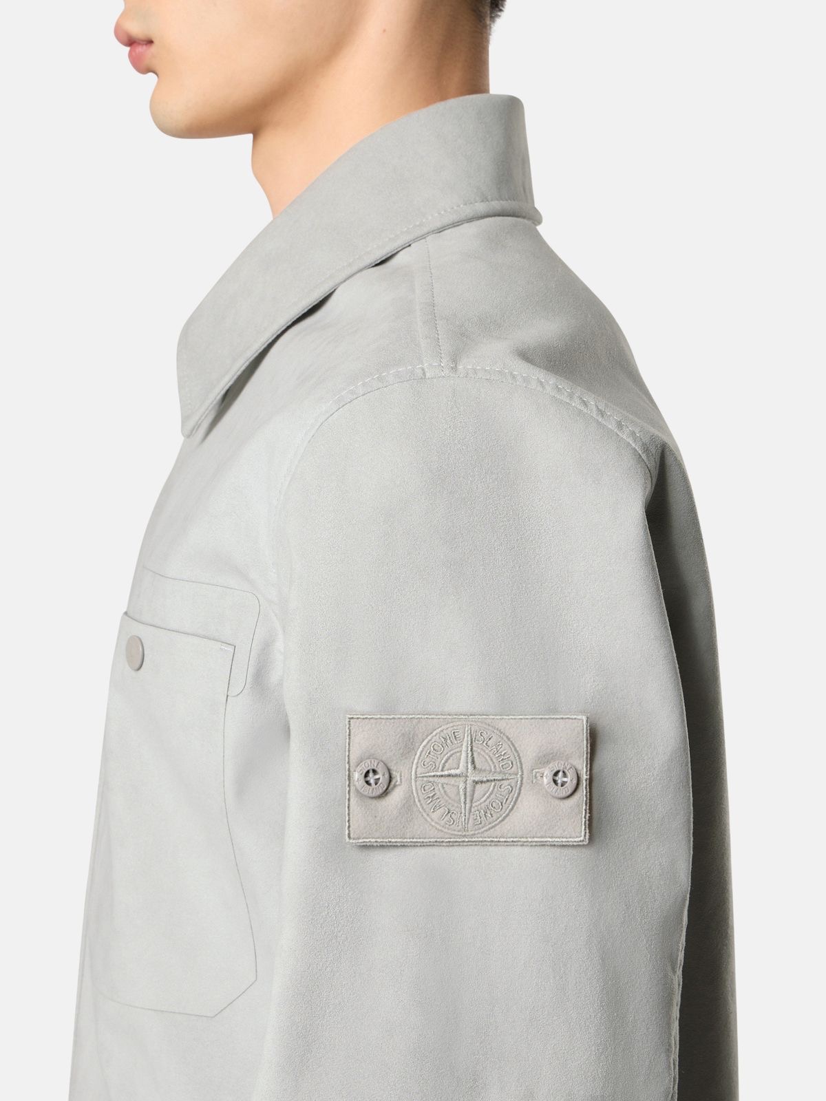
The Anatomy jacket carries one element that did not belong to the project alone. Its construction could end; the compass badge on its sleeve remained available to the house. Removable from the garment, it was nevertheless required to meet whatever surface Stone Island placed beneath it. That relation between mark and surface had been unsettled long before either external arrival.
On the Ice Jacket Camouflage of Spring–Summer 1991, the pattern was thermosensitive, fading toward a solid field as the temperature dropped — the image of concealment itself unstable. Seventeen years later, on the Raso Gommato Hand-Painted Camouflage of Autumn–Winter 2008–09, an irregular painted field crosses the rubber-backed shell without a repeat. It does not leave the removable badge untouched: the dark felt ground is brought into the garment's mottled condition while the pale embroidered compass remains legible. The badge does not disappear, and it is not exempt. It stops standing outside the field.
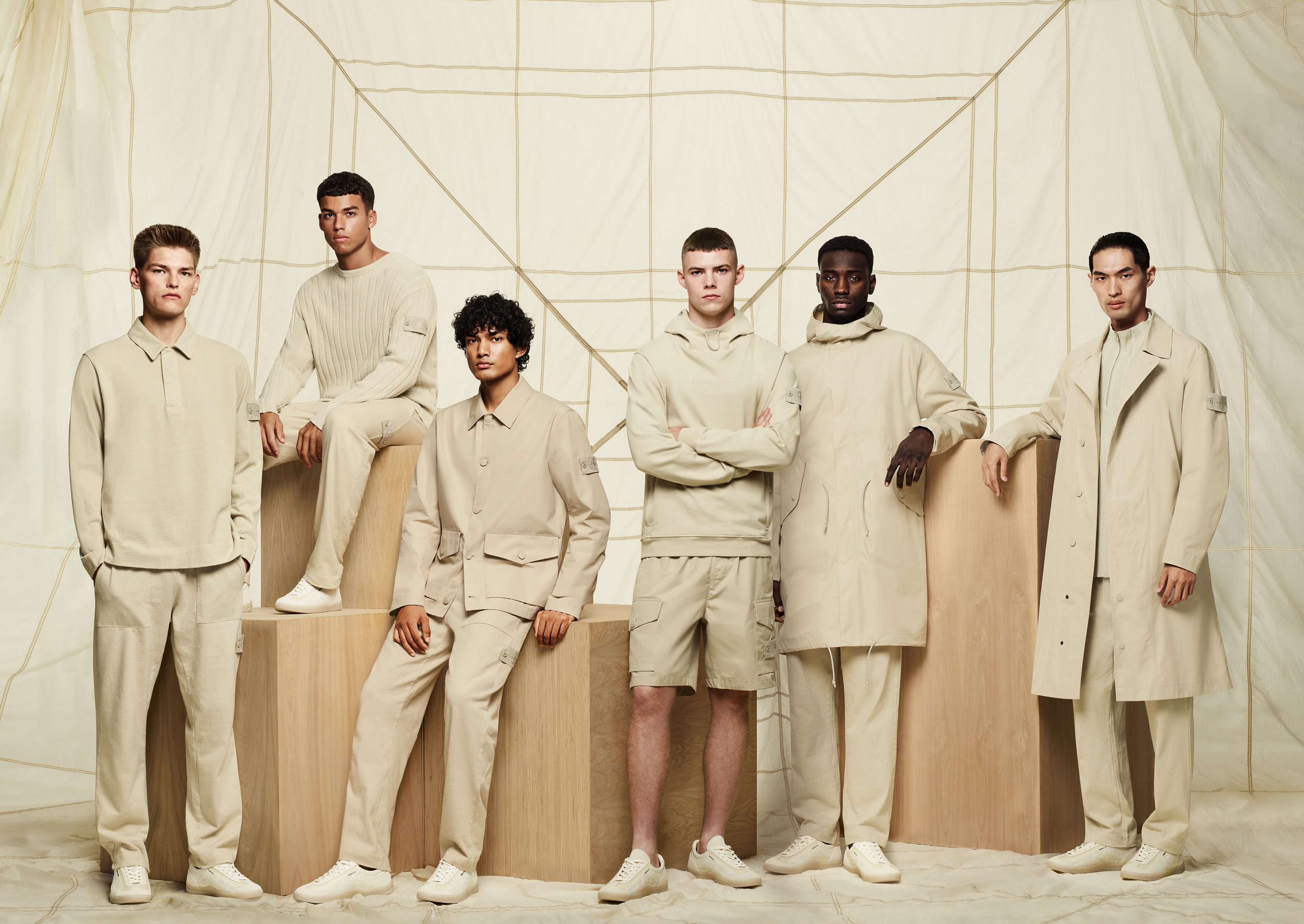
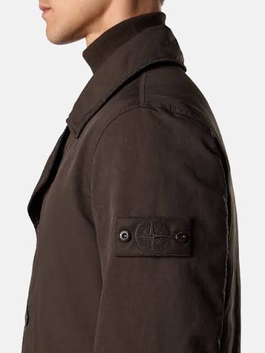
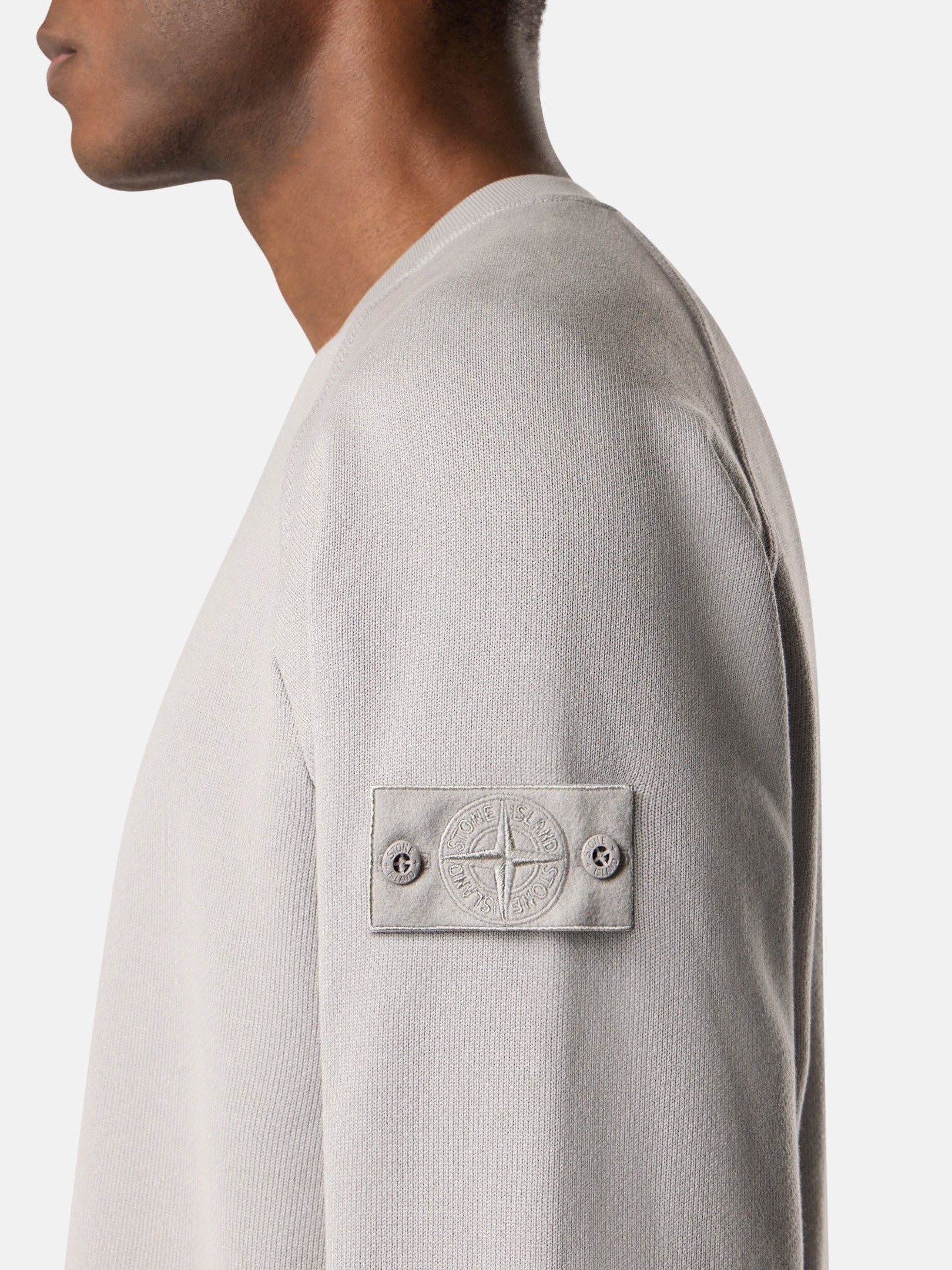
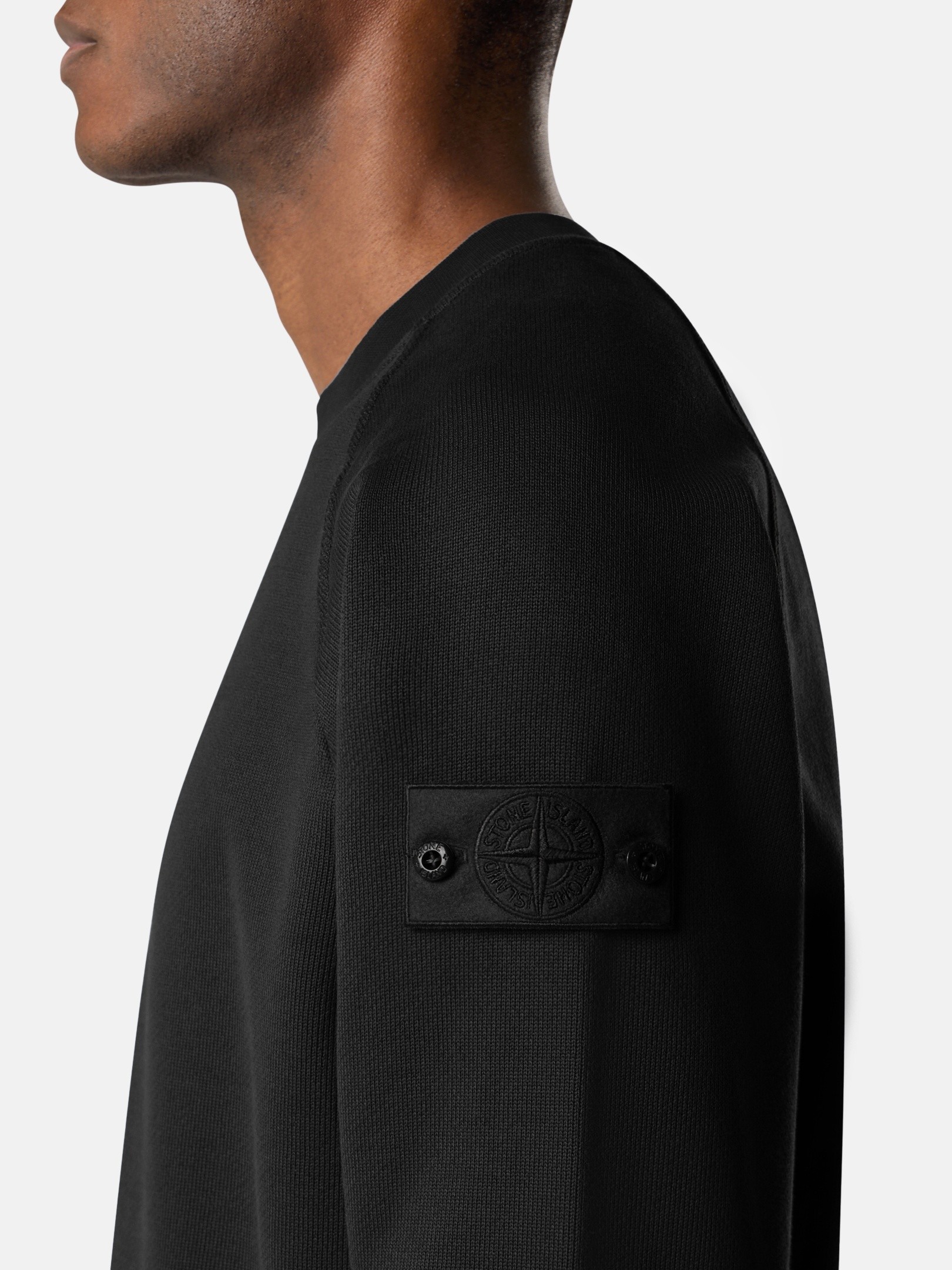
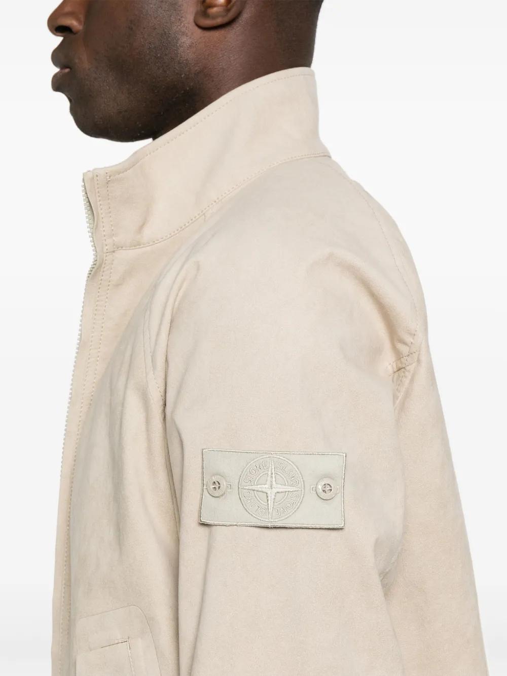
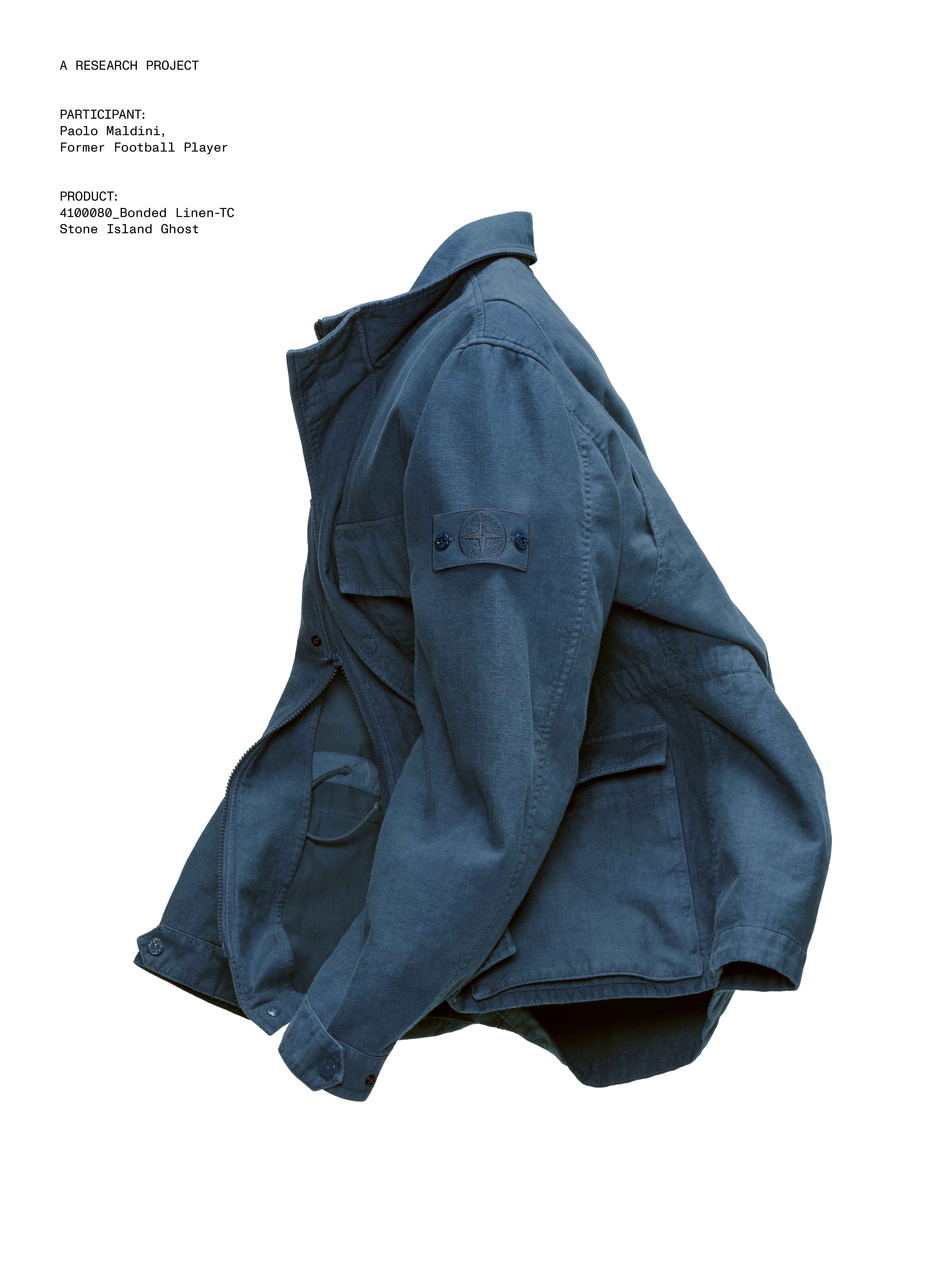
Ghost Pieces appeared in Spring–Summer 2011, under the Stone Island name, as what the company called an "extreme" evolution of camouflage. The inherited pattern was given up; the relation between badge and garment remained: entirely monochromatic garments, each carrying a compass badge made to blend with the garment. One garment, one color — and a garment is not one surface. Textile, hardware, trim, and badge do not necessarily return color and light the same way; a matte cotton and a moulded snap can agree on a color card and separate in daylight, and every new color renews the problem. The badge stays on the sleeve, unhidden. Its contrast does not survive the field it has to join.
The condition has recurred for roughly fifteen years across materials that share almost nothing — brushed cotton, knitwear, Alcantara — and every component has to reach it through its own material behavior. What returns is the demand, not a fixed garment. Ghost's identity has stayed where Pure Metal Shell's did, inside the house, carried by no external designer from season to season.
In Autumn–Winter 2021–22, the company printed reflective pigments into a visible directional rain-pattern camouflage: the pattern fully retained, its behavior toward light changed. Ghost did not supersede visible camouflage. Stone Island could remove the pattern while keeping camouflage as a condition, or keep the pattern while changing what it does with light.
Harvey's leaving did not leave design unfinished at Stone Island; it changed the scale at which finishing could occur. Under him, a proposition as extensive as Pure Metal Shell's — a material, a body, a pair of shoes, a promised divergence in every copy — could pass through one position from fabric to approval and reach the public whole. After him, fabric, garment, season, and final approval no longer converged through one designer position for the whole house — and completion did not disappear. It divided. Shadow finished inside a programme built to be refilled. Anatomy finished inside a construction that ended at the fingertips. Ghost finishes, still, inside a condition sustained across whatever material it touches. The house built separate rooms. None had to become the whole house.
Stone Island did not replace Paul Harvey with another total designer. Instead, design began reaching completion through different arrangements: a recurring external program, a construction concentrated in one project, and a material condition sustained inside the house. Shadow Project, Modular Anatomy, and Ghost were each allowed to finish at their own scale without becoming the language of the whole house.


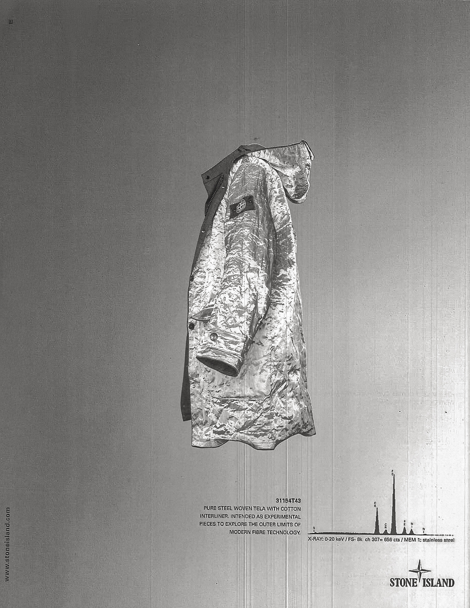

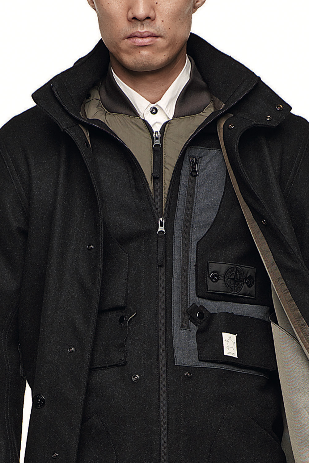

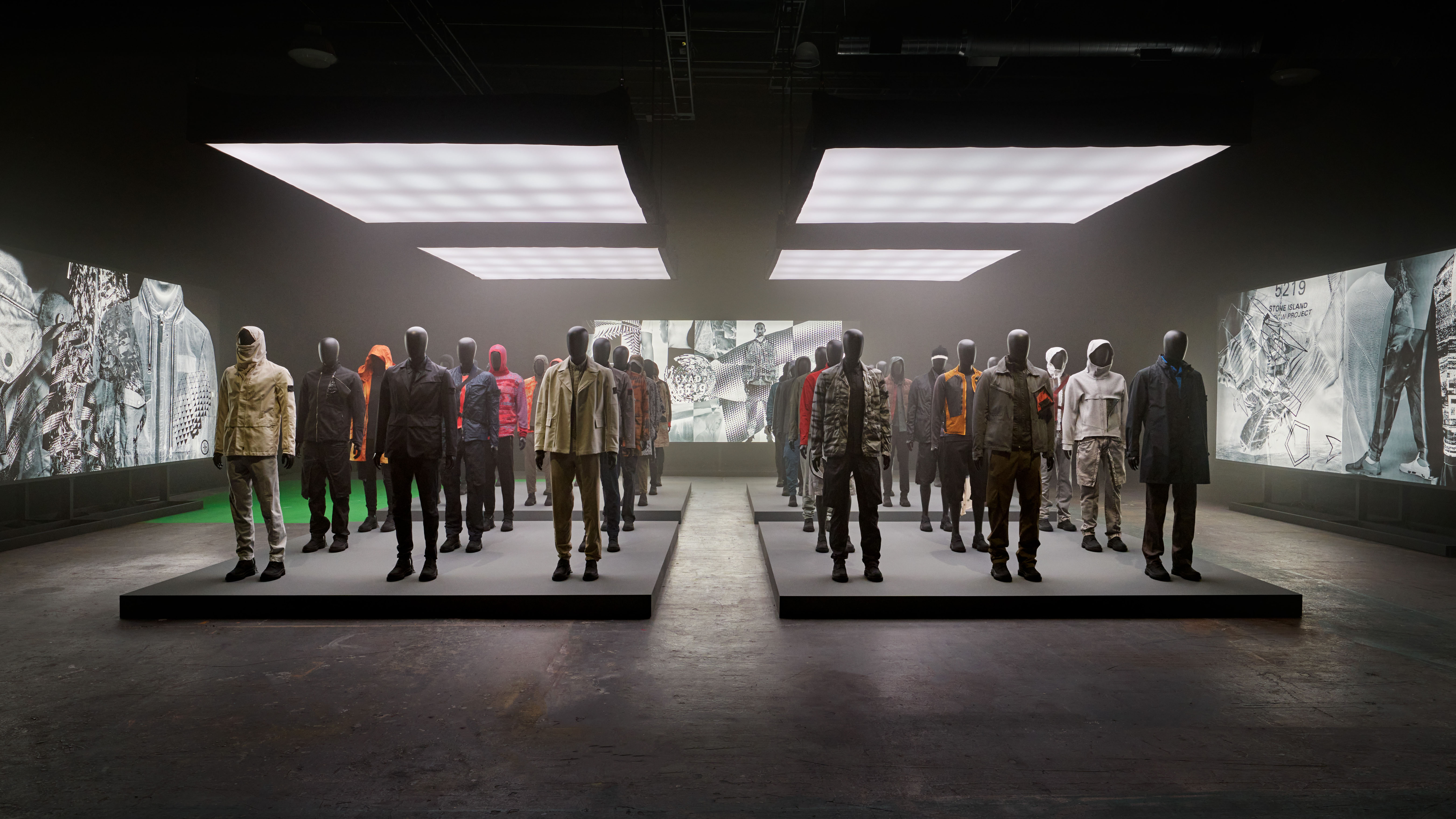


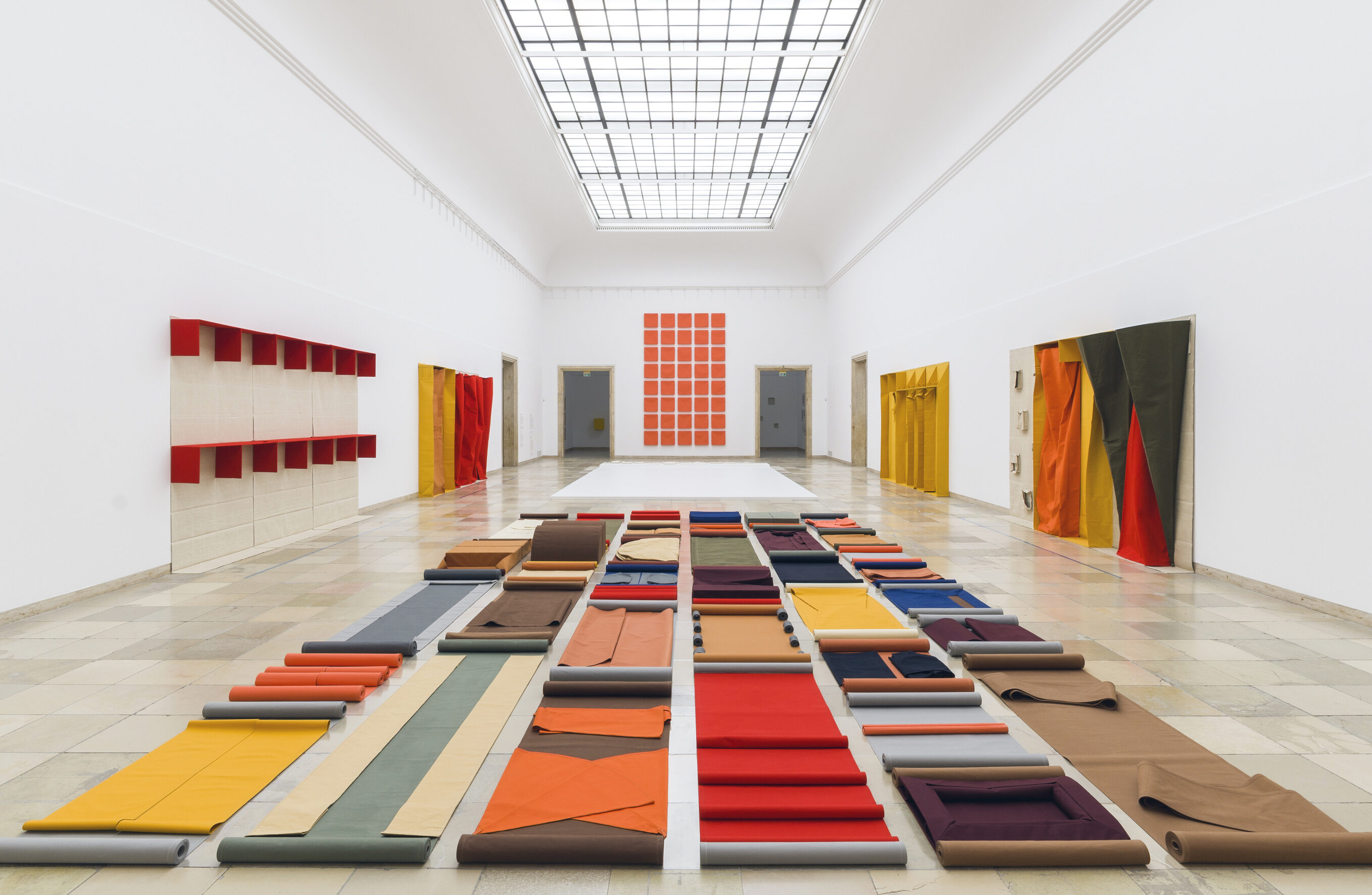
Cover Image: A complete proposition before it separates into rooms. Image Credit: Stone Island, Pure Metal Shell Army installation, Dover Street Market Ginza, Tokyo, 2023. Featuring Pure Metal Shell parkas from the Millennium collection, Autumn Winter ‘999’000 (Art. 31154T43). Courtesy Stone Island.
All images © their respective rights holders.
Image rights & attribution →