


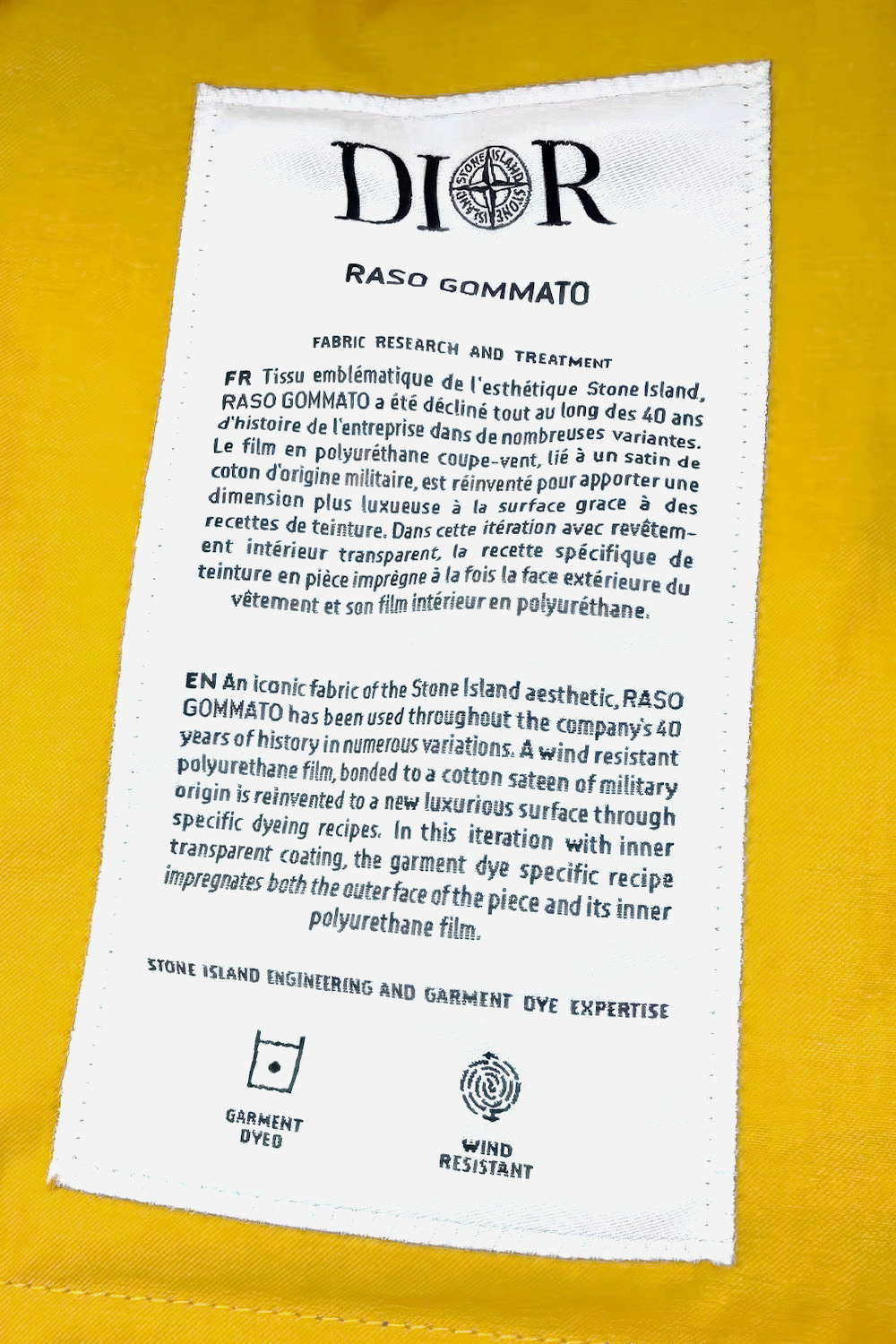
The label inside the jacket was written two years before the collaboration, by the other house, for a different garment. Dior edited one clause and added one sentence.
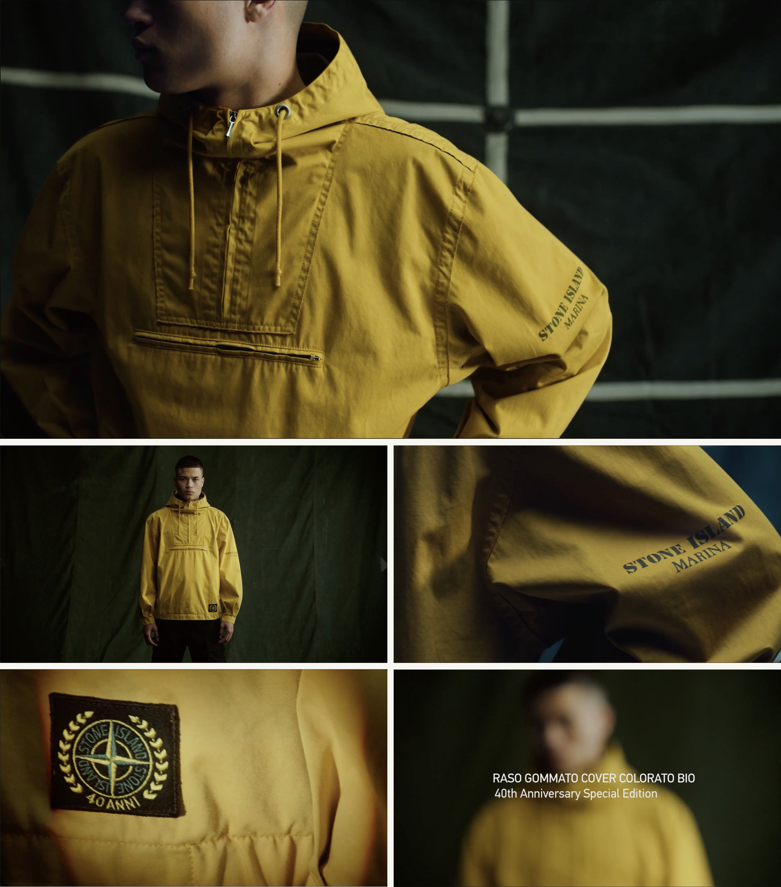
The earlier garment is an anorak. In May 2022, for its fortieth anniversary, Stone Island released Raso Gommato Cover Colorato Bio on what the house called a faithful replica of archive piece 85434, Spring–Summer 1984. Dyed ochre yellow, the return carried a label organized in two registers. The label is headed STONE ISLAND, the compass above the name; then the fabric, RASO GOMMATO COVER COLORATO BIO; then EDIZIONE SPECIALE 40° ANNIVERSARIO; then the rubric FABRIC RESEARCH AND TREATMENT, and a text in Italian and then in English. The first register holds the fabric’s forty years: an iconic fabric of the Stone Island aesthetic, declined across four decades in numerous variations — a wind-resistant polyurethane film, bonded to a cotton satin of military origin, interpreted time after time to obtain targeted aspects through specific dyeing recipes on the finished garment. The second describes this iteration: Cover Colorato Bio, organic cotton coupled with polymers deriving from 52 percent biomass, garment dyed with a PFC-free anti-drop agent. Beneath both, a line of self-description — STONE ISLAND ENGINEERING AND GARMENT DYE EXPERTISE — and four icons. A paragraph about repetition and a slot for the variant, sewn into an anniversary replica: the document is built the way the fabric is described as behaving, one part constant, one part answering the iteration.
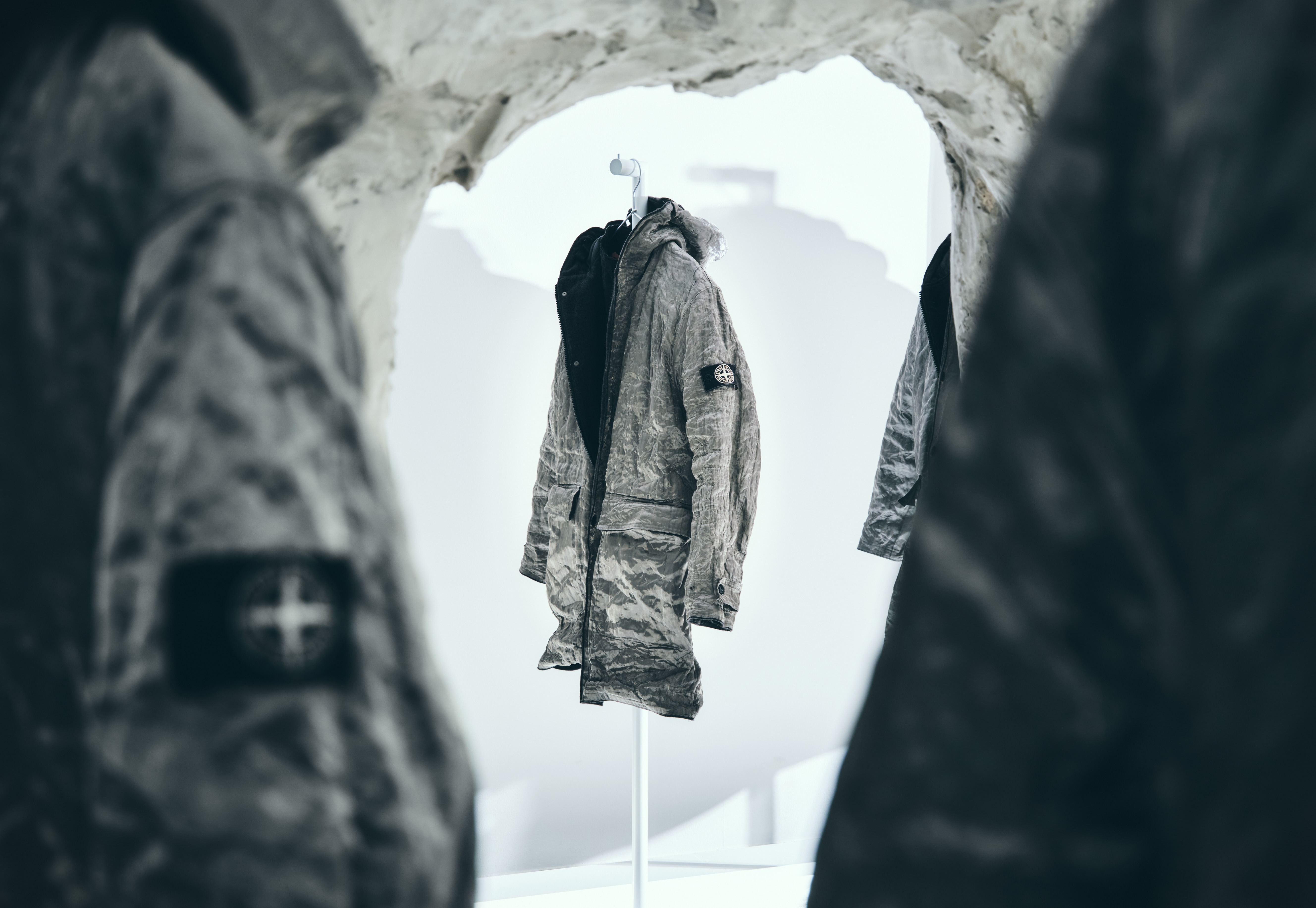
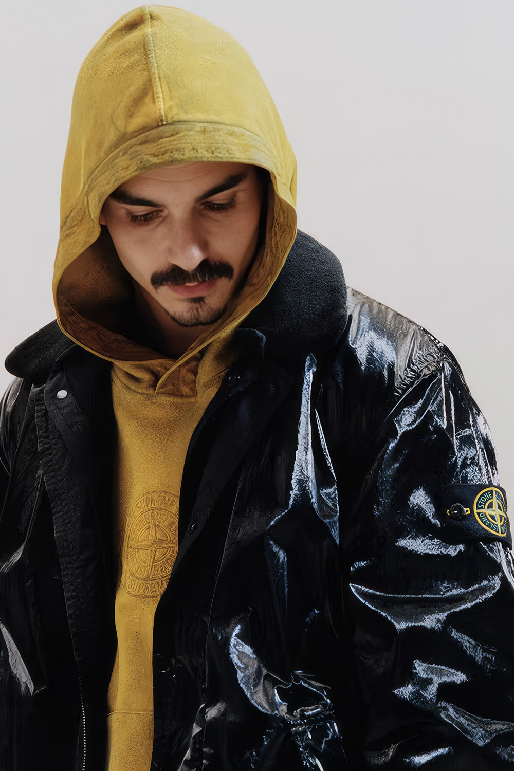
Two years later the collaboration’s field jacket — four bellows pockets, cannage leather occupying their lower panels, matching leather ovals at the elbows, and a detachable compass badge on a cannage jacquard ground, the same component arrangement repeated across yellow and black — carries the same documentary structure under a new heading. DIOR, with the Stone Island compass set into the O: on the house’s own label the compass stood above its name; here it is set inside the other house’s. Then RASO GOMMATO; the same rubric; a text in French and then in English; the credit line carried over; two of the icons, garment dyed and wind resistant. This is not the same label — it is a redesigned collaborative document — but it is the same form, and its first register is the 2022 paragraph, nearly whole. Count the differences. An article is added. Declined becomes used — in the English; the French keeps décliné. Satin becomes sateen; on the finished garment is dropped. The iteration slot is refilled: the Bio chemistry gives way to this iteration with inner transparent coating, a garment-dye recipe entering the outer face of the piece and its inner polyurethane film at once — one bath answered differently by the textile face and the bonded film; whose hand drafted the sentence, the record does not say. And one clause is replaced in the register built to hold still. In 2022 the film is interpreted time after time to obtain targeted aspects. On the collaboration’s label it is reinvented to a new luxurious surface. Time after time is deleted from the English account. Repetition — the founder’s filing, the position this volume has already weighed — is edited out of the constant register of a document whose variable register exists precisely so the constant one never has to change.
The label’s two languages do not agree about the edit. The English promises a new surface: replacement. The French — réinventé pour apporter une dimension plus luxueuse à la surface — promises the same surface, given a more luxurious dimension: continuation. The discrepancy sits exactly on the one clause that changed, and the label leaves it standing, the way a label written twice can. And the first language itself has changed nationality. The 2022 paragraph leads in Italian; the collaboration’s leads in French, and the Italian disappears. Yet the French keeps décliné, the verb the English gives up. The edit is fullest in English: the language of the release, the headline, and the market.
The public description arrived in May 2024, whole, before the garments could be handled. The release proposed an equation — two founders from opposite ends of the fashion spectrum, an haute couture vision meeting military functionality, obsessives, clothing alchemy — and it held the fabric in the past tense: an archive field jacket originally realized in cotton and rubber, transposed into cotton silk and embossed leather. The press returned the equation and improved it once. One headline converted the collaboration into Christian Dior and Massimo Osti — the living company replaced by its founding designer, nineteen years dead, the man this volume’s first essay watched recede behind his product, restored by a headline to caption a product he never touched. So two attributions circulated that spring, and only one of them was new. The emailed one assigned a vision and a function. The sewn one — engineering and garment dye expertise — had been on the anorak for two years, a house describing itself; under the DIOR heading the same words became a credit to the other house, their function changed only by the heading above them. Attribution never went missing from this collaboration; it moved inward, into the register no one reads, where it had been all along.
The garment answers the traveling description at the one point only its interior can check. The substitution clause is accurate wherever a photograph can verify it: the embossed leather is on the jacket, where described. The cloth story becomes harder to sustain inside. The resale listing for the black gives the shell as cotton 65 percent, polyurethane 35 percent — no silk — and the origin as France; the label names the coated satin itself, the dye entering its textile face and bonded film. If the marking holds, the credit line’s noun turns exact — the label credits expertise, and the origin line claims the making. On this jacket the Raso Gommato was not replaced. It crossed: cloth, film, recipe.
The same substitution recurs on the surface, in positions the archive fixed. The lower halves of the lower cargo pockets, and ovals at both elbows, carry calf leather — a compass star embossed at the top of each, a cannage field below. The Stone Island archive holds rubber components in the same positions, marked PATENTED, a raised diamond grip occupying the same field. The coordinates are the record. Reading the pairs as one operation — PATENTED to compass star, grip to cannage, targeted aspects to luxurious surface — is this essay’s reading, and is offered as one. The hardware makes the next relation literal. The badge, Stone Island’s compass on a cannage jacquard ground, hangs on two buttons of Stone Island’s own geometry — the central aperture crossed by a moulded plus, the detachable mechanism through which the sign can leave the garment — and around the rim of each button, DIOR is moulded. Above the badge, DIOR is embroidered into the shell. Unbutton the compass — the operation the buttons exist for — and what remains on the sleeve is DIOR, moulded in the rims and embroidered in the cloth. The sign that can leave the garment is Stone Island’s; the marks that cannot are Dior’s. Whether these garments went through the bath badge-off, the shell beneath the badge has not been photographed to answer.
One exchange ran the other way, and it keeps the reading honest. The tone-on-tone floral embroideries, drawn from the couture archive — autumn–winter 1955, the flowers of spring–summer 2013 — were passed through Stone Island’s dye, thread and ground taking the colour differently, a result both houses described as new to both. Decoration made to undergo an industrial process rather than sit on top of one. Stone Island supplied the cloth in one case; Dior supplied the motif in the other. The dye acted on both. On the evidence of its own documents the collaboration worked as an exchange rather than a capture — an exchange in which the most complete thing to cross was a paragraph.
The paragraph is still working. A dealer’s post offering the yellow jacket brand new runs the label’s English text as its sales description, unattributed, with a copyist’s variants — esthetic for aesthetic, a lost apostrophe — and gives the label itself as the tenth of twelve photographs, the sewn document standing in for a certificate. Across the platforms the garment cannot hold one name. The dealer titles it by the fabric, Raso Gommato. The marketplace listing both colours translates the cloth into generic English: Cotton-Blend Satin Jacket. The platform selling the black files it under Christian Dior Pre-Owned as an elbow-patch jacket and dates the collaboration to the 2010s, a decade in which it did not occur; the same listing grades the garment excellent, meaning no signs of damage or use. Two years out, the description precedes the object again, for its next buyer, in Stone Island’s words wearing Dior’s edit, with no one’s name on them.
The most durable material in the collaboration is the paragraph, and the paragraph did not travel alone. It crossed inside its own document — rubric, credit, icons, two languages — re-headed and nearly intact. It was written for an anniversary, about a fabric interpreted time after time, and the crossing was, in every register but one, another interpretation. The English lost the repetition. The replacement runs six words, and one of them is new.
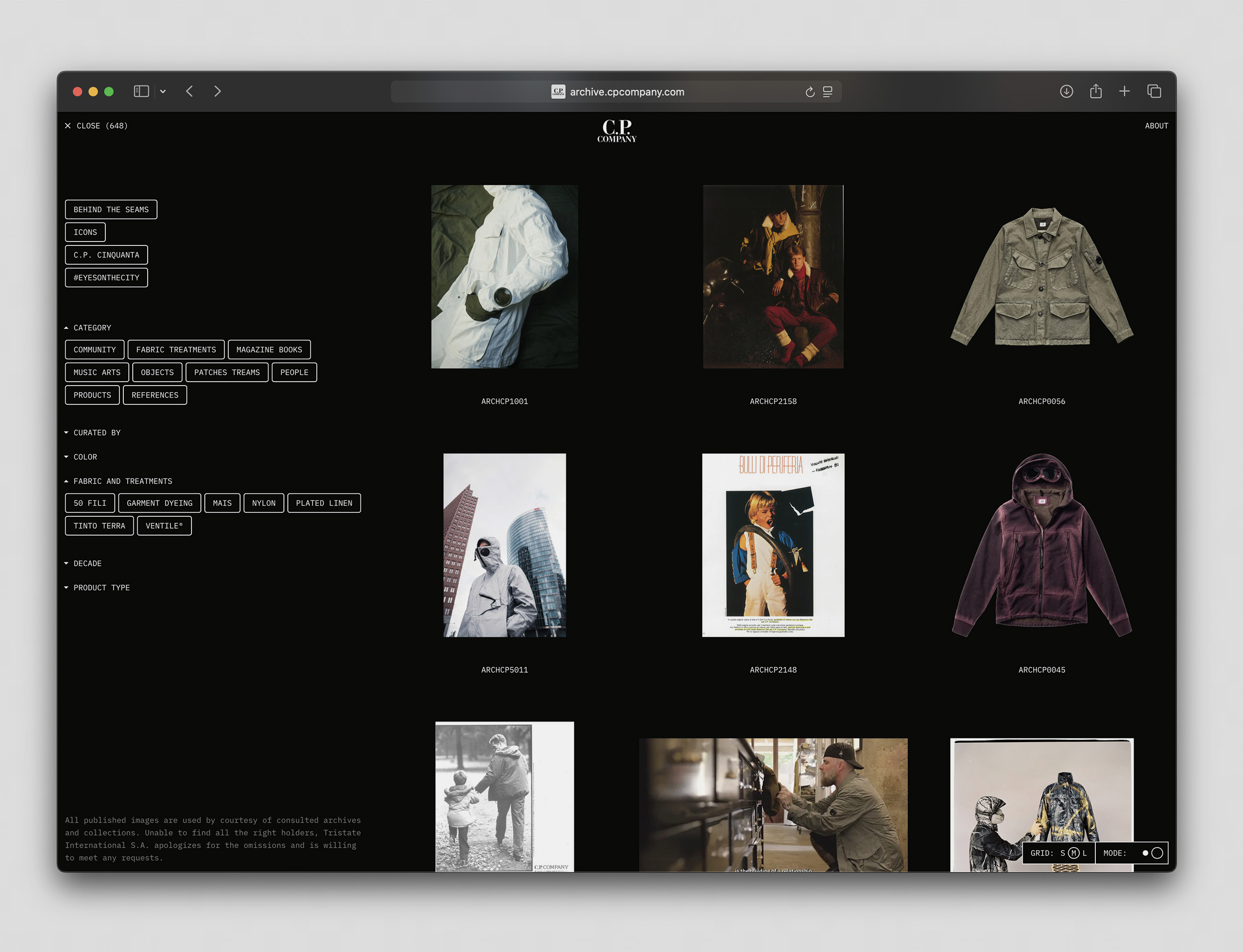
C.P. Company’s archive is public. It opens in a browser: six hundred and forty-eight records, the count printed at the top of the screen, garments with catalogue numbers hanging in a grid beside magazine spreads, factory photographs, scooters, people. Fabric is one filter among seven — the named cloths filed between color and decade. The categories run outward from the product: community, music, objects, people, references. At the bottom of the page, in small type, a concession: not every rights holder could be found, apologies are offered for omissions, requests will be met. The archive is lateral, searchable, and explicit about what it does not control: a house holding what it made and what gathered around what it made, then opening the shelves.
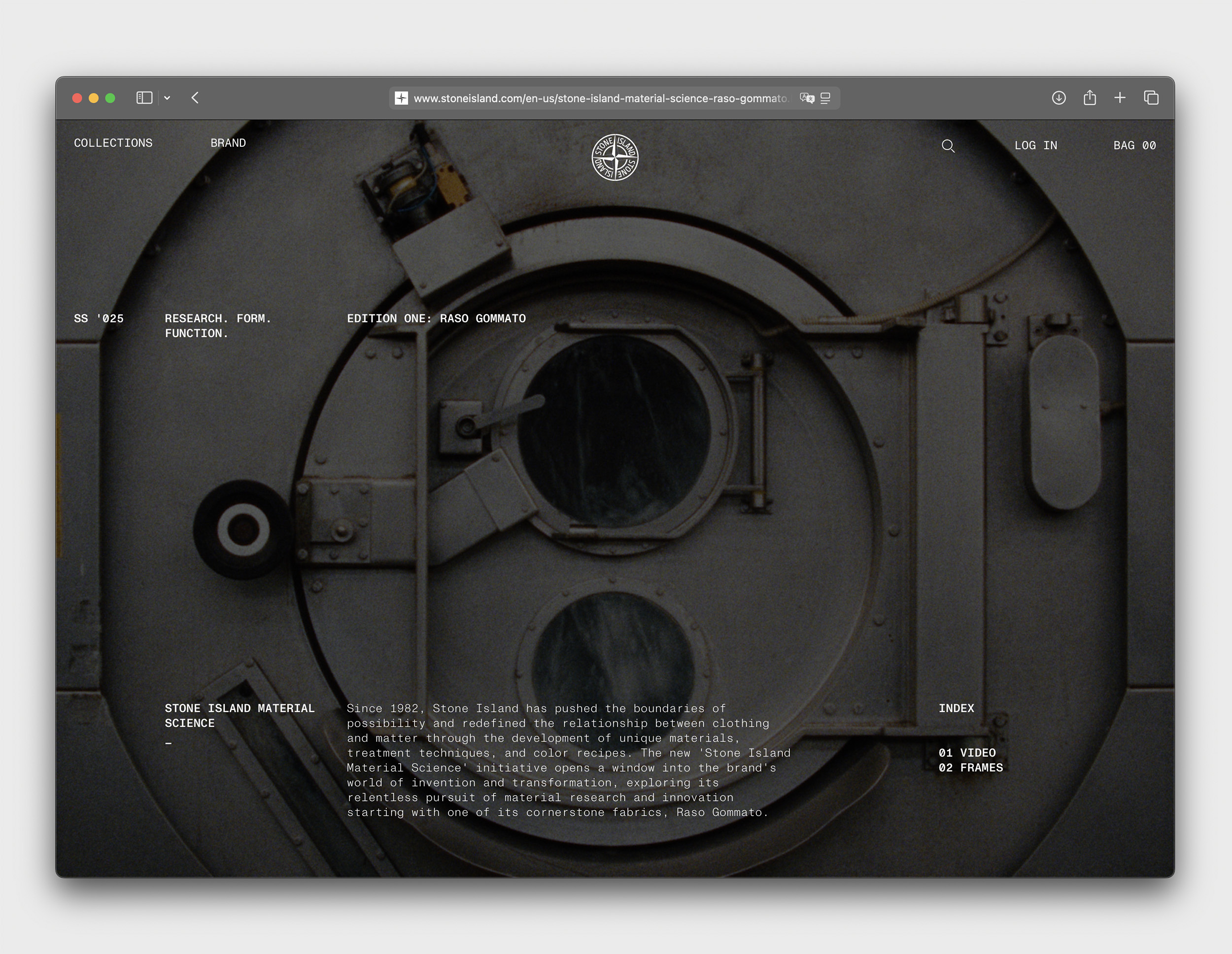
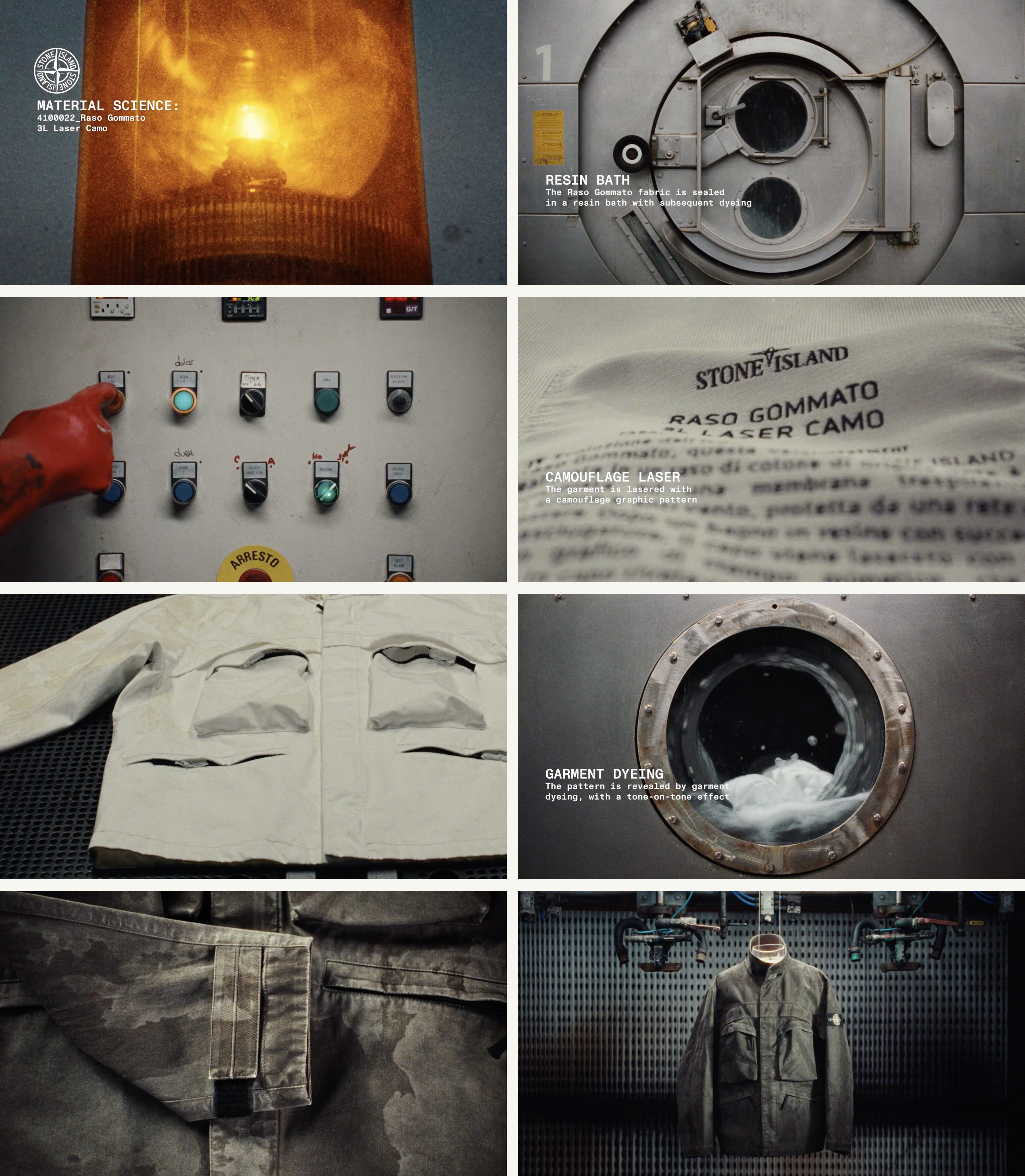
Stone Island built its interface the other way around. Material Science opens on a dye machine, and the index offers two entries: video, frames. Before any garment there is procedure — cloth sealed in a resin bath, a laser, a gloved hand at a control panel with its stop button, dye liquor turning behind a porthole until the pattern arrives tone on tone, a care label read in close-up like a document. The finished jacket comes at the end, hung in the machine room among the equipment that produced it. In the house’s own interface the object arrives last, postponed behind the evidence of its making. And the sequence does not resolve into a product so much as into a name. Edition One is not a garment and not a season. It is Raso Gommato.
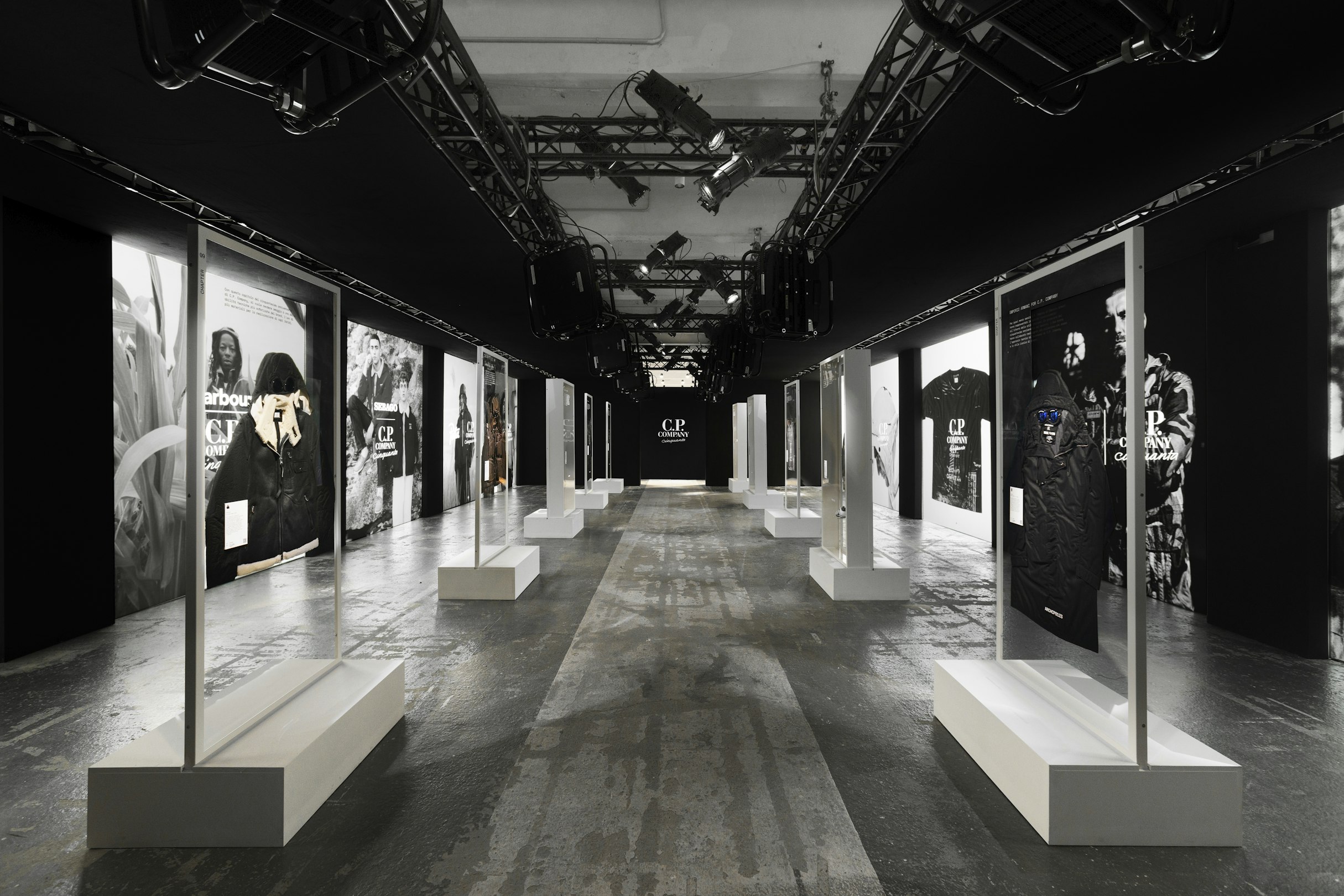
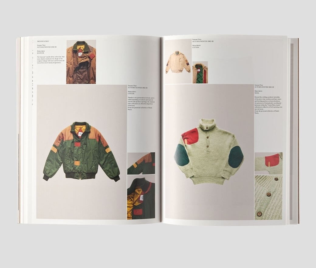
The two designs look opposed — one lateral, one forward-marching; one keeping, one performing. They run a single operation in two forms. C.P. consolidates the lineage: a standing range introduced for Autumn/Winter 1990–91, for garments intended not to leave production; a monograph built in two halves, fifty devoted wearers photographed in archive garments and a glossary of more than two hundred pieces with the stories of their making; an anniversary that put the garments back on racks. Stone Island consolidates the name: the fabric itself given the film, the frames, the edition number, a sequence that ends where the garment begins. Neither system depends on counterfeit evidence — the footage, the garments, the records, and the swatches are real. The system works because the evidence is accurate. Where the two interfaces part is only on the question of where evidence should live — in the kept object, or in the name.
What the operation produces, at its smallest and most complete, is a T-shirt.
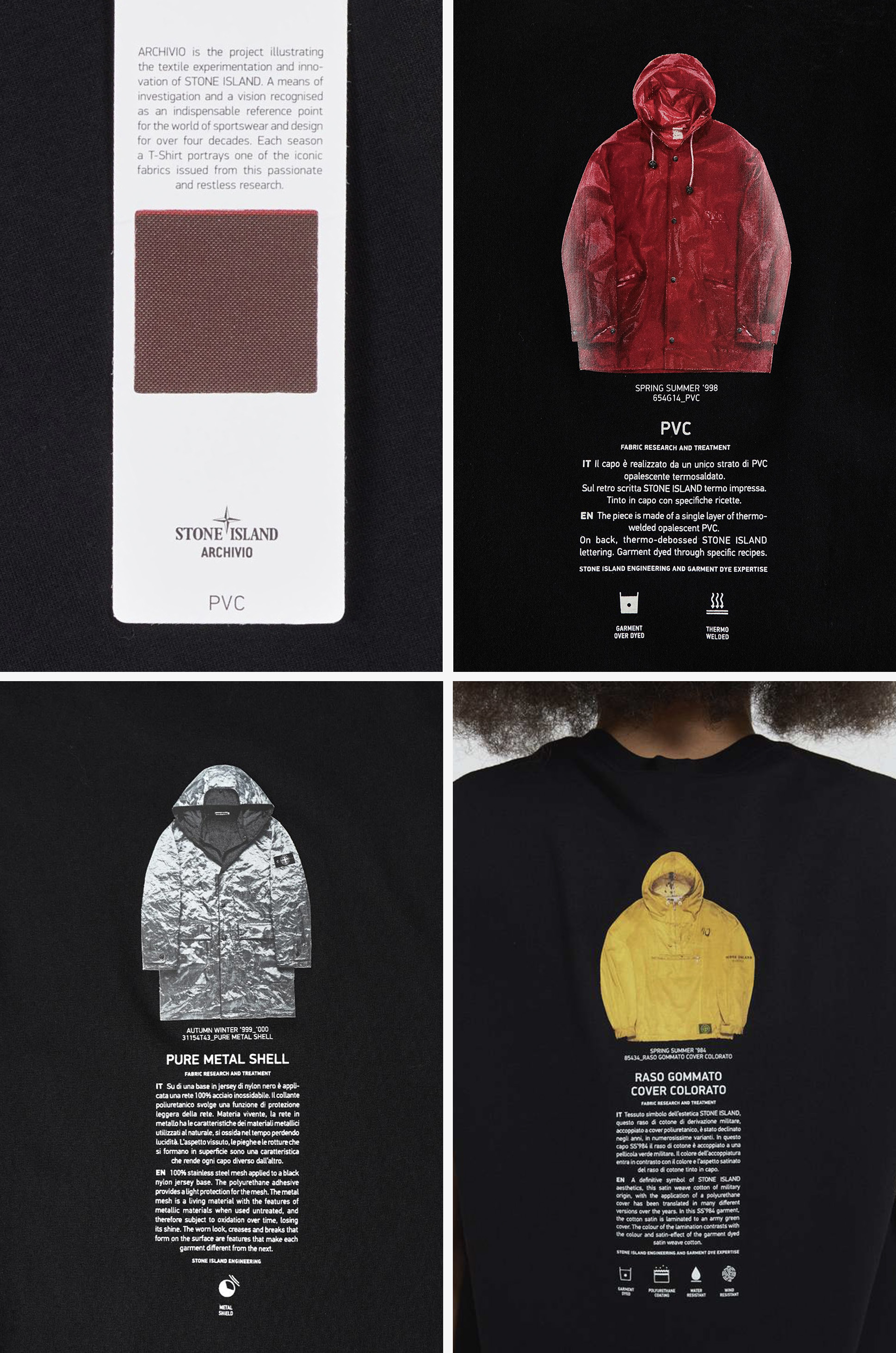
The Archivio shirt is plain cotton jersey. ARCHIVIO crosses the chest. On the back, a printed image of an archival garment — a jacket cut in Raso Gommato, reproduced with its description the way a plate is reproduced in a catalogue. On the hangtag, a die-cut window; behind the window, a swatch of the cloth itself. A cotton shirt carrying, on every surface, the name of a coated satin it is not cut from.
Read the object part by part. The name is present, in the house’s own typography. The history is present — the archival garment appears, described, mounted across the wearer’s shoulders like a print. The fabric is represented twice, once as an image of a garment made from it, once as a sample of the material itself, and only the sample is materially present. The sample is genuine. The swatch behind the window is the coated satin — resinated, dyed, the actual surface — and cut to the size of a hangtag it can do none of the work the coating was developed to do. It cannot meet weather. It cannot take a body. It cannot age through wear, because nothing will ever wear it. The swatch is a witness: present, credible, excused from performance.
If it were one shirt it would be a souvenir, the kind of object any house with a past eventually prints. It is not one shirt. The construction returns, season over season, around the house’s other named cloths — Tela Stella, Mussola Gommata, Poly Felt — the chest name, the back plate, the windowed swatch renewed each time in a different material. One shirt is a curiosity. A format is a decision.
The vocabulary does not stay inside the house. In the spring of 2020 a press article announced a T-shirt dedicated to a fabric — dedicated, a word built for monuments, now applied to a named cloth. The article does not have to interpret the shirt. The shirt arrives with its interpretation attached, and the press repeats a name already prepared to travel.
The terminus is a search field. Type the fabric name into a resale platform and the platform answers in garments. The name enters the listing title; the treatment helps support the price. Raso Gommato returns a hand-painted jacket approaching five thousand dollars. David-TC returns listings under authenticity guarantees, watchers counted in the margin. Tela Stella gathers garments from the first collections, shipped from Japan, priced like documents. None of the sellers explains the words. The buyers arrive already schooled.
At the top of that market sits the jacket that holds all of the cloth — a full garment in Raso Gommato, the coating at working scale, the actual subject of every proxy beneath it — and it is the object least able to perform. Owners report what the decades do to the surface: coatings gone sticky, peeling at the folds, resin lifting exactly where a body bent. The cloth was built to answer use, and answering is what consumes it. A garment priced as a document becomes harder to take into weather; a garment already shedding its coating becomes harder still. The proxy is stable because nothing is asked of it; the original is unstable because its material life was the point. Preservation cannot return the cloth to an untouched state. The coat kept out of the rain is not saved. It is kept. The swatch behind its window will outlast every jacket it certifies. The highest condition a technical garment can hold in this market is the condition of never having been used — deadstock, the market’s own name for it: unworn, tagged, the state the platforms pay a premium for and a used garment can never recover.
None of which makes the collector wrong. The listing is accurate, the coating is fragile, the money is real, and a coat worn hard is worth less than a coat kept. Grading peeling as a flaw is what grading is for. The contradiction is structural, and it requires nobody to behave badly: the garment becomes valuable partly for a material life its value then discourages from continuing.
Something else is subtracted along with the wearing. Where wear has altered the garment, a body produced part of the condition the market later prices. Weathering becomes provenance, adaptation becomes aura, and learned use becomes evidence of the maker’s intelligence. The wearer appears in that account as ownership history or condition, not as one of the people who completed the object. Wearing is not factory labor, and it does not confer legal authorship. But the finish was partly made by a body, while its value returns to the label, the season, the named fabric, and the archive.
This is recognition running backward. The name was earned in performance, and the name now acts on what the cloth will be permitted to do. It identifies the material, certifies the object, and helps preserve both by withholding the use through which the name was earned. Accurate evidence had become eligibility.
In April 2026 a retailer’s website published a test. Written as search-facing retail editorial, the page rules on outfits — which combinations count and which have stopped reading correctly — and calls its criteria litmus tests. Its authority extends no further than a shop with inventory to move. That is precisely its value as a document: a text with nothing to defend says the quiet part in rules. It lists what qualifies: a hardshell with a three-layer membrane, taped seams, pit zips; trousers in a named technical fabric. It lists what does not: cotton cargo trousers with sewn-on pockets, a nylon bomber without a membrane. It warns that an outfit falling outside the prescribed balance no longer reads correctly. And it adjudicates the border with the confidence of a court: one shell is ruled to count for two categories at once, on silhouette alone — the same physical jacket, filed twice, on cut.
The distinctions are not arbitrary, which is what makes the page worth pausing on. A three-layer laminate is not cotton. Taped seams alter water ingress. Pit zips answer the heat a waterproof shell retains under exertion. The criteria track real differences in what cloth can do — differences the field had spent decades engineering. The evidence is accurate. The turn is what the evidence is for. Accurate evidence became eligibility. On this page the membrane is no longer a way of keeping a body dry; it is a way of keeping an outfit inside a definition. And the direction of address is the finding. These signs were read off finished garments — cloth already made, worn, weathered. The page points them the other way, at the next purchase, the next release, the next season’s shell. It became a test administered to garments that had not yet been made.
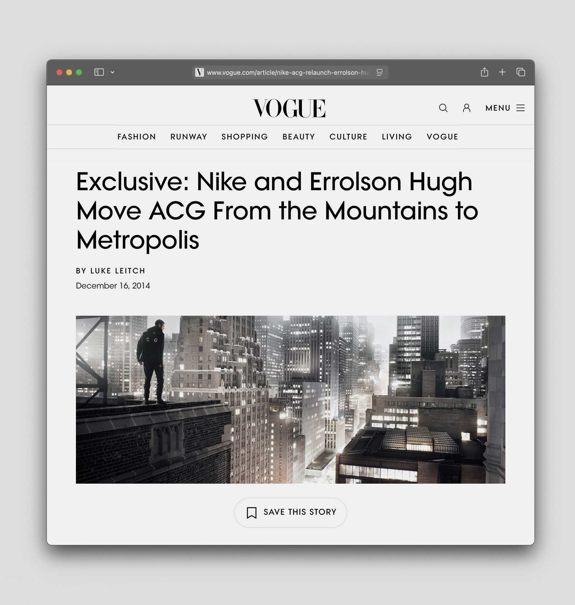
In December 2014 Nike relaunched a sub-label that had been dormant for years. All Conditions Gear had been outdoor equipment in the early nineties — bright, wilderness-facing, built for terrain the city does not have. The announcement repositioned it as sport utility for the city, under the NikeLab banner, with Errolson Hugh leading the design. Hugh later described an instruction from the chief executive: reference nothing the company had done before, avoid the known color schemes, and make the line triple black, stealth, and sophisticated. That sentence is the retailer’s examination moved to the other end of production. Triple black, stealth, sophisticated is not a design; it is the category’s visual grammar issued as specification before a pattern was cut — no longer a verdict on what had been made but an order for what would be. A design director said at launch that the collection’s innovations would move down into the regular apparel line, which completes the circuit: position, collaborator, brief, object, wider product. Recognition moved from description into production and back into the product line.
And the garments were good. Engineered fit, real weather protection, construction its founding practices would sign. The problem was never that this process produces bad objects. It is quieter: the objects arrive to confirm a sentence written before them. After a leadership change in 2018, ACG was redirected toward its outdoor origins — the same line assigned back to the description it had been created to leave. The line itself was the object, passed between equations.
Nike was not first, only loudest. Five years before the commission, Arc’teryx had launched Veilance — 2009, for the city dweller rather than the alpinist, its launch notes announcing a new category in apparel before the first season had shipped, the position preceding the product as an organizational fact, a division built to hold it. The maker the institution brought into that early development was Hugh: the same designer, first the author of a practice whose work exceeded the category, now the specialist reached for when a recognizable technical position needed supplying. At the presentation, water was suspended above the house’s signature waterproof fabric so that guests walked across the material’s proof, a demonstration staged because the credential’s evidence does not photograph. Later the schedule arrived. Moncler’s Genius program, from 2018, replaced the single creative director with a rotating cast on a monthly rhythm — announcement, teaser, event, limited release, the next announcement — while business coverage continued to identify the Maya, unchanged, as the company’s core commercial object. Transformation had acquired a calendar. And in late 2017 the credential itself split: GORE-TEX announced Infinium, a second self under a white diamond, carrying the name into products that, in the company’s own phrase, offer a performance upgrade that does not need to be waterproof. A name built as a guarantee — a test passed, a standard met, the tape and the membrane behind the mark — was engineered to travel where the guarantee could not follow, and Gore said so plainly. The recognition had become valuable apart from the test that built it, valuable enough to be given a second form.
Brief, division, rhythm, credential — what the category could recognize, it could price; what it could price, it could commission. And the asymmetry underneath it is the reason it runs one way: the signs were easier to brief, repeat, price, photograph, and scale than the questions and procedures that produced them. Recognition scales more easily than transformation. The announcement that reopened the sub-label named the direction of travel: from the mountains to the metropolis. The category no longer waited for the object. It began arranging the conditions under which the object would appear.
Reading the time is a movement before it is an act of reading. The arm rises, or the hand leaves what it was holding; the wrist rotates; the dial comes around to meet the eyes. On foot the gesture is free. At a steering wheel it has a price: the hand rolls partway off the rim to bring the watch into view, and for the length of that rotation the grip is less than a grip, on a road that has not agreed to wait. It is among the smallest movements a garment could be asked to notice. The category that examines garments has no field for it.
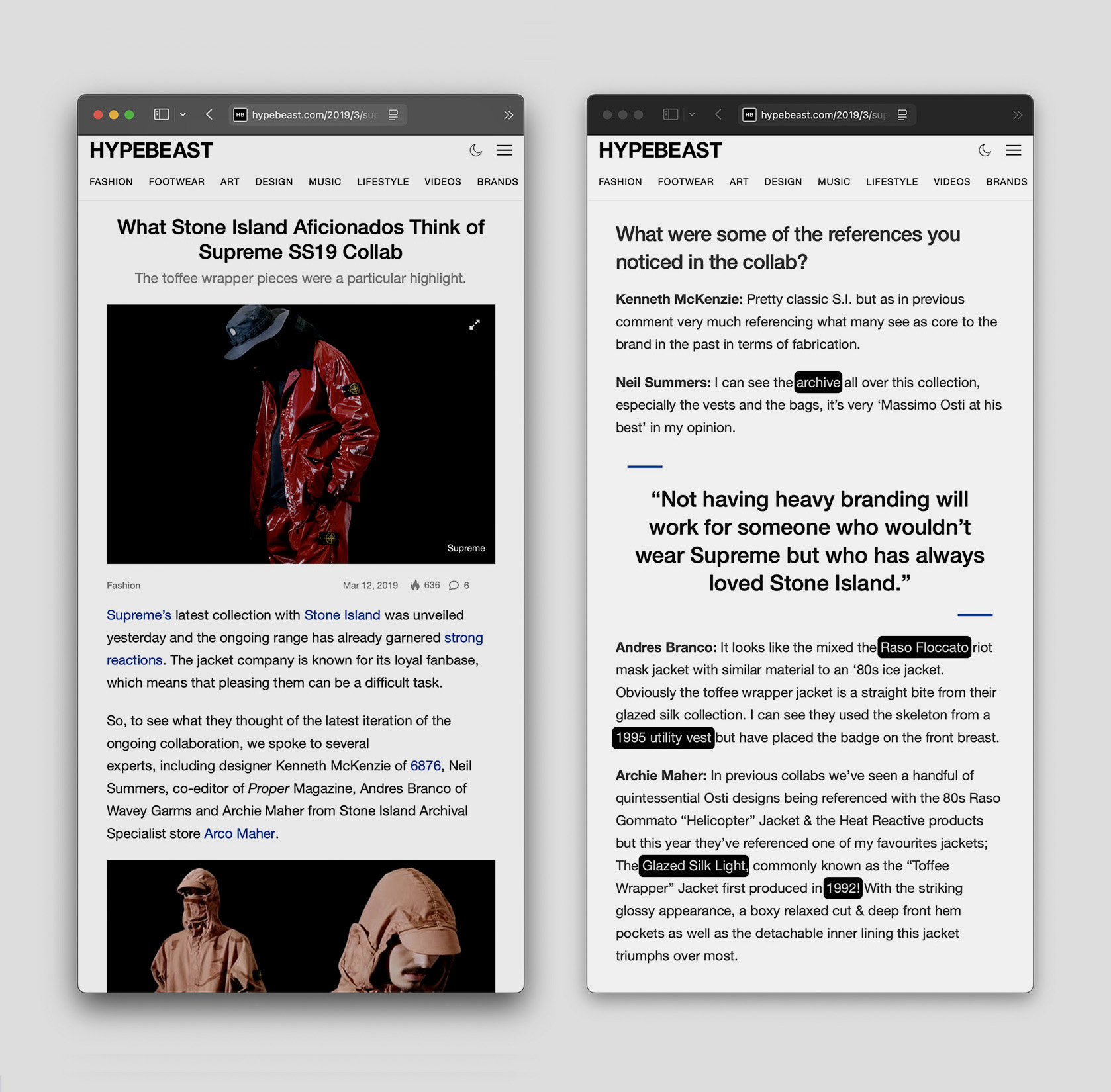
What the category can recognize, it recognizes with real precision. In March 2019, two days before Supreme and Stone Island’s fifth collaboration reached stores, Hypebeast put five questions to four specialists and published their answers, gathered separately, under shared headings. They were reading a lookbook and product copy; the cloth had not yet arrived. And still the readings were exact. One response identified the glossy laminated nylon as so classically Stone Island that its appearance came as a surprise. Another recovered, beneath the new cargo vest, the skeleton of a 1995 utility vest with the badge relocated to the breast. A third supplied a construction genealogy across the Formula Steel line, a 2005 Raso Floccato, and the house’s earlier bag ranges. One reading credited archive pieces, rather than collaborative branding, with governing the designs. And the closing judgment praised the collaboration for taking iconic pieces and updating their materials and properties — substitution, endorsed as the essence of the work done well.
None of this is a purity test. The respondents do not ask whether the original cloth remains. They ask whether the transformation can be traced — whether a knowledgeable reader can reconstruct, from pattern, component, placement, and lineage, what has been changed and from what. Supreme’s capsule passes because its changes preserve a chain of reasons that specialists can name, working backward from the objects. The other form of confirmation the essay has already met runs the other way. The archive reference, the compass, the look of dye, the assigned role of material expert: an account that arrives forward, from the sentence, before the garments can be encountered at all. The question a collaboration answers is not change or repeat. It is whose account of the practice the object obeys — one reconstructed backward from the object, or one supplied in advance of it.
And the second kind of confirmation excludes nothing. The category can enlarge a practice’s audience while narrowing the contribution the practice is expected to make. Stone Island was not kept out of anything in 2024; it was celebrated at the highest altitude fashion has — and admitted, there, as exactly the four or five things the prepared account already knew how to ask for. The portable account of a house — its public language, its named fabrics, its archive presentations, the story its collectors and its press repeat back — is built over years, jointly, by the brand and the market that circulates it. Dior did not reach past Stone Island to some external caricature. It confirmed the version already prepared for circulation — down to the paragraph.
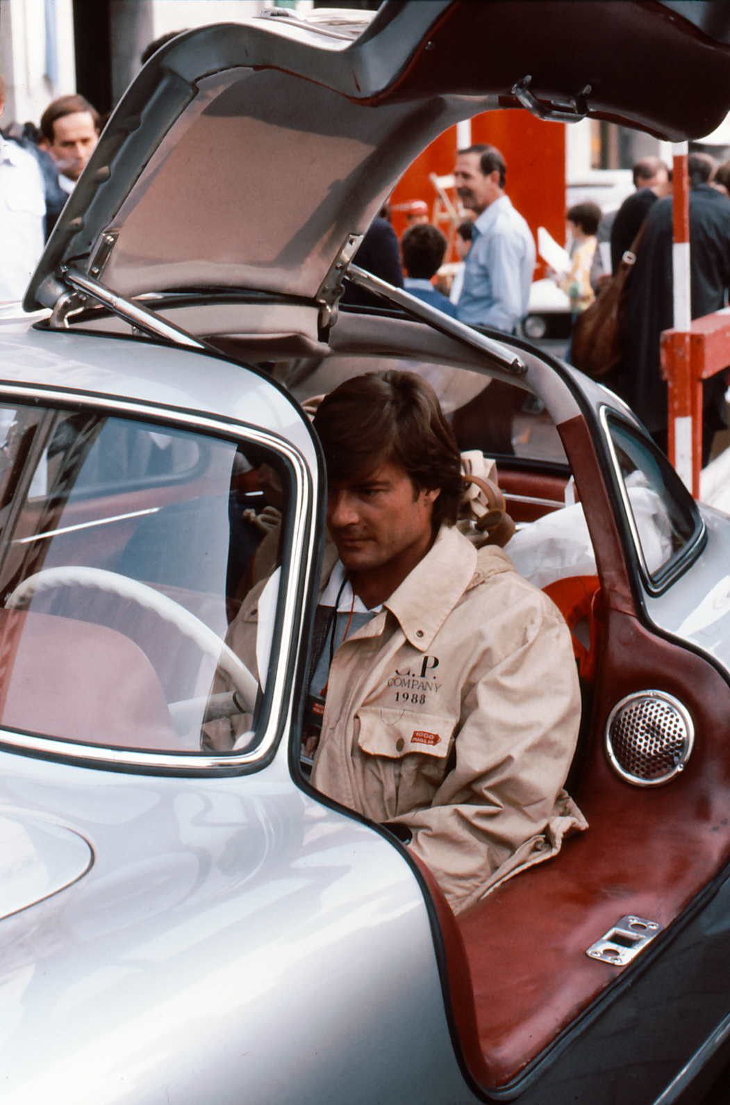
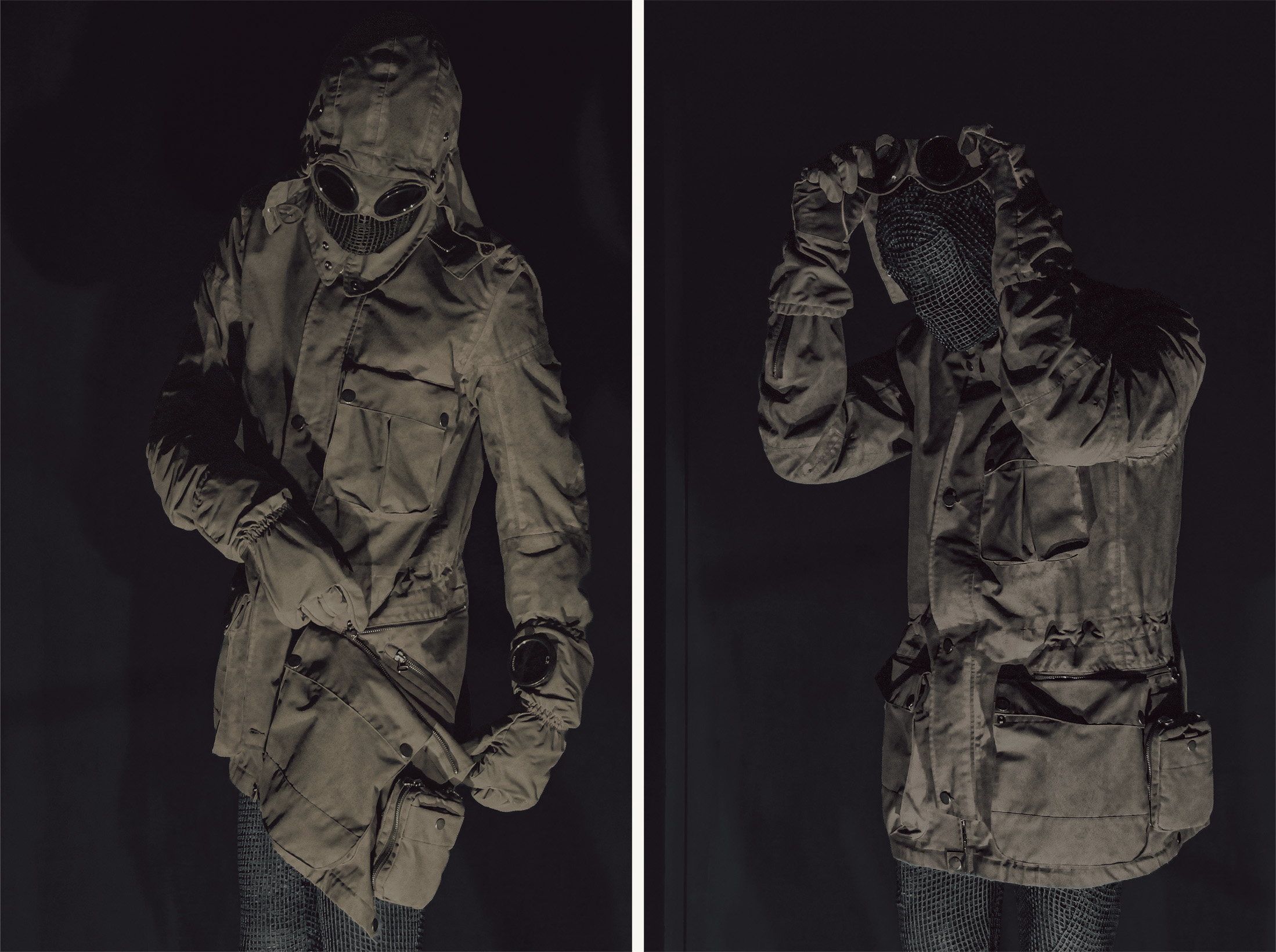
In 2008, C.P. Company invited an outside designer to revisit its icon. The reference object was Massimo Osti’s Goggle Jacket — the Mille Miglia, designed in 1988 for competitors in the revived thousand-mile road race. Its pattern is recorded as grown from a Swiss military jacket; the house’s account traces the hinged lenses in its hood to Osti’s research into wartime protective hoods. A third lens was set into the left sleeve above the watch, carrying the driving premise into the cuff. The use scenario was seated; the inherited pattern still resolved the jacket as a standing garment.
The commission went to Aitor Throup, for the twentieth-anniversary edition — the framing is the record’s own, printed across the anniversary publication’s cover: GOGGLE JACKET / PAST AND FUTURE / THE 20TH ANNIVERSARY OF AN ICON. Throup brought a declared method to the commission. He called it justified design: every form requiring a reason, archetypes revised slowly rather than seasons. The method had been formed by the icon before it was invited into it — Throup has written that the Goggle Jacket is the reason he became a designer. A house that commissions a designer whose discipline is the reason has commissioned the question of whether its icon still has one.
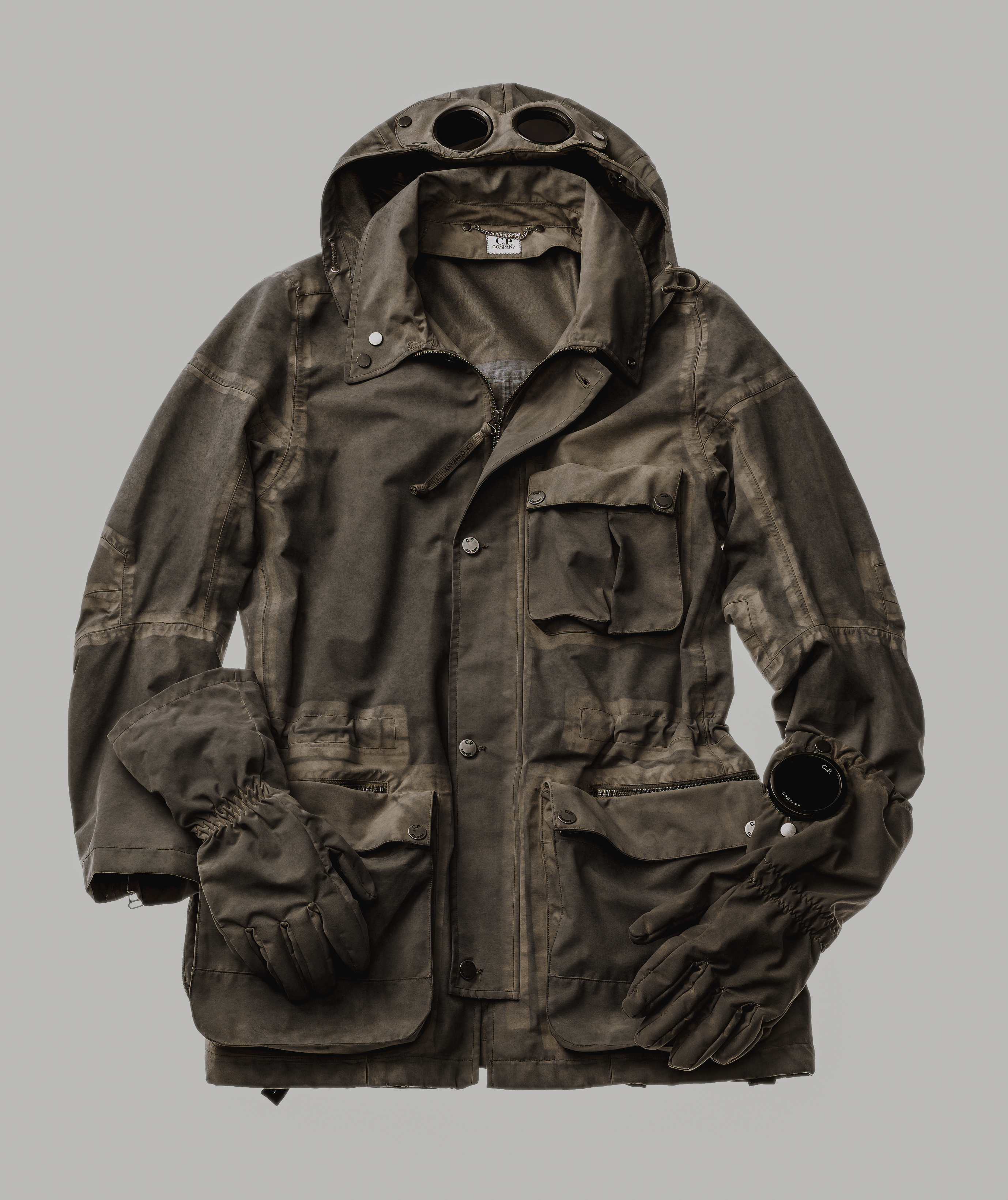
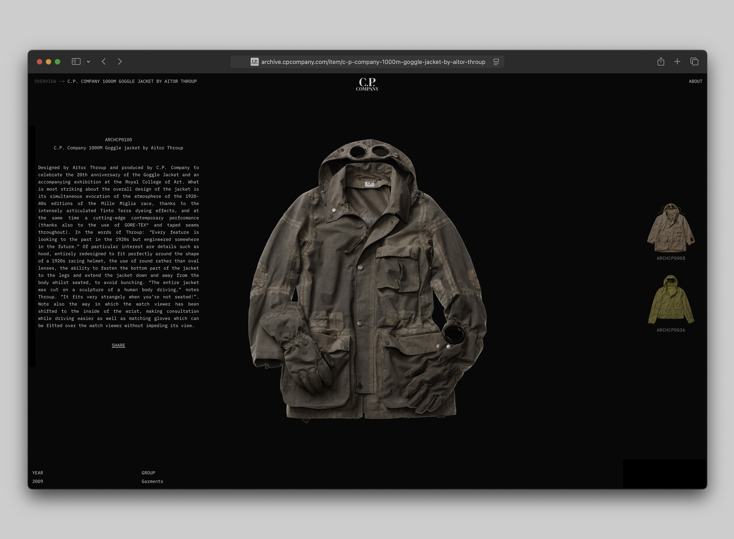
The 1000m Goggle Jacket, released for autumn–winter 2009, was developed on a full-size sculpture of a body in driving position. The design drawing makes the same premise visible. Its origin figure is seated, hands at a wheel rim. The jacket is rendered finished while the legs continue as bare pencil — the design ends where the garment ends, and the body goes on. A car seat appears in cross-section with a small seated figure inside it, the seat drawn as the garment’s negative form. A thumbnail sequence works the conversion pose by pose. Dense annotations surround the figures, but they are not legible at the available resolution and are not quoted here.
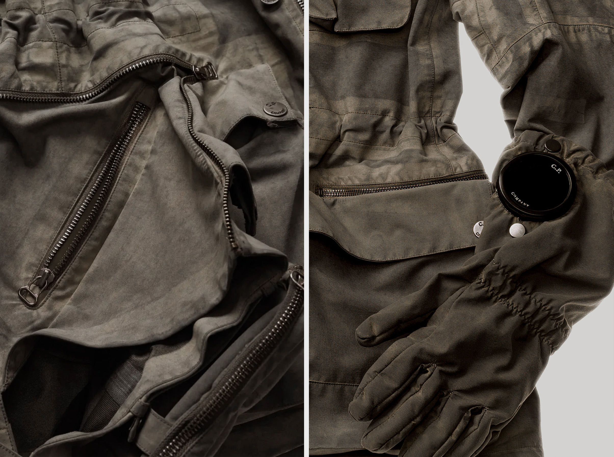
From the seated body the jacket acquired two states — cut to stand, engineered to drive — and the house’s own details diagram, a numbered technical drawing with its list printed beside an exploded figure, records the revision in fourteen decisions. The list names ergonomic driving shoulders, articulated elbows, hidden pockets exposed in the seated state, gloves attached to the jacket, and a transforming flap that becomes a leg cover. Four entries are marked New. One is marked the other way: waterproofed traditional shape front pockets. The spec sheet cites its own past inside a parts list.
The eighth entry is smaller than any of these and carries the most. New ergonomic watch viewer placement: the record’s noun is watch viewer — the smoked lens visible at the left sleeve — and its operative word is placement. A relocation. The window had existed since 1988. The diagram’s claim for the move is ergonomic. The relocation the essay reads in it is to the seated position the whole pattern was cut from.
The cloth is where the category’s confidence lives, and the house did not leave it alone. Three-layer GORE-TEX PERFORMANCE SHELL, taped throughout, the mark legible on the internal label in the documentation — and then garment dyed. The house’s archive describes the treatment as Tinto Terra, soil pigments bonded to fabric, and the photography carries the dye as evidence: the tape resists the bath differently from the shell and returns as pale banding, a patina that repeats on no two surfaces. The membrane remains credentialed, but its factory uniformity does not.
The presentation is the house’s own reading of what it had received. The campaign and display photography do not merely stage the garment. They stage the posture that generated it. The figures have bodies of knitted metal mesh — legs, feet, faces — suspended on visible strings, hands raised and curled around a wheel that is not there. Three stagings remove the car entirely and keep the grip. One photograph restores it: a figure seated in an actual cabin, side zips open, the flap deployed across the thigh, the conversion executed. A display of four figures walks the jacket through a postural sequence that ends at the invisible wheel. The strings are not hidden. The mesh is not dressed. The car is missing. The posture is not. The garment is the only finished part of the body. The house did not exhibit a jacket and imply a driver. It exhibited the premise and hung the jacket on it.
Dior retained the archive silhouette and held its coordinates; Throup regenerated the pattern from the use premise. Dior’s changes ran inside positions built to stay still — calf where rubber had been, reinvention where repetition had been, an inherited label re-headed; Throup let the premise redraw the object until it could no longer be described in its previous terms — a jacket with two postural states is not “a jacket with goggles,” whatever the spec sheet says. One collaboration edited inside an inherited structure and left it standing. The other made the signs undergo the work.
The 1000m satisfies every technical term the record knows how to print: goggles, membrane, taped seams, watch viewer, garment dye. The details diagram proves the completeness of that description and its limit. The condition that generated the decisions appears nowhere in it, because the body for which a pattern is correct is not itself a component.
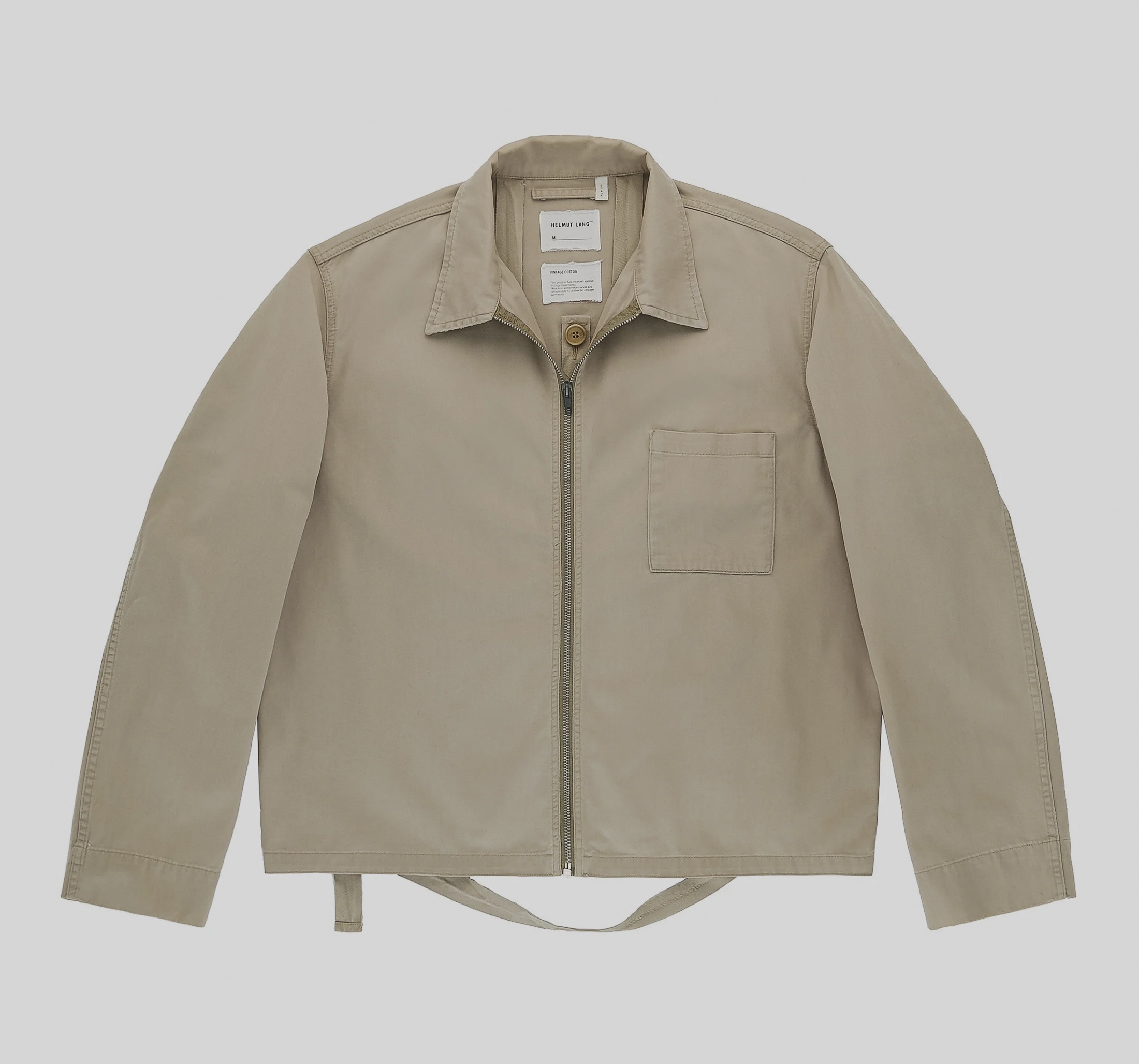
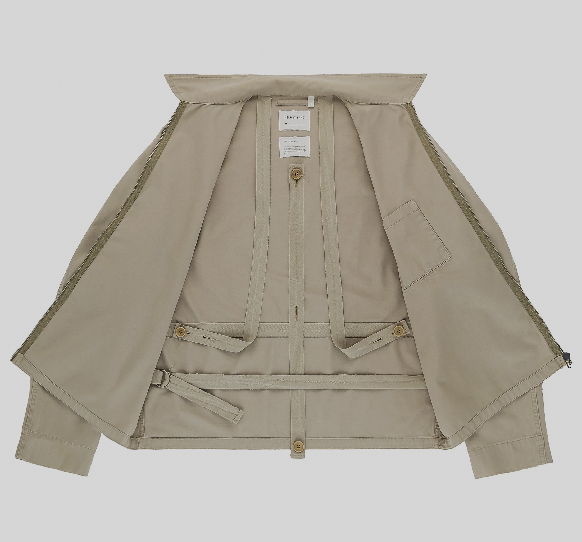
A conclusion this part could otherwise deliver has to be refused: that transformation is the privilege of difficult method — that a garment escapes its assignment only through a sculpture, a rebuilt pattern, a decade of justified design. Throup’s jacket could carry that lesson. A zipped blouson from Helmut Lang’s Jeans line, article 5610, produced around 2000, breaks it with cotton tape and shirt buttons. The exterior offers almost nothing to read: unlined cotton shell, plain collar, front zip, one patch pocket. The interior holds a system in tape colour-matched to the shell — two long straps descending from anchors at the upper back into worked buttonholes that engage buttons at the waist; a centre tape refastened at either of two lengths; a horizontal tape crossing the waist and closing through a paired D-ring, its long tail passing out below the hem. Nothing detaches. Worn conventionally the tapes button flat and the jacket passes as plain. Cinched, the waist tape binds the shell to the torso. Worn open, the straps hang visible below the hem — the state the garment’s own documentation photographs it into, unprompted. Through all of it the components hold still. The mechanism does not transform. Its assignment does. The strap did not need to become more advanced; it needed to be allowed more than one job. The category’s limitation was never that it values function. It is that it assigns one job per feature and files the assignment once.
Issey Miyake began one level down, in the behavior of the cloth itself. One dominant postwar promise of finishing was resistance to use: permanent-press and stain treatment trained cloth to suppress the visible evidence of wear, to hold a prescribed, undisturbed appearance whatever the body did. Miyake redirected that industrial ambition. He instructed cloth to return — not to a blank surface but to a form, and to a form that bodily movement continually opens. In the pleating system a garment is cut and sewn first, at two to three times its final size, then heat-pressed; the fold is set into the polyester as something the cloth remembers. The pleat did not decorate the garment. It taught the garment how to return.
Histories willing to search two centuries for technical ancestry rarely place this industrial control of return inside the line. And an absent ancestor is not only a gap in a history. A genealogy is the reference list a brief is written from, and what a category cannot name, it does not think to ask for.
The operations described here were established before technical menswear had consolidated into a category capable of issuing its own briefs. They are not evidence that garments were better before the category existed. They show what becomes harder to request once a field begins writing its future from the features it has already learned to recognize.
The finished object was never the source of its intelligence. It is the last visible residue of what produced it — a driving posture, a dye bath, a strap’s second job, a cloth instructed to return, a body considered correct — and the residue is what survives handling, photography, listing, and search. The category’s founding act was to make that residue portable. Its error, compounding for two decades, was to mistake the residue for the beginning: to read the swatch without the weather, the lens without the wrist, the strap without the torso, and then — the step documented across briefs, divisions, systems, and credentials — to hand the residue back to the makers as the assignment.
Fourteen numbered decisions; the wheel is not one of them. The list is not careless. It is a list, and a list holds what can be itemized: a placement, a seam, a treatment, a marked New. The posture that generated all fourteen has no field. What happened to the wheel in that diagram is what happened to the weather in a swatch behind a window, and to the industrial control of return in a genealogy of technical ancestry.
The category began with what those objects left behind, and then acquired two powers nobody granted it: to narrow the next garment’s possible forms, and to narrow what the recognized garment is likely to go on doing. The brief forecloses the first. The price makes the second costly. Neither waits for the cloth to have its say.
Before the garment was technical, someone had decided which body it was for.
Technical menswear built its vocabulary by recording what garments had already shown. As those records accumulated through archives, collaborations, credentials, exhibitions, resale, and commissioning, they gradually stopped functioning only as descriptions. They became instructions for what garments should become next. The category stopped waiting for the object and began arranging its future.












Cover Image Caption: The collaboration contracts into a single object. The compass no longer identifies a garment; it becomes the object itself, carrying recognition before performance. Image Credit: Dior and Stone Island, embossed leather round bag, Fall 2024. Photograph: Théo de Gueltzl. Courtesy of Dior.
All images © their respective rights holders.
Image rights & attribution →
Notes on Image Production
The visual essays are prepared using the best historical material available. Where necessary, images are restored, colour corrected, reconstructed from multiple sources, or replaced with higher-quality examples to improve legibility and fidelity to the original object.
The aim is not enhancement or reinterpretation. It is to remove the accidents of reproduction that obscure the historical record, allowing garments, artworks, and documents to be encountered with greater clarity while remaining faithful to the original sources. This work prepares historical evidence for viewing rather than altering it.