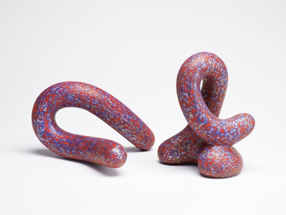
The titles are the contradiction. Bloop. Crook. Vernon. Prone. The surfaces are polished and the bodies closed, but the names refuse the elevated language late style usually borrows. A Bloop is not a masterpiece yet. A Crook is a bend. Vernon sounds almost neighborly. Prone is a body before it is a form.
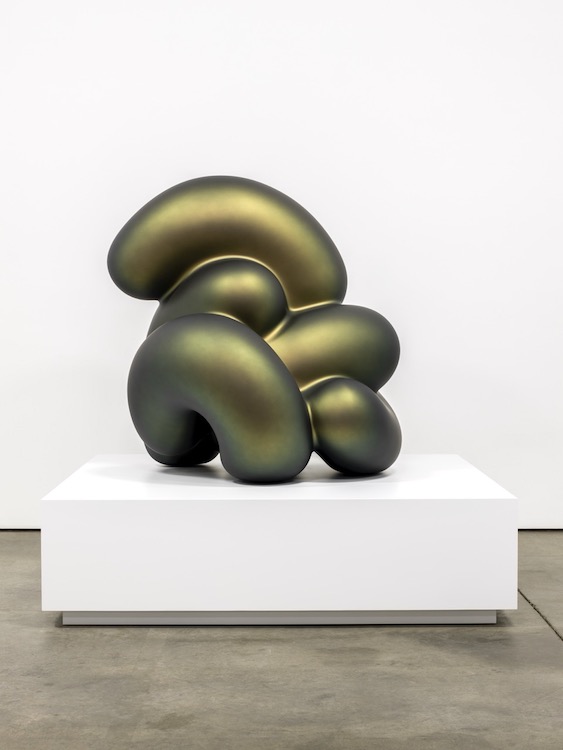
The polish wants another vocabulary. It is exact, bright, almost sealed. The color is held close to the body. The forms carry the density of objects brought slowly to completion. Jewel-like, biomorphic, ceramic, refined — none of these words is false. They are simply too smooth. Price’s work keeps something less resolved inside admiration: candy brightness, bodily humor, vernacular directness, the strange charm of forms that polish has not made tasteful.
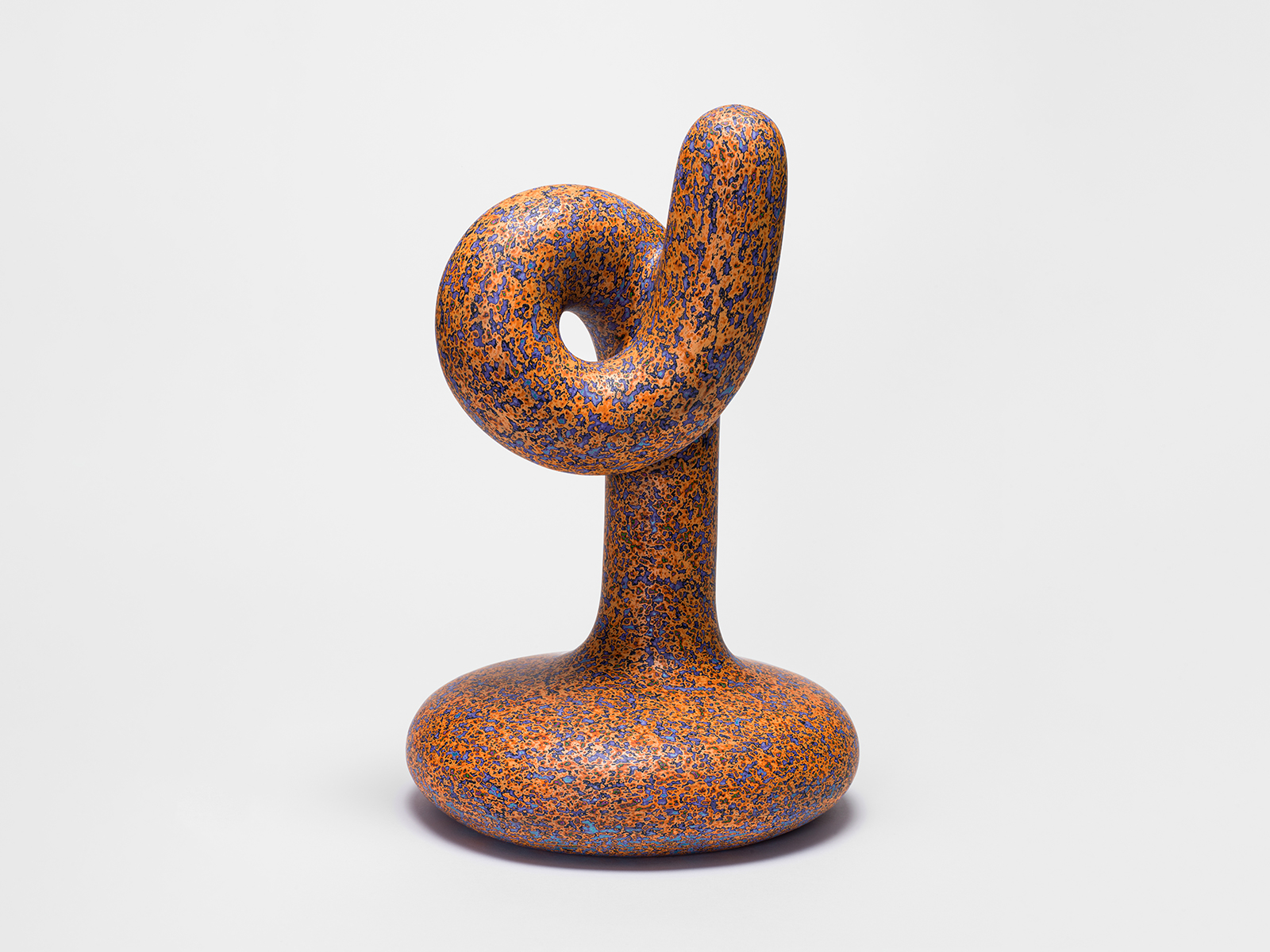
The surface begins to change when looking moves closer. What first appears sealed starts to show its making: layers brought forward unevenly, dots and flecks where color has been recovered, shine interrupted by the evidence beneath it. Price builds the object, fires it, paints, sands, paints, sands, and polishes. The procedure matters because finish becomes subtractive. The visible color is not simply the last coat. It is earlier color reached through removal. The skin is a record. The surface is not coated into brightness so much as worked back until earlier color returns. Polish usually signals resolution. Here, it keeps the object open. The more refined the surface appears from a distance, the more physical it becomes up close.
A photograph tends to return the work to finish: form, sheen, color, silhouette. In the room, the eye does not stay on the skin. It goes into it. Seeing becomes vertical before it becomes spatial, reading down through layers before following the body around its curve. The surface holds light, but it also holds labor — abrasion, recovery, the repeated pressure of making something appear by taking material away.
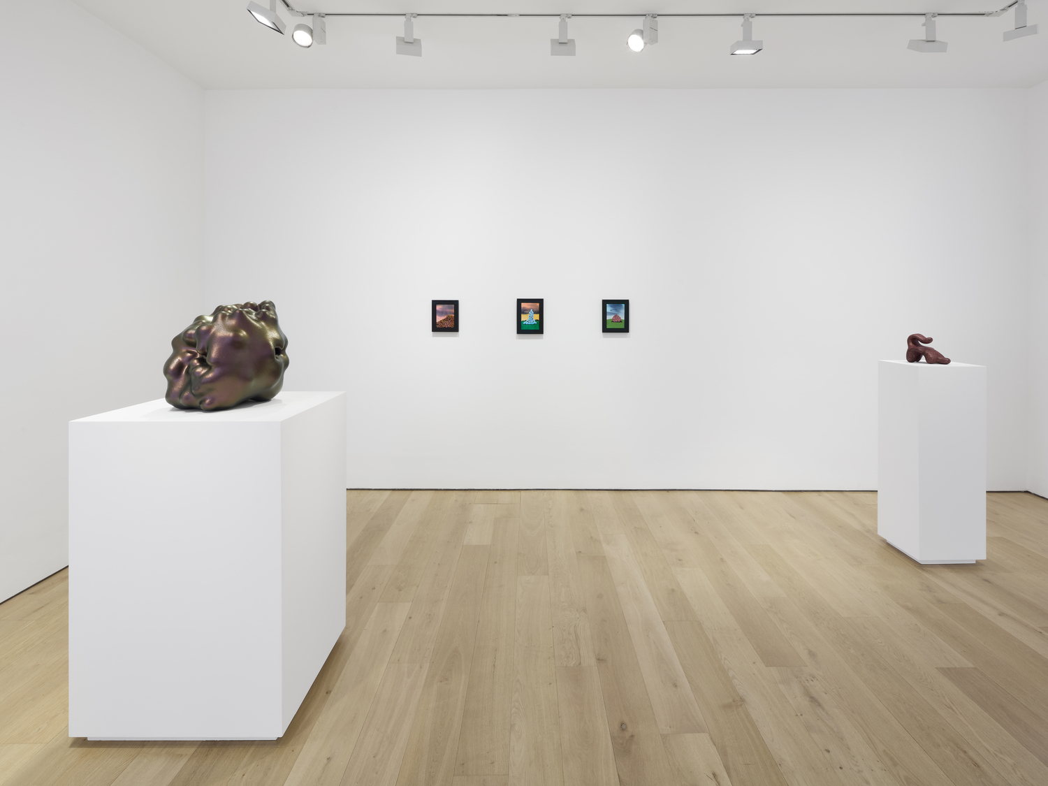
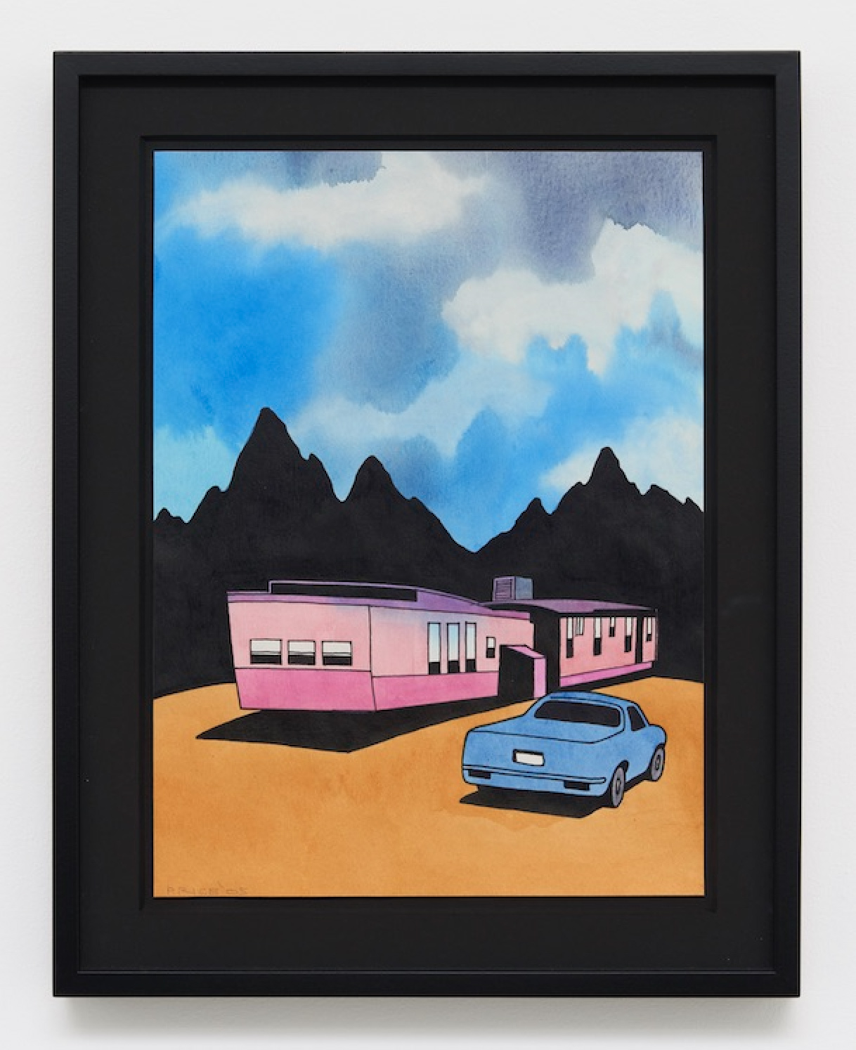
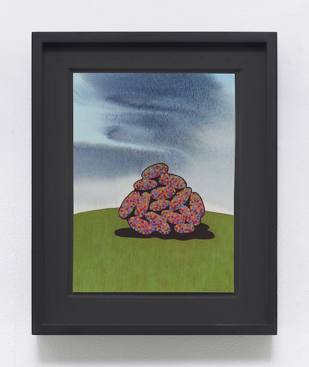
The form is allowed a world on paper. A trailer appears. A house sits on a hill. Dark mountains hold the horizon. Skies turn pink, blue, and gray. Trees, rocks, roads, birds, and colored forms enter scenes with a directness closer to cartoon than to landscape tradition. The register is low, scenic, and unembarrassed. These works do not ask to be elevated into abstraction. They let the form belong somewhere. There, strangeness is distributed across a scene: the hill, the sky, the trailer, the tree, the ground each helps carry the object’s oddness. Take that world away, and the body has to carry the pressure itself. No hill steadies it. No sky softens it. No comic landscape explains it. The cartoon has not been stripped away. It has been compressed into the body.
The candy color, the bodily curve, the humor of the titles, the awkward charm of the forms — all of it remains, but without the world that would make it easier to place. The body replaces the scene. Color no longer has ground to settle into. It needs a body dense enough to carry it: curve, return, recess, underside, edge. The surface is finite, but it is not frontal. Looking has to move because the form keeps turning away from any single possession of it.
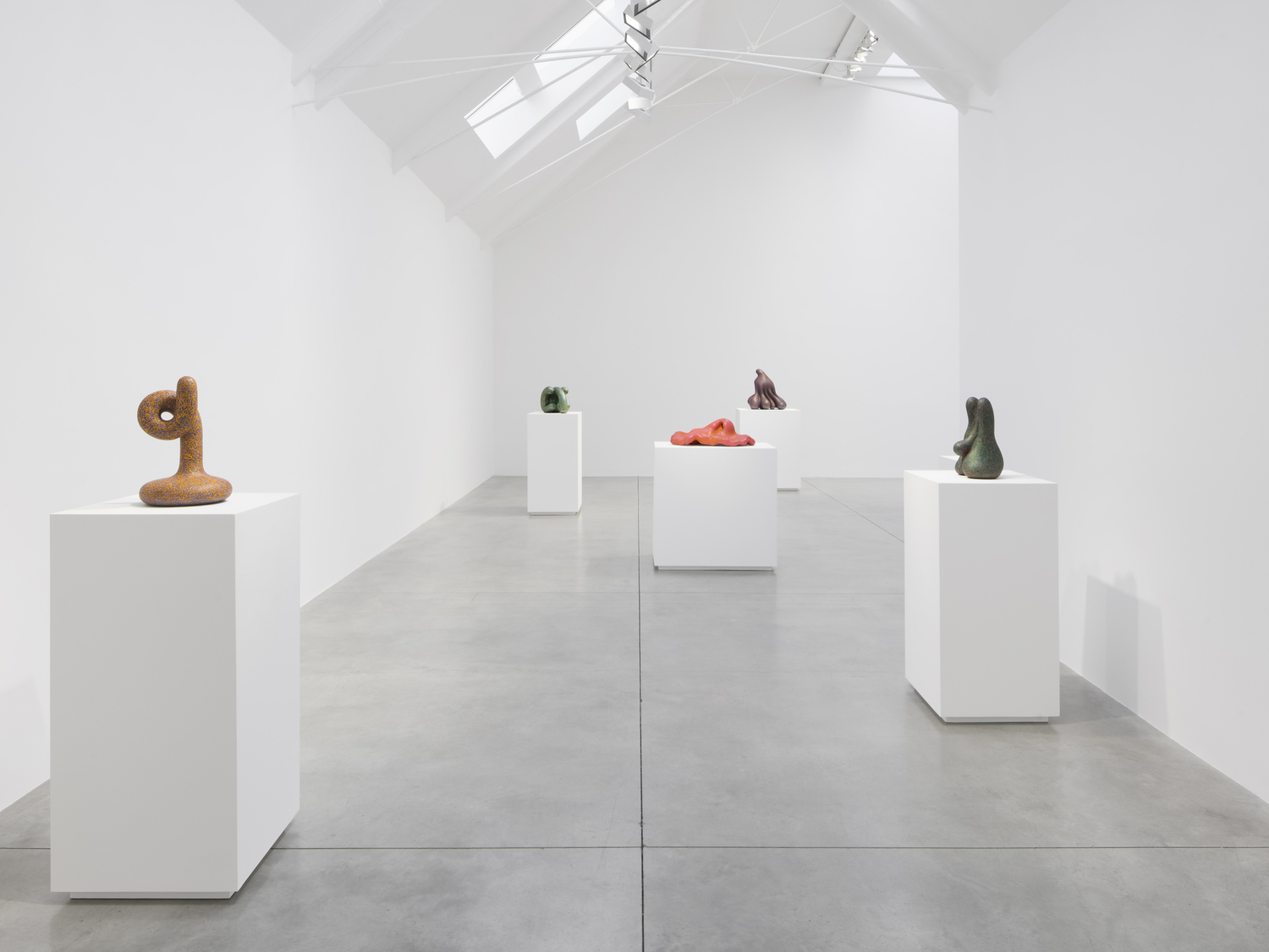
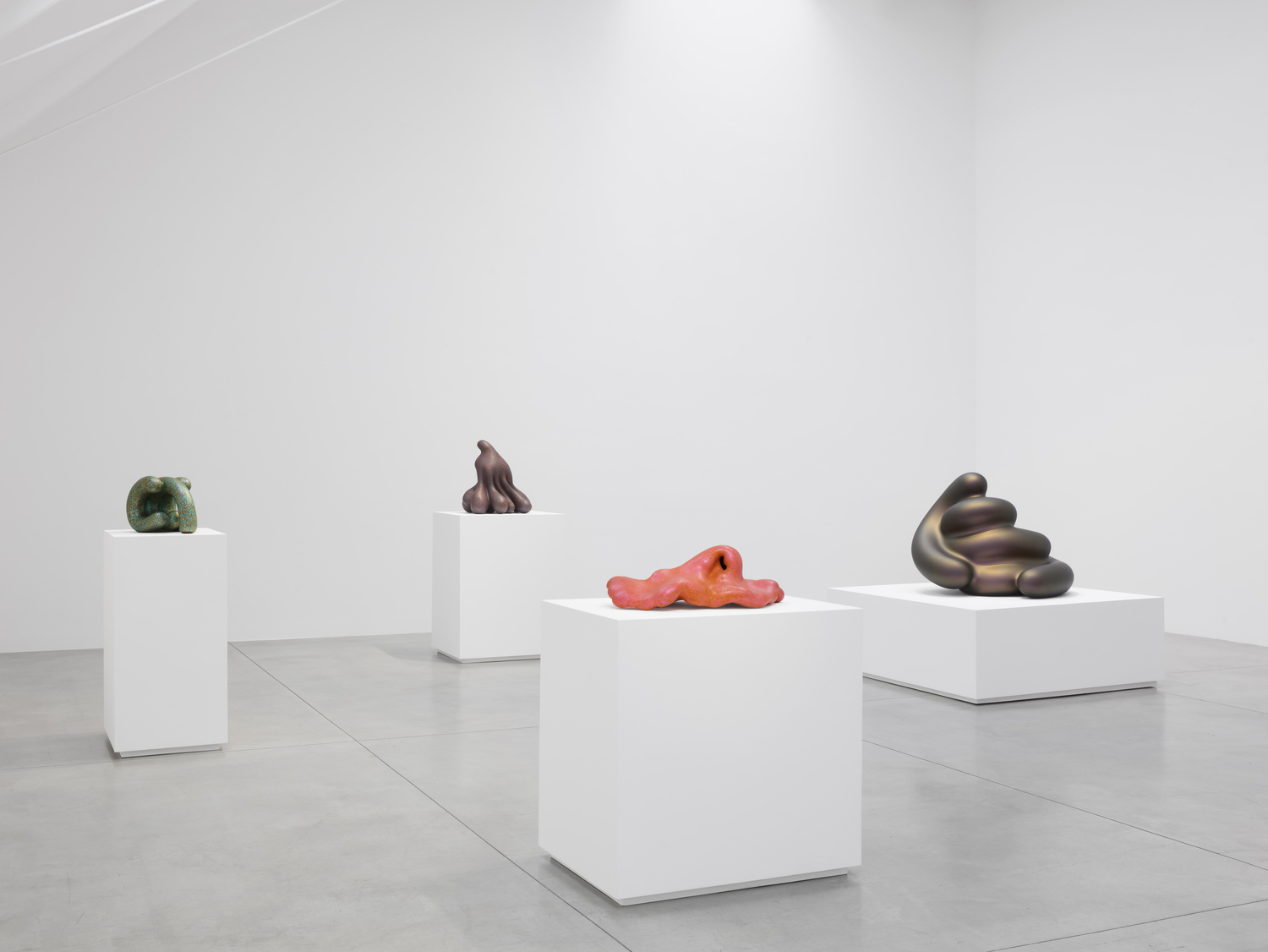
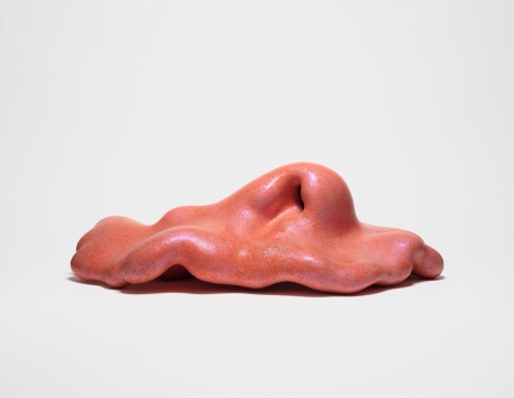
Yin turns the surface inward before returning it to view. Color seems to deepen at the recess, not because the hollow becomes symbolic, but because the body gives color somewhere else to go. Crook tightens that pressure. Its bend keeps the eye slightly behind the form, following surface around a body that will not flatten into a single face. Vernon and Prone extend the condition outward, closer to ground than upright form. Their low profiles can suggest creature, landscape, or reclining mass, but resemblance does not organize them for long. Color runs over the top and disappears beneath, making the underside part of the work even when it cannot be fully possessed.
Bloop divides the closed body into two. The forms sit near one another without touching, close enough to be read together and separate enough to resist merger. The title lowers the register before the relation can become solemn. Each body carries color around its own perimeter; neither completes the other. The space between them becomes a pause, not a composition imposed from outside.
Scale changes before authority does. Percival and Ceejay are larger, harder, more physically present, but they do not take on bronze’s usual authority. They are painted rather than absorbed into patina or monument. What carries across is the worked surface logic Price built through clay: color recovered through removal, polish refusing refinement, a closed body holding strangeness without the help of scene. Enlarged into another material, the forms remain polished, odd, and physically unresolved. By then, ceramics or painting has become the wrong question. So has craft or fine art. Price was not moving ceramics toward respectability, and he was not simply giving painting volume. He was giving color a body dense enough to hold it without a world. Clay remains essential because it gave the surface its first resistance, its curve, its intimacy with the hand. But the operation does not end with clay. It travels because it is not a hierarchy of media. It is a way of keeping strangeness intact through finish.
After the room, what stays is not only the polish. It is the labor inside the polish: the surface cut back until earlier color returns, the comic register held without embarrassment, the closed body carrying what the works on paper allow landscape to carry. The works that first looked complete begin to feel less resolved than preserved. Their finish does not calm them. It keeps them bright enough, strange enough, and close enough to remain unsettled. The works on paper have hills. The clay works do not. The cartoon was always part of Price’s intelligence, not a lesser register beneath it. Strip that away and the work becomes too elegant, too formal, too easy to admire. In the clay works, the cartoon register remains after the cartoon world has been removed. Color is reached through removal. Polish is worked into the surface. The body closes because there is nowhere else for the strangeness to go.
The surface is not where color settles.
The body is what color crosses.
Ground could never civilize this work. In clay, it is gone.