

In September 1991 the one thing people came to Spike’s Joint for was the one thing it did not have. The shop, in Brooklyn, sold the merchandise of Spike Lee’s films: postcards for Mo’ Better Blues, sweatshirts for Do the Right Thing, key rings for School Daze. People came to it from Flatbush Avenue and from Tokyo, and what they wanted most was a baseball cap, black or white, with an X on the front, the cap Lee had been wearing on television since the previous winter to announce a film about Malcolm X that would not start shooting until the following week. It cost $17.50 and the shop was out of it. There was a notebook of names waiting. Knockoffs sold for five or ten dollars at party stores and souvenir booths, and when the co-manager, a boyhood friend of Lee’s, was asked about them he said the thing everybody already knew: “nobody has a patent on the X.”
The letter on the cap needed nothing. It was complete before anyone put it on, the same on the five-dollar copy as on the one with the waiting list, and it would be the same on the next hundred thousand. It had been a man’s surname. Malcolm Little had already given himself a name in prison, signing his letters Shabazz; after his release in 1952 the Nation of Islam gave him the X in place of Little, the name his family had been given in slavery, and he wrote afterwards that it stood for the African family name he could never know. He signed the letter for twelve years, and carried Shabazz beside it. Now it stood for a film, a season, a cap.
James Little’s X paintings were made before any of this; he said so himself, before the X thing, before the movie, before all of that. There were sixteen, small and square, and six of them are at Petzel. They have the letter in them, and it is the one thing in them that no one painted.
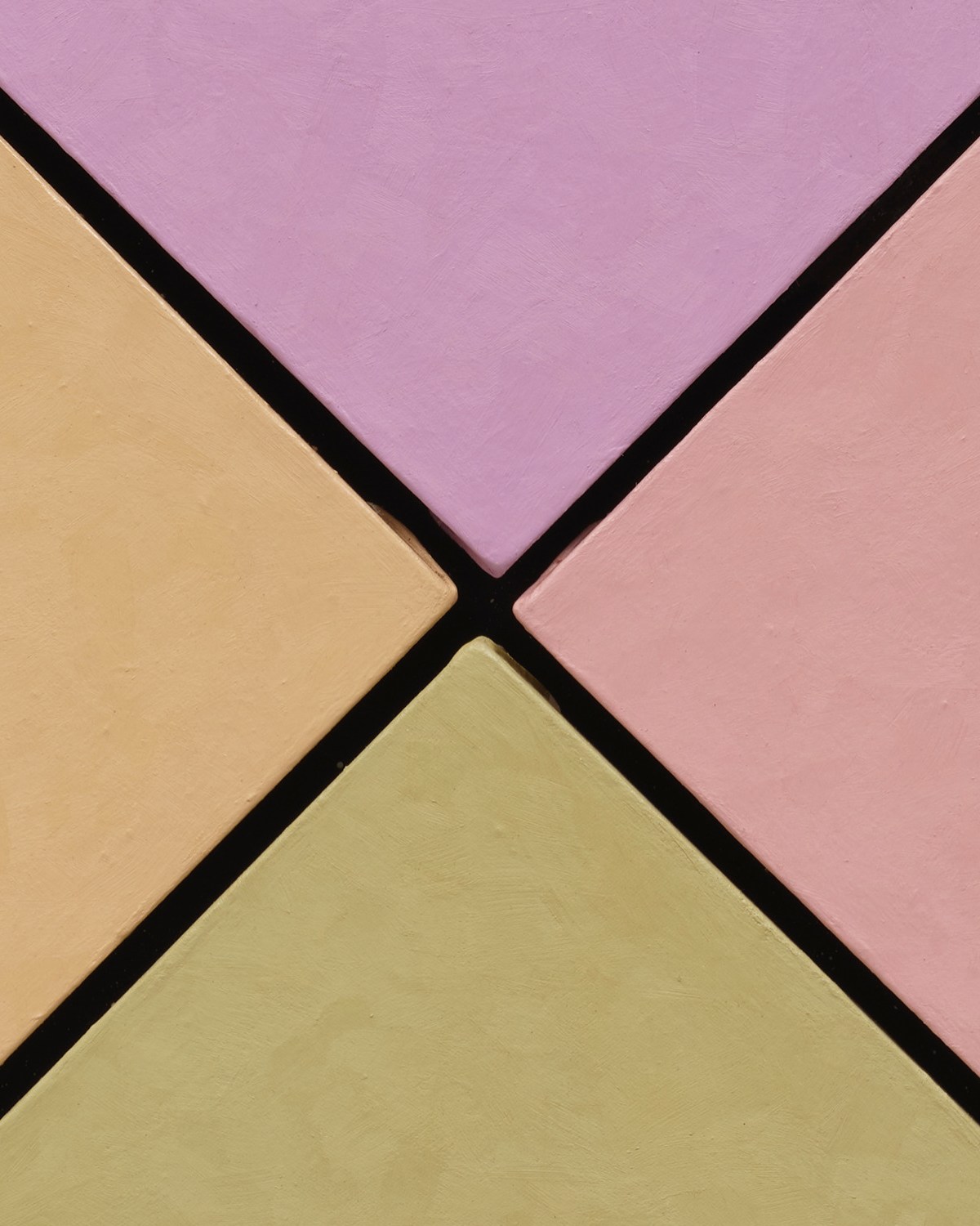
Each is a square of four colours in a deep black frame. The colours are triangles, one to each side, and they point inward to the middle, where a black X holds them apart. In the lowest-numbered of the six, Homage El Shabazz #2 of 1985, they are a lilac, a sand, a green with the sourness of an unripe lemon, and a blue that has some grey in it: the tints of sugared almonds, matte, with the faint cloudiness of wax. The title gives the rest. Shabazz was the name he had carried alongside the letter, from a prison signature to the form he settled on after Mecca in 1964, El-Hajj Malik El-Shabazz, and the X between the four colours is read before the colours are. A letter, a name, a tribute. The painting appears to have said what it is before the eye is finished with it.
Little was in his early thirties when he made it, nine years in New York, still mixing his own paint. He had been cutting oil with beeswax since his student years in Memphis; he melted it in coffee cans and stirred it with chopsticks, and he said that the colour was frozen in the wax. So the lilac and the sand are not the colours of 1985 seen through forty years of varnish and dust. They are the colours of 1985.
Closer, the X is not a line. Each colour is a separate object, a triangle of linen stretched on its own bars, and along the diagonals the sides of the stretchers catch the light as pale strips, so that each of the four stands a little forward of the black like a tile set in a dark grout. The paint wraps the edges with a rough lip. The X is the space between four objects. At the centre, where four points should meet, they do not: each tip is blunt, cut short, and between them there is a small dark hole, roughly square, the one place in the painting where there is nothing at all. The black that fills the X is the black behind the four, and it is the same black that runs around them, in a flat frame about four inches wide on every side, two fifths of the face. Inside and outside the painting the black is one colour. The X reads as the frame entering the picture, and the picture as four pieces of colour the frame keeps from touching.
Describing, many years later, how he lays colour against colour on a single canvas, Little said that when he painted a painting there was no negative space between the colours.
The letter on the cap went wherever the cap went; it was on the cloth. The letter in these paintings is on nothing. Lift any one of the four out of its frame and there is no X on it, only a triangle of colour with a painted edge. The letter lies between them, and it needs all four, the black behind them and the frame that holds them where they are. Once that is seen, the letter stops being the only thing to look at, and the four canvases begin.
What the four are is this. Four triangles of one size, so that no colour has more ground than another; and a diagonal division, so that each colour meets two neighbours across a gap and never meets the third. The opposites face each other across the hole and nowhere else. There is no black among the four and no white; the dark in each painting is the frame’s, and the light is whatever the palest tint can manage on its own. Little said in 2009 that he used colour as imagery, the way figurative artists used imagery, and in these the colours are what there is to see once the letter has been read: four hues, two meetings each, and one pairing that is only ever a facing.
The wax does the rest. It takes the shine off everything. The surfaces are matte and faintly cloudy, closer to tinted plaster than to oil, and they hold the light without returning it, so that a colour reads as a substance rather than as a glaze over something. In a raking light all six show the same making: short, overlapping strokes laid down in patches across every triangle, the same in the orange of #3 as in the near-whites of #6. The sides are painted too, so that each triangle is a coloured object and not a coloured face.
Six of the sixteen are in the exhibition, and the four colours do something different in each. In #3, also 1985, they are an orange, a dusty pink, a yellow and a leaf green at nearly full strength; the orange above and the green below face each other across the hole, the pink and the yellow hold the sides, and the channel between them is wider than a pencil and steady from corner to centre. With four strong colours on four equal grounds, the black between them narrows to a line, the way the bars of a window narrow when the light outside is strong, and the letter is the last thing the eye attends to. #6 is the reverse. Its four are near-whites, a blue-grey above, an ivory below, a sand and a blush at the sides, and against them the black of the frame is the only full colour in sight. The channel there is at its tightest, the triangles all but touching at the outer corners of the square and parting as they come in, and the X is at its clearest: the painting is within a shade or two of being a drawing of an X on white, and the four tints read as warm or cool only against one another and against the black.
In #16, of 1989, lilac above, apricot and salmon to the sides, a khaki below, the colours are so close in weight that the eye settles on the lilac first and then cannot say why; the two warm colours face each other across the hole, the two dull ones do the same, and the channel again closes toward the corners and opens toward the centre.
Why the gaps differ is not known, and the paintings do not say whether the four were set this way or have moved. What they do show is that the letter read in an instant is not one figure repeated six times. It is what four separate things make between them, and no two of the six make it alike.
A seventh of the sixteen belongs to the Studio Museum in Harlem. Homage El-Shabazz (#10), 1986, is four reds in a frame of pale wood, so that the X between the four is a seam of shadow with wood around it rather than a channel of black with black around it. The four reds are what the four colours are in the others; the colour of the X is the colour of whatever surrounds it. The painting came to the museum as the artist’s gift, in memory of Mr. and Mrs. Rogers Little, Nancy and Brandi Little.
Little titled after the fact. “I don’t title the paintings until after they’re done,” he said. “The paintings dictate the titles; the titles don’t dictate the painting.” For this series, by his own account, it went the other way: the title and the idea were decided before the paintings were made. So the word was in place before the first triangle was stretched, and what followed was not a sign painted under a title. It was four supports set into one frame, and the title’s letter occurs only between them. The X in them is the one he built, by where he set the four. The title has neither the name he was born with nor the letter he took in its place; it has the name he chose for himself.
Six of the sixteen hung at the Walker Art Center in Minneapolis in the winter the film came out, in an exhibition about the man, the ideal and the icon. In an exhibition with the letter in its title, these were paintings on which it had not been drawn.
The series did draw it, in at least one print. A small etching, The Conspiracy, pencil-dated ’87, is a field of black, splattered and dense, with a thin X crossing it corner to corner in dashes of red and green. On the back of its frame, in crayon and undated, the artist wrote that it was from the El-Shabazz series, a tribute to Malcolm X. It is an edition of ten. So the series has its own drawn letter, inked and printed ten times over, with a title that names an event, and the paintings are the part of the series in which none of that occurs.
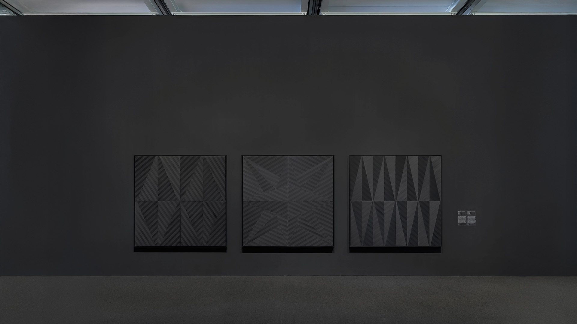
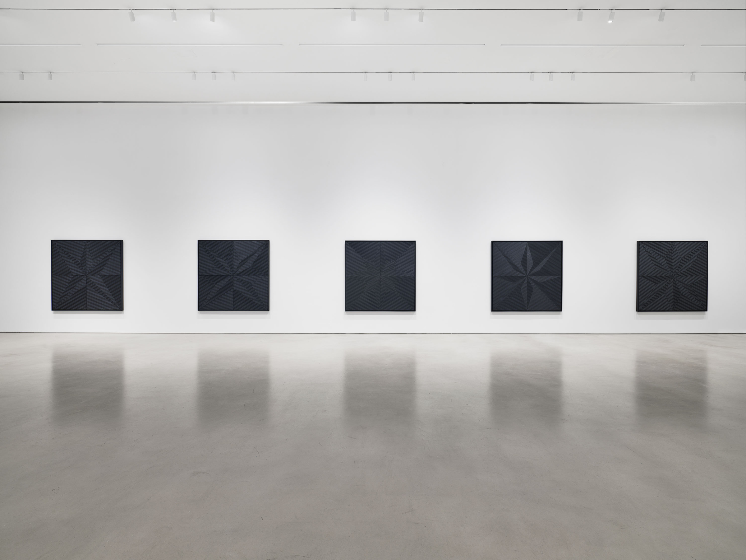
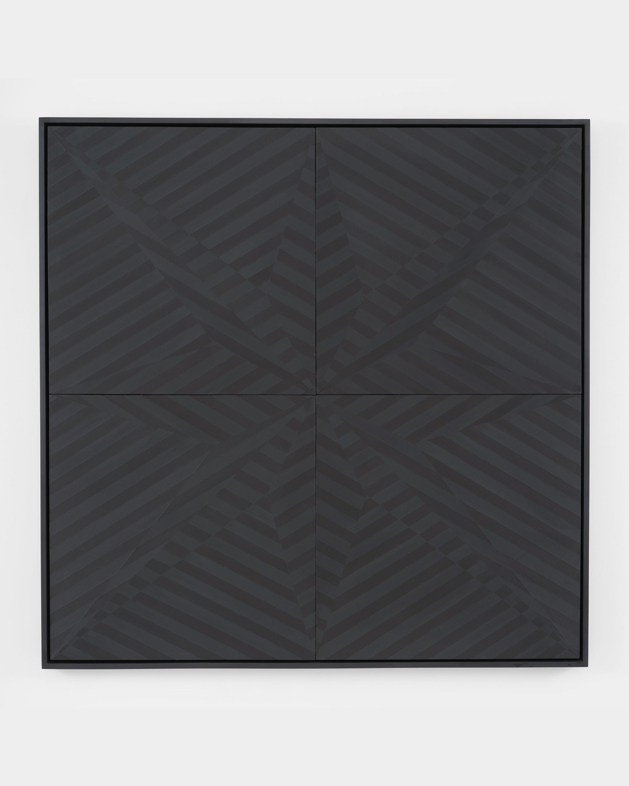
Two years ago the larger gallery in the same building held Little’s black paintings, more than six feet square, black on black, each built from four square panels whose seams cross at the centre, with fans of thick striped wedges converging on the middle and titles that were first names and nicknames: Josephine, Mahalia’s Wings, Mr. Domino. Everything absent from the small paintings was present there: the black was paint, the diagonals were painted bands, the centre was where the whole painting arrived. Even the joins had turned: there, four square panels meet in a cross; here, four triangles meet on the diagonals, and the meeting is the X.
The centre of #16, then. The lilac comes down from the top as a point, the apricot comes in from the left as a point, the salmon from the right, the khaki up from below, and none of them arrives. Each stops short, squared off, a little rough where the wax rounds the corner of the stretcher, and the four blunt ends stand around a hole. Up at the corners of the square the same four canvases all but touch. The X is widest, and emptiest, at the place where the letter would cross.
The letter on the cap was finished before it was worn. This one is not finished until four canvases have stopped where they stop, in this frame, against this black, and even then it is the least of what there is to see: lilac meeting apricot across a dark gap and meeting salmon across another; apricot and salmon facing each other across the hole, the two colours in the painting nearest to one another and the two that never touch; a khaki below that keeps the other three from floating; and a wax surface, laid in short strokes, that holds the light the way a wall holds it. A viewer who already knows what an X means arrives with the meaning in hand and leaves with it still. What the painting does, slowly, by the only means it has, is keep them looking past it. Nobody has a patent on the X. Here nobody has painted it, and what has been painted is everything else.
James Little decided on the title of this series before he made the paintings, the reverse of his usual practice. The Homage El Shabazz paintings each set four separately stretched triangles in a frame, and the X the title leads a viewer to expect is the gap between them; its width is not the same from one work to the next. Little made the series years before the X became a mass-market emblem in 1991 and 1992. The question is what is left to see once the X has been read.


Cover image: Installation view, James Little: Homage El Shabazz, Petzel, New York, 5 November – 19 December 2026. © James Little. Courtesy the artist and Petzel, New York. Photo: Meg Symanow.